| Image |
Comment |
| 02/23/2007 05:33:49 AM |
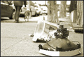
2007-2-12 10:46:27 AM - Thompson St, New Yorkby pineappleComment: Interesting subject and great depth if field use. I do feel a tilt to the image that seems more accidental rather than compositional. I'd also like to see the monitor off the image border. Overall, I like it. I agree with your assessment mentioned in the comment you returned. I do think that this one would make a nice wall-hanger. |
 Photographer found comment helpful. Photographer found comment helpful. |
| 02/23/2007 05:32:46 AM |
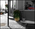
Street Cornerby FocusPointComment: You created a very interesting range of tones here. It almost looks like selective desaturation with the grey of the building and the neutral coloring of the vehicles parked along the street. I do feel that the large, colored flower pot is placed too much in the center of the image. With its coloring and the lack of colors elsewhere, the eye is drawn and held there, not giving the voter ample opportunity to explore the image. I think that you met the spirit of the challenge well, but the image could use a bit more interest. |
| Photographer found comment helpful. |
| 02/23/2007 05:32:30 AM |
Orange Sliceby HipychikComment: I really like you minimalistic-type of composition with this capture. The textured wall makes for an interesting background that gives my eye plenty to roam around the frame inspecting. I think that I'd like it better as a black and white. |
| Photographer found comment helpful. |
| 02/23/2007 05:32:24 AM |
Like Childrenby PeterPicComment: You captured a great expression and a terrific feel of joy with this image. It looks like the focus may be just a bit soft, and the background is a bit too busy. Your depth of field was nicely used, but the distractions are still a bit too much back there. Still, the expression makes the image. |
| Photographer found comment helpful. |
| 02/23/2007 05:32:20 AM |
Waitingby sagestudioComment: When I open this one up, my eye is immediately drawn to the bright sky deep into the image. The problem is that there are no other elements that compete with that brightness to pull my eye away. I like your toning, but the image is a bit too dark overall to keep the voter's eye interested in the capture. |
| Photographer found comment helpful. |
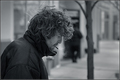
| 02/23/2007 05:32:14 AM |
Layersby aznymComment: Its really hard to tell what is going on here. While I really like strong contrast in most images, your darks are a little too dark, while your highlights are nicely lit. This draws the eye to the lit areas of the image without pulling through the entire frame. I also think that you are a bit too centered here. While I am no stickler for the 'rules' of photography, I think offsetting him a bit would have produced a much stronger composition. |
| Photographer found comment helpful. |
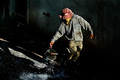
| 02/23/2007 05:32:01 AM |
Brokenby violinist123Comment: I do get a broken feeling looking at this one. I think you did a nice job meeting the spirit of the challenge, though some may bash you or provide stupid links regarding shooting homeless. I like the composition, but I think it would be better zoomed out just a little bit. I'd also like to see your toning with a bit more contrast. As it is, the image looks just a little flat. |
| Photographer found comment helpful. |
| 02/23/2007 05:31:58 AM |
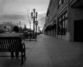
The Watchersby JPRComment: Excellent tonal range. Your whites are well exposed without blowing detail, and your darks are very nice. While I understand that there are limitations when shooting, I think shifting the frame a bit left would have made this one more appealing. With this composition, your subjects are a bit too forced into the center. Still, a very nice capture. |
| Photographer found comment helpful. |
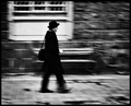
| 02/23/2007 05:31:42 AM |
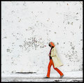
The Pedestrianby LalliSigComment: Very nice motion pan and terrific tonal range. I also like the strength of your composition in the capture. About the only thing that I'd like to see changed would be the angle you took the shot. I think if you were just a few inches higher (or taller), keeping the off of that horizontal line would have made this one even better. |
| Photographer found comment helpful. |
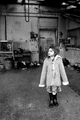
| 02/23/2007 05:31:36 AM |
Waitingby jaxedComment: This is only the second image that I came across to vote on, but I bet that it will be one of my top few. When it popped up, I almost immediately felt a sense of waiting. I think that you could use a bit more contrast, perhaps a curves adjustment, but the composition is terrific. The position of the girl draws the eye into the image to inspect all the interesting elements you included. Nice toning, but I think I'd like to see the darks just a little darker. |
| Photographer found comment helpful. |
Home -
Challenges -
Community -
League -
Photos -
Cameras -
Lenses -
Learn -
Help -
Terms of Use -
Privacy -
Top ^
DPChallenge, and website content and design, Copyright © 2001-2025 Challenging Technologies, LLC.
All digital photo copyrights belong to the photographers and may not be used without permission.
Current Server Time: 08/08/2025 06:10:42 PM EDT.