| Image |
Comment |
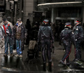
| 02/23/2007 05:35:00 AM |
Spare some change, Armor Truck?by CharleneComment: I took a people photography class some years ago, and the first lesson was geared toward awkward places to chop the human body. Cutting the body off at major joints almost always looks accidental rather than one's compositional intent. You lost two at the waist and two at the knees (one walking and one sitting). Then another is chopped at the ankles. Always be aware of everything in your viewfinder and its placement. |
 Photographer found comment helpful. Photographer found comment helpful. |
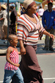
| 02/23/2007 05:34:50 AM |
Fashionable in Stripesby wsteynComment: I took a people photography class some years ago, and the first lesson was geared toward awkward places to chop the human body. Cutting the body off at major joints almost always looks accidental rather than one's compositional intent. Chopping these two at the knees makes this capture seem like more of a quick snapshot than a composed, thought-out image. |
| Photographer found comment helpful. |
| 02/23/2007 05:34:39 AM |
Working the Streetby EBJonesComment: I took a people photography class some years ago, and the first lesson was geared toward awkward places to chop the human body. Cutting the body off at major joints almost always looks accidental rather than one's compositional intent. Chopping your subject off at the ankles makes this look more like a quick, shoot-from-the-hip snapshot than a composed image. Always be aware of everything in your viewfinder, as well as its placement. |
| Photographer found comment helpful. |
| 02/23/2007 05:34:36 AM |
\"And the Beat Goes On\"by IvoryComment: Too much dodging and burning. The post-processing you chose alienates your subjects from the scene rather than making the viewer focus on them. It looks like you had a nice scene that you started with, but the processing really hurt this one. |
| Photographer found comment helpful. |
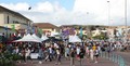
| 02/23/2007 05:34:29 AM |
Street Marketby brettt83Comment: Nice focus and nice work meeting the challenge, but this one is a bit too busy. With all the business, there is no defined subject to grab the eye and pull it into the image. It also feels cramped with the to individuals' feet touching the bottom of the frame. |
| Photographer found comment helpful. |
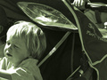
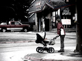
| 02/23/2007 05:34:26 AM |
Strollerby JuliBocComment: This is an interesting choice of subjects, but I feel that your execution is a bit lacking. Composing this one with the child so close to the frame edge that he is facing gives a very uncomfortable, cramped feeling to the image. You also lost a good deal of detail in his hair where your blow highlight is. Softer light of a different time of day would have helped out a great deal. I'm also not too wild about the green toning that you added. With some work, this one could have been much better. |
| Photographer found comment helpful. |
| 02/23/2007 05:34:23 AM |
Afternoon Stroll in the Snowby emily212Comment: I really like the scene you captured here, but I can't see the snow. I think that your use of selective coloring and desaturation sort of blended it all together. I'd also like it better without the pickup truck in the background, or at least without the arse end chopped off. I think that the selective coloring would have worked much better without it in the frame. The red in the truck pulls the eye away from your subject. |
| Photographer found comment helpful. |
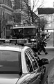
| 02/23/2007 05:34:20 AM |
One of the Braveby pipersdComment: I like your selective focus here, but its one the wrong spot. Either that or your shutter set too slow. Your title suggest that the firefighter is the subject of the image, yet he is out of focus and too close to the edge of the frame. It feels like he is about to walk right out of the image. On the positive side of the image, your tonal range and coloring with this one is very, very nice. |
| Photographer found comment helpful. |
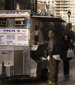
| 02/23/2007 05:34:06 AM |
Nick was right - Kerry & Edwards were best.by quiet_observationComment: This one would have worked better in landscape orientation. With his feet nearly touching the bottom of the frame and chopping off the price list, this one feels too tense. I also tend to steer clear of art geared toward political statements. Even still, you had a great start here. With a simple flip of the camera, I think that this one would have been a great deal stronger. |
| Photographer found comment helpful. |
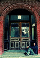
| 02/23/2007 05:34:02 AM |
Waiting: not homeless but defiantly hopelessby Elvis_LComment: I like the coloring here, but I'm not very fond of the composition. If your point of view were higher, the perspective of the arch could have been better. Or some perspective correction would have also made this one better. Even still, I think it would have been more interesting with a tighter crop. |
| Photographer found comment helpful. |
Home -
Challenges -
Community -
League -
Photos -
Cameras -
Lenses -
Learn -
Help -
Terms of Use -
Privacy -
Top ^
DPChallenge, and website content and design, Copyright © 2001-2025 Challenging Technologies, LLC.
All digital photo copyrights belong to the photographers and may not be used without permission.
Current Server Time: 06/19/2025 12:38:37 PM EDT.