| Image |
Comment |
| 06/07/2007 03:54:00 AM |
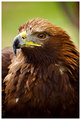
Harris Hawkby h2Comment: Superb focus and a nicely composed capture. I also like the shallow depth of field that you created, giving this one a nice bokeh-esque look. |
 Photographer found comment helpful. Photographer found comment helpful. |
| 06/07/2007 03:52:51 AM |
|
| Photographer found comment helpful. |
| 06/07/2007 03:52:26 AM |
Sunday Applesby ShecoyaComment: Not a bad image, but your composition is just too centered. While I'm no stickler for the 'rules' of photography, I think paying closer attention to the rule of thirds would have made this one stronger. |
| Photographer found comment helpful. |
| 06/07/2007 03:50:20 AM |
|
| Photographer found comment helpful. |
| 06/07/2007 03:49:22 AM |
|
| Photographer found comment helpful. |
| 06/07/2007 03:48:47 AM |
Lost in timeby LalliSigComment: Great image, but I think the blur you applied is a bit too strong. It just harsh on the eyes, and it looks unnatural. I am sure that the voters will still love it. |
| Photographer found comment helpful. |
| 06/07/2007 03:47:30 AM |
|
| Photographer found comment helpful. |
| 06/07/2007 03:47:05 AM |
Beauty of the Gorgeby CraftyComment: I am sure that this is an amazing scene in person, but I'm afraid that the image just doesn't do it much justice. The trees just seem to make it too busy for my eyes. |
| Photographer found comment helpful. |
| 06/07/2007 03:45:48 AM |
Contemplatingby zaflaboutComment: Neat. I like the human-like stance and expression, but the image needs something more. Nice rule of thirds use. |
| Photographer found comment helpful. |
| 06/07/2007 03:44:51 AM |
Colourful lifeby imagine74Comment: Great sky and nice contrast in the colors you captured. The light is mildly distracting, especially being lit differently from the rest of the scene. |
| Photographer found comment helpful. |
Home -
Challenges -
Community -
League -
Photos -
Cameras -
Lenses -
Learn -
Help -
Terms of Use -
Privacy -
Top ^
DPChallenge, and website content and design, Copyright © 2001-2025 Challenging Technologies, LLC.
All digital photo copyrights belong to the photographers and may not be used without permission.
Current Server Time: 08/06/2025 06:12:39 PM EDT.