|
|
|
Showing 331 - 340 of ~1006 |
| Image |
Comment |
| 10/05/2008 05:00:08 AM | Bright Girlsby pjangelComment: This is funny. When we were up in Seattle back in August, we kept seeing groups of girls dressed like this. I just don't get it. I do like the action and color that your image captures. I do like the basis of your composition, keeping the top of the frame to add depth and interest, but I'd also like to see pinky's hand. That kind of leads the eye out of the frame and adds a crowded feel. Nice work overall. |  Photographer found comment helpful. Photographer found comment helpful. |
| 03/31/2008 02:51:02 AM | | | Photographer found comment helpful. |
| 03/09/2008 10:11:02 PM | Don't you stick that tongue out at me!by love32907Comment: Hey there from the Critique Club
Camera Work/Technical: It looks like you got the primary focus in a nice area. You captured a good deal of detail and a great expression on the cat's face. The tongue is hilarious!
Lighting: You lighting is a bit lacking in this capture. The tongue falls of into the darkness and doesn't grab the eye's attention like it should. With a little more lighting on the bottom of the image, I think this one would have been a good deal better.
Composition/Content: I do like the tight composition idea, but I think it is a bit too tight for this image. It gives a crowded, almost anxious feeling to the image when it should feel more light-hearted and happy. I'd like to see a little more of the head and perhaps the ears.
My Opinion: Even with its flaws, this is better than a 4.anything. I think that it should have scored a bit better just based on the chuckle I got form it alone.
Thank you for the opportunity to provide a critique on your entry,
Eric
| | Photographer found comment helpful. |
| 03/09/2008 05:09:24 PM | Girls Love Their * B L I N G * B L I N G *by hotpastaComment: Hey there from the Critique Club
Camera Work/Technical: I do like your post-processing, as well as the shallow depth of field that you chose to go with. My only technical gripe is that the primary focus are appears to be on the pups nose. I'd always try to make sure that the eyes of my subject, whether human or otherwise, stay as focused and as crisp as possible.
Lighting: I think that your choice of lighting is what pulled your score down more than anything else with the capture. I like the antique-esque effect that you captured/created, but the hot spot on her head is a fairly strong distraction to my eye. The same goes for the background in this particular shot. You also lost a little detail with the lack of light on her right eye. A little fill flash would have made this one a good deal stronger.
Composition/Content: Nicely creative. I didn't vote on this particular challenge, but I did go through them after the voting was over. This one made me chuckle. I bet she was tired by the end of 60 shots.
My Opinion: I like it. You did a pretty good job achieving the look you were after. Great subject, good use of props, but I think the lighting could have been a bit better. Good to see that the D300 is getting some good use.
Thank you for the opportunity to provide a critique on your entry,
Eric
| | Photographer found comment helpful. |
| 03/09/2008 04:51:33 PM | Frank the Cat IIby freakin_hilariousComment: Hey there from the Critique Club
Camera Work/Technical: The technical aspect of this image is pretty strong. I do feel a touch of soft focus on Frank's left eye, and it looks like the nose was the primary area of focus. Using f/8 was a good decision, but I think that I would have made sure that both of those eyes stayed crisp.
Lighting: I do like the softness that you achieved with your lighting. Capturing good detail is often difficult when shooting black subjects like this one. You did a nice job, even capturing detail in the ares deep into your photo that aren't in focus.
Composition/Content: While I am no fan of cats, and not normally of cat images, you did a very nice job with the tight composition that you chose. I do think that the angle of the cat's eyes take a little away from the picture. The angle tends to lead my eyes up and out of the frame rather than into it.
My Opinion: 5.897 is a strong score, and I think it is a well-deserved score. With a couple of small changes, particularly with the shooting angle, I think that this one would bump up even closer to the 6 range. Nice work with a fairly difficult colored subject.
Thank you for the opportunity to provide a critique on your entry,
Eric
| | Photographer found comment helpful. |
| 02/29/2008 07:47:26 AM | | | Photographer found comment helpful. |
| 02/07/2008 11:07:09 PM | | | Photographer found comment helpful. |
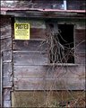
| 01/25/2008 05:20:03 PM | Postedby Donna21Comment: I really think that you had a good starting image. The composition does feel a bit cramped, especially with the sign so close to the edge of the image. Leaving some negative space can be as simple as just leaving some extra space around you main focal point, just like you did in the top two alternatives below. I do like those much better, with the one at the top being my fav of the two. If you could have shot this with a better, more interesting sky, I think your score would have grown some. I also think that it would be a more interesting shot in the summer with the greenery on the vines, but we live by the hand of Langdon here. He put the challenge in for this week, not the summertime. Nice work with the post-processing. | | Photographer found comment helpful. |
| 01/25/2008 04:58:46 PM | Deep Reflectionby JimiRoseComment: I do like the image, but I agree with Jason that the contrast may be pushed just a bit too much. The face and hand are overly distracting and keeps the eye in that one area rather than allowing it to wander through the image. Overall, it really isn't a "DPC Friendly" image. Voters here like sharp images with too much noise reduction that are full of vibrant colors, for the most part anyway. I'm not an average DPC voter, and I gave it a 7 in voting. I also agree with Jason that taking the hot lights out of the composition would have helped a bit, too.
E | | Photographer found comment helpful. |
| 01/23/2008 06:01:16 PM | Cuddle Buddyby XMountaineerComment: Power down that flash...a lot. As soon as this one pops up, I can see that the flash overpowered the image. Normally my goal with flash is to make the image look as if no flash was used. Your flash could also use some sort of diffuser, as your shadows behind the pup's ear, and the doll's ear are very harsh. A diffuser works to make the light of your flash come from a larger source, in turn making your shadows softer. Even better, go ahead and buy a flash unit to get away from the on-camera unit, then use it judiciously.
Other than the flash, you have a great starting subject. I am sure that the doggie will be the star of may photos to come. Your composition does seem a bit tense with everything cramped into the frame. Don't be afraid to leave some negative space and try not to crop off important parts of the subject. Now every image and composition is different, in this one, I think that the dogs left ear should have been included. Do a search for 'rule of thirds' and you'll find some very interesting composition ideas and theories. I hope that this helps, and feel free to email me if you have any more questions.
E | | Photographer found comment helpful. |
|
Showing 331 - 340 of ~1006 |
Home -
Challenges -
Community -
League -
Photos -
Cameras -
Lenses -
Learn -
Help -
Terms of Use -
Privacy -
Top ^
DPChallenge, and website content and design, Copyright © 2001-2025 Challenging Technologies, LLC.
All digital photo copyrights belong to the photographers and may not be used without permission.
Current Server Time: 08/05/2025 11:35:06 PM EDT.
|