| Image |
Comment |
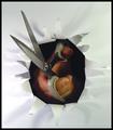
| 04/20/2005 09:36:12 AM |
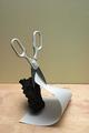
The three muskeeters?by palmfrodurComment: OK. when this is over you gotta let me know how you accomplished this. Great composition, love the curve on the paper to offset the rock & scissors. Wish the background was _either_ more neutral or more colorful. |
 Photographer found comment helpful. Photographer found comment helpful. |
| 04/20/2005 09:33:10 AM |
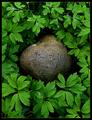
In good companyby jjbeguinComment: This is the kind of pic I love (I'm a 'budding' nature photographer), and you've done the subject great justice. Beautiful greens, wonderful texture on the leaves and rock, great composition. |
| Photographer found comment helpful. |
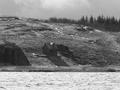
| 04/20/2005 09:30:39 AM |
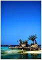
The Rock Landmarkby librodoComment: Those are some seriously _gorgeous_ colors! The only reason I don't like this one more is the fact that there is sooooo much sky - overwhelms the rest of the pic. |
| Photographer found comment helpful. |
| 04/20/2005 09:26:48 AM |
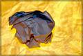
The Creative Processby gotrondComment: Very interesting lighting. Great texture. Not sure I care for it aesthetically, but technically a pretty good pic. ;) |
| Photographer found comment helpful. |
| 04/20/2005 09:22:45 AM |
|
| Photographer found comment helpful. |
| 04/20/2005 09:21:13 AM |
|
| Photographer found comment helpful. |
| 04/15/2005 02:49:40 PM |
The Old Cabinby SiRaComment: DOF too shallow - building and hilldside out of focus. Also, building too small and in too much shadow. |
| Photographer found comment helpful. |
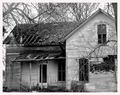
| 04/14/2005 01:53:39 PM |
Nobody Lives Here.......I Hopeby ShannonComment: Nice clarity. Good choice of B&W - I think color would have made it look cluttered. Don't care for the border, and I would have liked to see a different crop. The end of the house is cut off on the right, and the left end of the roof is clipped slightly. |
| Photographer found comment helpful. |
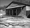
| 04/14/2005 01:50:55 PM |
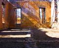
Shadows of Oldeby fulgentComment: Nice crisp shot. Like the shadows on the road. Good choice of B&W - emphasizes the play of light and shadow. Like the angle. |
| Photographer found comment helpful. |
| 04/14/2005 01:49:30 PM |
Sanctuaryby srbrubakerComment: Great color. Good clarity - I like to see the textures. Wonderful lighting and shadows. Interesting view. Maybe a slightly taller crop would have made it a 7. Wall looks chopped off at the top. |
| Photographer found comment helpful. |
Home -
Challenges -
Community -
League -
Photos -
Cameras -
Lenses -
Learn -
Help -
Terms of Use -
Privacy -
Top ^
DPChallenge, and website content and design, Copyright © 2001-2025 Challenging Technologies, LLC.
All digital photo copyrights belong to the photographers and may not be used without permission.
Current Server Time: 08/05/2025 12:12:31 AM EDT.