| Image |
Comment |
| 11/14/2005 03:08:52 AM |
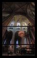
Footsteps and Whispersby jjbeguinComment: I can't see that the separations add anything to t his picture, and there doesn't seem to be any rhyme nor reason to them. The upper one breaks up the beautiful stained glass windows. |
 Photographer found comment helpful. Photographer found comment helpful. |
| 11/14/2005 03:03:29 AM |
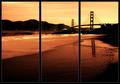
Golden Gateby bryanbrazilComment: Good subject matter for a triptych, but it bothers me that you broke the span of the bridge. |
| Photographer found comment helpful. |
| 11/14/2005 03:02:08 AM |
Incredible Journeyby MAKComment: IMNSHO, triptych pictures should be three pictures that can stand independently, but together make a stronger whole. You've done it. The only thing I don't like is the red and green colorization. I think those frames would be better in B&W and just have the little girl's dress colored. Great idea and execution. |
| Photographer found comment helpful. |
| 11/13/2005 05:14:26 PM |
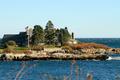
Bush on an Islandby holdingtimeComment: Kennebunkport? I think I get what you were trying to do with the foliage in the foreground, but it really doesn't add to the picture. I'd get rid of it. |
| Photographer found comment helpful. |
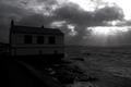
| 11/13/2005 05:11:47 PM |
|
| Photographer found comment helpful. |
| 11/13/2005 05:00:24 PM |
Home on the Range.by banditComment: I really like the use of the long, skinny format, but is there any way you could have made the picture larger? It's hard to pick out all the detail. |
| Photographer found comment helpful. |
| 11/13/2005 04:59:14 PM |
Smoothby owenComment: Good idea, but I wish there was some more texture in the sand. (Is that sand?) |
| Photographer found comment helpful. |
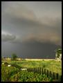
| 11/13/2005 04:58:23 PM |
|
| Photographer found comment helpful. |
| 11/13/2005 04:57:28 PM |
|
| Photographer found comment helpful. |
| 11/13/2005 04:52:25 PM |
Spirit of the Lakeby MAKComment: I really like your long, skinny format. Who says we have to be locked into a 6x4 world? However, I think the picture would be improved by cropping it at the left at the gap in the trees. IMHO, the little building in the ridge doesn't add much to the pciture nor does that black part of the lake. It would also get rid of a hunk of distracting white sky. |
| Photographer found comment helpful. |
Home -
Challenges -
Community -
League -
Photos -
Cameras -
Lenses -
Learn -
Help -
Terms of Use -
Privacy -
Top ^
DPChallenge, and website content and design, Copyright © 2001-2025 Challenging Technologies, LLC.
All digital photo copyrights belong to the photographers and may not be used without permission.
Current Server Time: 06/20/2025 06:36:05 AM EDT.