| Image |
Comment |
| 11/14/2005 03:12:07 AM |
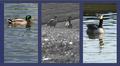
Duck Day Afternoonby Prof_FateComment: The shot of the mallard is great. The goose (?) on the right seems to be a little out of focus. I don't think the B&W shot in the middle does much for the composition. Next to the green of the mallard's head, they seem sort of blah. |
 Photographer found comment helpful. Photographer found comment helpful. |
| 11/14/2005 03:08:52 AM |
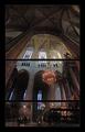
Footsteps and Whispersby jjbeguinComment: I can't see that the separations add anything to t his picture, and there doesn't seem to be any rhyme nor reason to them. The upper one breaks up the beautiful stained glass windows. |
| Photographer found comment helpful. |
| 11/14/2005 03:03:29 AM |
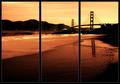
Golden Gateby bryanbrazilComment: Good subject matter for a triptych, but it bothers me that you broke the span of the bridge. |
| Photographer found comment helpful. |
| 11/14/2005 03:02:08 AM |
Incredible Journeyby MAKComment: IMNSHO, triptych pictures should be three pictures that can stand independently, but together make a stronger whole. You've done it. The only thing I don't like is the red and green colorization. I think those frames would be better in B&W and just have the little girl's dress colored. Great idea and execution. |
| Photographer found comment helpful. |
| 11/13/2005 05:14:26 PM |
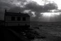
Bush on an Islandby holdingtimeComment: Kennebunkport? I think I get what you were trying to do with the foliage in the foreground, but it really doesn't add to the picture. I'd get rid of it. |
| Photographer found comment helpful. |
| 11/13/2005 05:11:47 PM |
|
| Photographer found comment helpful. |
| 11/13/2005 05:00:24 PM |
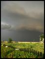
Home on the Range.by banditComment: I really like the use of the long, skinny format, but is there any way you could have made the picture larger? It's hard to pick out all the detail. |
| Photographer found comment helpful. |
| 11/13/2005 04:59:14 PM |
Smoothby owenComment: Good idea, but I wish there was some more texture in the sand. (Is that sand?) |
| Photographer found comment helpful. |
| 11/13/2005 04:58:23 PM |
|
| Photographer found comment helpful. |
| 11/13/2005 04:57:28 PM |
|
| Photographer found comment helpful. |
Home -
Challenges -
Community -
League -
Photos -
Cameras -
Lenses -
Learn -
Help -
Terms of Use -
Privacy -
Top ^
DPChallenge, and website content and design, Copyright © 2001-2025 Challenging Technologies, LLC.
All digital photo copyrights belong to the photographers and may not be used without permission.
Current Server Time: 12/21/2025 01:00:27 PM EST.