| Image |
Comment |
| 04/19/2003 07:38:53 AM |
Scorching Springby jjimComment: underexposed. This pic looks like it has a lot of potential, but it needs to be exposed a little more. |
 Photographer found comment helpful. Photographer found comment helpful. |
| 04/19/2003 07:35:36 AM |
Scattered at Sunriseby mrbarquetComment: Sunrises rock. Nice colors and cloud formations. I really like the silhouettes of the landscape too. Good solid pic |
| Photographer found comment helpful. |
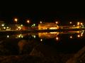
| 04/18/2003 04:09:48 PM |
Isafjordur in the nightby birgirComment: Glad this wasn't around for symmetry. I might not have a ribbon! Nice pic. Maybe a little too much negative space for my tastes, but very good photo. Could be a little sharper, probably due to exposure time. |
| Photographer found comment helpful. |
| 04/18/2003 05:11:22 AM |
Storm brewingby brentg3Comment: If this wasn't quite os dark it would be much better. Its so hard to see anything under the cloud at all. Almost a fantastic shot |
| Photographer found comment helpful. |
| 04/18/2003 05:10:00 AM |
|
| Photographer found comment helpful. |
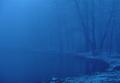
| 04/18/2003 04:56:23 AM |
into the great abyssby schurgComment: Very cool effect and I really like the color tone of this photo. The reflections in the pond/swamp are really eerie and make this shot. NIce job |
| Photographer found comment helpful. |
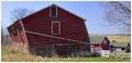
| 04/15/2003 02:53:49 PM |
A Tornado did thisby STEINRComment: Holy leaning structures batman!! This poor thing looks like its one foot in the scrap pile. Makes for interesting pis. Too bad this couldn't be a little clearer |
| Photographer found comment helpful. |
| 04/15/2003 02:52:04 PM |
|
| Photographer found comment helpful. |
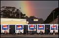
| 04/15/2003 02:27:09 PM |
Pepsi Lovers Pot O Goldby PaigeComment: Greetings from the Critique Club
By Inspzil
Composition - One of my favorites this challenge although I don't think it was one of the best. I really think this was a great idea and I hope you will work on getting those lines out. Who could ask for anything more in a color challenge? Very good capture. Ironic it goes to the pepsi garage though.
Technical - This could be a little sharper, but I don't think it's a requirement. The exposure is perfect. Nice colors and framing to this too.
Overall - I really like the rainbow, its quite a catch. It just needs to be cleaned up a bit with the power lines mostly, but other items like the fence and the house and the trucks could be edited out... Okay maybe not THAT much stuff :) Cute pic and great capture. Good luck in future challenges - Inspzil |
| Photographer found comment helpful. |
| 04/15/2003 12:12:30 PM |
Forty Five Miles Per Hourby lennierComment: Greetings from the Critique Club
By Inspzil
Composition - There is some awesome color and texture to this shot. I'm still not sure where the sign fits in, but to each his own. I think sacrificing the sign in order to lose the wires at the bottom and the washed out part at the top is a fair trade. But that's just me. The grass is wonderful, like the fairways at Augusta. The hills have cool little bumps that make cool little shadows. The sky is a great shade of blue. Nice work.
Technical - Great color, exposure, use of available lighting. The shot is really crisp and clear. Really nice work.
Overall - I don't think I'm the only one wondering about the sign judging by the comments. I really don't think it needs it. There are some great colors and nice textures to this pic. I reminds me of the Teletubbies, if you know who they are. This is a nice pic with or without the sign in it but I think it allows for some more criticism as well. Good luck in future challenges - Inspzil |
| Photographer found comment helpful. |
Home -
Challenges -
Community -
League -
Photos -
Cameras -
Lenses -
Learn -
Help -
Terms of Use -
Privacy -
Top ^
DPChallenge, and website content and design, Copyright © 2001-2025 Challenging Technologies, LLC.
All digital photo copyrights belong to the photographers and may not be used without permission.
Current Server Time: 08/15/2025 01:22:16 PM EDT.