| Image |
Comment |
| 05/04/2003 07:47:19 AM |
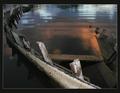
Once it had been usefulby JeanComment: The colors in the water are some very nice hues. I really like this idea and actually I think the crop works pretty well for this picture. I'm usually picky about cutting stuff off but I like this one cut off. I never would've thought to do it this way. Nice job |
 Photographer found comment helpful. Photographer found comment helpful. |
| 05/04/2003 07:43:17 AM |
Training Wheelby GeneralEComment: My kids are in the learning to ride bikes stage, so I know all about this. I think the crop is a little to tight on this one. I'd at least have included the entire training wheel. |
| Photographer found comment helpful. |
| 05/04/2003 12:22:37 AM |
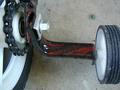
Prowlerby DennisFComment: Great colors but they might be a little oversaturated judging by the headlight. Good composition overall and I like the angle and perspective. |
| Photographer found comment helpful. |
| 05/04/2003 12:21:20 AM |
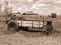
Ol' Timerby tcherringComment: The house in the background kinda ruins the mood to this one. The subject is very fitting for the photo. If it were an old farmhouse, I'd be more apt to believe this is a period shot. |
| Photographer found comment helpful. |
| 05/04/2003 12:19:24 AM |
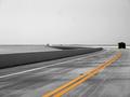
Round the Bendby BudweezerComment: Great perspective shot. I'm not really sold on the desaturation of all the colors but the yellow stripes, but I really love the perspective |
| Photographer found comment helpful. |
| 05/03/2003 11:54:19 PM |
Reef A to Reef Bby elliottwhitleyComment: The sky needs a little more color to it. The sail has some really nice colors but it needs a little contrast with a nice orange or blue sky. |
| Photographer found comment helpful. |
| 05/03/2003 11:51:23 PM |
The Coasterby ScottKComment: Nice framing with the aquatic vegetation type stuff. A little nicer sky and this would've been a really great pic. As is, a really nice pic with some good colors and I like the reeds framing this in. Nice work |
| Photographer found comment helpful. |
| 05/03/2003 09:43:47 AM |
catby GinaRothfelsComment: I like that this is split with shadow and sun. Good use of the 6pt star filter. Gives it that little something extra without being way too much. |
| Photographer found comment helpful. |
| 05/02/2003 06:49:46 AM |
Joy Rideby jenaromComment: The motion could be a little more frozen. I think this is cute, but what would've made it really special was to have each frame seem like it was still. The portrayal of motion should be shown by three still frames. Its one of the better uses of realy triptych in the challenge, but the motion shown in each frame is a little too much. But its adorable anyway! |
| Photographer found comment helpful. |
| 05/02/2003 06:46:23 AM |
Feeling Disconnectedby greenem2Comment: The proportions of this photo don't seem to match really well. It may be the way the shadows are, but it just seems odd. The head seems more than a little bit small. Conceptually its a pretty good idea. |
| Photographer found comment helpful. |
Home -
Challenges -
Community -
League -
Photos -
Cameras -
Lenses -
Learn -
Help -
Terms of Use -
Privacy -
Top ^
DPChallenge, and website content and design, Copyright © 2001-2025 Challenging Technologies, LLC.
All digital photo copyrights belong to the photographers and may not be used without permission.
Current Server Time: 08/13/2025 05:14:58 PM EDT.