| Image |
Comment |
| 06/12/2003 04:43:19 AM |
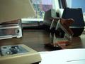
Turf Warby GeneralEComment: Too much background going on for this "showdown" However I do like the idea |
 Photographer found comment helpful. Photographer found comment helpful. |
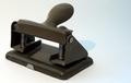
| 06/12/2003 04:42:23 AM |
A Staplerby russiComment: It looks more like a hole punch to me. I've been wrong before tho |
| Photographer found comment helpful. |
| 06/11/2003 05:48:15 AM |
Drop of Honey by JackoComment: Congrats on yet another ribbon. I told crabappl3 he was hoarding them. I think you've got a pretty fair collection too. Nice shot! |
| Photographer found comment helpful. |
| 06/11/2003 05:44:29 AM |
Dairy Queen by crabappl3Comment: Congrats on another well deserved win Crab. Quit hoarding those damn ribbons eh?
Bob |
| Photographer found comment helpful. |
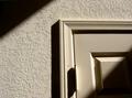
| 06/10/2003 05:39:15 AM |
Hallway in morning lightby caroleeComment: Greetings from the Critique Club
By Inspzil
Composition - With no details on this photo, its difficult to say what exactly you were going for here. I'm guessing you were going for some geometry in lines in lieu of a definite object as a subject. The shadows are pretty good here. I like the darkness in the top left and bottom right corner. The shadows on the rest of the door are pretty good too. I think it would've been conducive to show more of the door, unless there was something there we weren't supposed to see. There isn't a real compelling "subject" here though. The shadows are okay, but the seem like leading lines leading to something somewhere, we just don't know what or where.
Technical - You have the interesting lighting aspect of this and actually the framing isn't too bad. I rather like it except for its a little tight. The focus is good and DOF isn't really an issue in this pic. There is no obvious post processing which is good.
Overall - Its not a bad photo, but there seems to be nothing really compelling about this shot, no "wow" factor. Interesting yes, but not much else. I think you did a good job for what it is, but I wish something else was going on here. Sorry I couldn't be much help. Good luck in future challenges - Inspzil |
| Photographer found comment helpful. |
| 06/10/2003 05:28:29 AM |
My Cuckoo's Nestby AnachroniteComment: Greetings from the Critique Club
By Inspzil
Composition - The choice of subject material for this challenge was a little questionable to say the least. I personally did not care for this composition due mostly to the choice of the sign. I also think that anything with a phone number should probably be left out. You must not have felt that way, but I can respect that too. I don't find this a terribly interesting subject. I can see the humorous approach you took to this challenge with this subject, but its not terribly effective to that approach either.
Technical - Its pretty flat on the whole. There really isn't anything done out of the ordinary with the lighting or the perspective. Its reasonably well focused and there are no real obvious flaws with the DOF or exposure. There doesn't seem to be any extraneous post processing which is always a plus to me.
Overall - I think the choice of subject was not a very sound one. It's cute for a very brief moment, but that's about it. I don't care for this photo and I think the only recommendation I can offer is to choose your subjects a little more wisely. Perhaps a blue wasp. Have you seen them? they are cool! Sorry I'm a little disappointed Anachronite. Good luck next time - Bob |
| Photographer found comment helpful. |
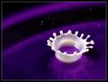
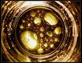
| 06/09/2003 11:41:47 PM |
Liquid Reactionby davidbellComment: Very cool abstract. I love the way the balls are all different sizes at the bottom ranging from very small to quite large. Nice job with this one. |
| Photographer found comment helpful. |
| 06/09/2003 11:39:39 PM |
|
| Photographer found comment helpful. |
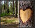
| 06/09/2003 11:36:32 PM |
My Heart Is Bleedingby MonaComment: This isn't portrayed really well from this far back. In order for we dumb viewers to understand this photo, it should've been shot much closer or at least cropped closer. It's that or I'm missing the point completely which is entirely possible. Are we looking for the sap? |
| Photographer found comment helpful. |
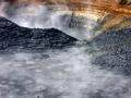
| 06/09/2003 11:32:38 PM |
Bubbling Mud Potsby BAMartinComment: The texture of the rocks and of the mud is really good. Honestly I think you should stuck with one mud hole or the other. I don't think both together work as they should. |
| Photographer found comment helpful. |
Home -
Challenges -
Community -
League -
Photos -
Cameras -
Lenses -
Learn -
Help -
Terms of Use -
Privacy -
Top ^
DPChallenge, and website content and design, Copyright © 2001-2025 Challenging Technologies, LLC.
All digital photo copyrights belong to the photographers and may not be used without permission.
Current Server Time: 08/11/2025 01:59:44 PM EDT.