| Image |
Comment |
| 02/03/2003 01:17:03 PM |
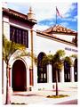
Sun Drenchedby GraciousComment: Critique Club by Inspzil
Composition - Wonderful old building with some nice trees in front. I really like the roof with the colorful tiles. The flag is a nice touch as well. The perspective is pretty good but I'm wondering why the whole building isn't in the picture. Nothing bad about the composition, but there really isn't anything to grab me either.
Photography - In a word, overexposed. This photo is really blinding. This situation, with the building being white, is similar to shooting in snow. I think that a lot of the reason for the lower score is that the building becomes flat white as does the top of the columns above it. Without exif data, it's hard to tell what could've been changed to make this shot better.
Processing - It's hard to correct a very overexposed (or underexposed) photo with PS or equivalent. There might've been a way to tone it down a little so that it wasn't quite so bright.
Overall - This isn't a bad photo, but not the kind that does well on DPC. It looks a lot like a tourist brochure cover actually, which isn't a bad thing. The composition of this photo doesn't really lend itself to being a real contender. It just doesn't have the WOW factor. The exposure though is the sticking point for this pic. If it was done intentionally, then I can't say much. If it wasn't, maybe making the camera adjust to ultra-bright, then holding it and taking the picture with that exposure in mind would have helped the picture and ultimately your score. - Inspzil |
 Photographer found comment helpful. Photographer found comment helpful. |
| 02/03/2003 05:41:36 AM |
ABC bubble-gumby justineComment: Simple, but effective. This is definitely an easy one in terms of obtaining and photographing. It has great color though and makes for a nice picture. I wish more people would stay on the keep it simple theme this challenge - Inspzil |
| Photographer found comment helpful. |
| 02/03/2003 05:37:47 AM |
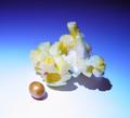
Peel + B4by redfigComment: Good photo. The hightlight on the orange is a little much for me. Great clarity in this pic. It could use a little more light methinks, just not so direct - Inspzil |
| Photographer found comment helpful. |
| 02/03/2003 05:30:39 AM |
Roastedby SonifoComment: Great red color. very vibrant. unusual pose with its counterpart. - Inspzil |
| Photographer found comment helpful. |
| 02/03/2003 05:06:08 AM |
Popcornby MajorChaosComment: Awesome gradient background. You couldn't save a few more kernals for the pic? Well conceived well taken, my favorite so far - Inspzil |
| Photographer found comment helpful. |
| 02/03/2003 05:04:49 AM |
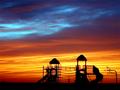
Past, Present and Futureby SharQComment: This is dramatically lit, but not quite enough for my taste. Its very hard to see much on the left side of the pic. - Inspzil |
| Photographer found comment helpful. |
| 02/03/2003 04:52:35 AM |
|
| Photographer found comment helpful. |
| 02/03/2003 04:49:44 AM |
Roast, Grind, Brew and Enjoy!by DougPazComment: Its 4:45am. Wow that looks good right about now. Reminds me, I think my coffee is done. Great contrast between the beans themselves and also with the cups. Good luck - Inspzil |
| Photographer found comment helpful. |
| 02/03/2003 04:39:55 AM |
All Cracked Up!by kandyjComment: THe hand shadows are too overpowering. Light source needs to be moved. - Inspzil |
| Photographer found comment helpful. |
| 02/03/2003 12:19:15 AM |
Windows and Mirrorsby MorganComment: I gotta think this one was intended for the last challenge. Well I'll rate the photo anyway. |
| Photographer found comment helpful. |
Home -
Challenges -
Community -
League -
Photos -
Cameras -
Lenses -
Learn -
Help -
Terms of Use -
Privacy -
Top ^
DPChallenge, and website content and design, Copyright © 2001-2025 Challenging Technologies, LLC.
All digital photo copyrights belong to the photographers and may not be used without permission.
Current Server Time: 08/12/2025 01:38:04 PM EDT.