| Image |
Comment |
| 03/11/2003 12:44:51 PM |
Springing Fourth From the Riverby DougPazComment: Good colors of the tree. The river looks a little yucky in the color department tho I really like the reflections. Too bad the sky is so overcast. A little more of a clear dusk would've helped a lot. |
 Photographer found comment helpful. Photographer found comment helpful. |
| 03/11/2003 05:37:43 AM |
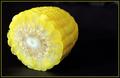
Yellow Zeroby karmatComment: Framing is a bit off IMO for this shot. The crispness of the corn isn't quite there. This is striking me as odd because I can see the grain of whatever textile you used underneath the cob. Pretty good overall tho |
| Photographer found comment helpful. |
| 03/11/2003 05:24:21 AM |
|
| Photographer found comment helpful. |
| 03/11/2003 05:17:48 AM |
A perfect three by mbardeenComment: Good lighting and exposure. The colors are nice too. I'm not sold on the framing and I think this is a little softer than it should be. Not a bad photo overall. |
| Photographer found comment helpful. |
| 03/11/2003 05:15:05 AM |
|
| Photographer found comment helpful. |
| 03/11/2003 05:12:25 AM |
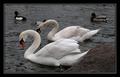
Just the 2 of usby agwrightComment: Awesome shot. Great contrast between the bird and the water further increases the effectiveness of this shot. Nice job |
| Photographer found comment helpful. |
| 03/11/2003 05:10:27 AM |
Eye of Time - [0]by rj324Comment: Great portrayal of textures and natural colors. This is especially impressive in a single piece of wood. I think the framing is good, but might improve the effect of the picture if the lighter brown circle was placed on the bottom right corner. It would give a little room for the circle to open up to. I'm not sure how to describe it exactly. Maybe I'm way off anyway... Nice shot whatever the case |
| Photographer found comment helpful. |
| 03/09/2003 08:46:54 AM |
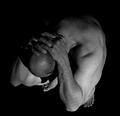
At Wit's Endby AnachroniteComment: Greetings from the Critique Club
By Inspzil
Composition - The composition of this photo is awesome. I really think this is a terrific idea and a great study of the human form. It also reminds me of something on the Twilight Zone TV show from days of yore. The hands over the back of the neck are great. The greyscale with totally black background build the mood masterfully. I wouldn't change a thing.
Technical - The soft focus works well here. This is not a photo that demands an ultra sharp perspective to be effective. I think this is where your score suffered a little, unfairly I might add. The lighting is really really good. The only thing that I might suggest for this pic at all is that the contrast be turned up a little to make the skin a little whiter and not so grey.
Overall - I think you've really done an excellent photo. I'm trying to think of reasons it didn't score better and I really can't think of anything except that it just doesn't immediately grab the viewer, but it has definitely grown on me. Great image and good luck in future challenges. - Bob |
| Photographer found comment helpful. |
| 03/08/2003 08:14:05 AM |
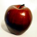
1 appleby boyte1Comment: Greetings from the Critique Club
By Inspzil
Composition - Good choice of subject for stock photography IMO. I think the simple aspect of this photo makes it very suitable. The subject is very centered in this photo and I think it has to be. You might have left a little more room at the top and bottom of the photo though. I don't like the little blue dot on the left side of the apple. It is pretty distracting and I can't think of what would cause it. This background might be a little light. I'll elaborate more in the technical section.
Technical - Most of the problems that I see with this picture have to do with exposure. The bottom half of this apple looks black. It is really underexposed IMO. I think the light needs to be brighter and moved perhaps a little more to the right judging by the highlight. I think with the background being so light, it would be difficult to properly light and expose this photo so as not to wash the background out or leave the apple dark. If the exposure was more the background would most likely was out. This might be a good place to use the grocery bag background trick. I think with that dark a background you could effectively light the subject and not wash the background out. As it stands I feel the apple is underexposed. The focus is good. The crop is a little too tight.
Overall - I like the simplicity of this photo and I think it meets the challenge. The pic needs a little less contrast so that the exposure could be increased without fear of washing the background out. The crop could leave a little more room on top and bottom. Hope this has been helpful to you. Good luck in future challenges Boyte - Bob |
| Photographer found comment helpful. |
| 03/08/2003 07:57:10 AM |
Wrestling With Coffee Addictionby SwashbucklerComment: Greetings Swash from the Critique Club
By Inspzil
Composition - Very unorthodox depiction of despair. I'm not real sure this meets the challenge as it was intended, but we'll say it does for the purposes of discussion. The expression is the first thing I notice and its good for this challenge. I'm a coffee-holic also so I can relate. I'd be wrestling with the EMPTY cup though. The background needs to be smoothed out, or not so brightly lit. The bright light on the bottom left corner really makes the wrinkles in the background stand out. The hand is also very brightly lit. I think the intensity of the lighting on the subject's face is pretty good, but it's generally too bright on the left side of the picture where I'm guessing the lighting source was held.
Technical - I think this photo was pretty well taken actually. Most of the problems I feel are due to the lighting. The exposure of the subject is pretty good though on the face and for this particular challenge a little on the dark side is probably beneficial. Processing stuff doesn't seem to be too much of an issue on this picture.
Overall - A humor photo more than a despair one. I think the lighting is the source of most of the other problems with this picture. The background needs to be smoothed out a little more as well. I'm not particularly fond of this photo for this challenge. I think there are other challenges for which it would be more appropriate. Good luck swash on future challenges. I look forward to your comments. - Bob |
| Photographer found comment helpful. |
Home -
Challenges -
Community -
League -
Photos -
Cameras -
Lenses -
Learn -
Help -
Terms of Use -
Privacy -
Top ^
DPChallenge, and website content and design, Copyright © 2001-2025 Challenging Technologies, LLC.
All digital photo copyrights belong to the photographers and may not be used without permission.
Current Server Time: 08/16/2025 11:02:28 PM EDT.


![Eye of Time - [0]](https://images.dpchallenge.com/images_challenge/0-999/73/120/Copyrighted_Image_Reuse_Prohibited_13773.jpg)