| Image |
Comment |
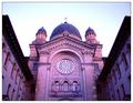
| 04/04/2003 09:40:51 AM |
Mother Houseby mariomelComment: Outstanding color and clarity in this photo. Nice symmetry to boot. Perfectly framed. My only complaint is that the sky is stark white. Looks like it was trying to get blue on the edges, but unfortunately is mostly white. Great photo though - 9 |
 Photographer found comment helpful. Photographer found comment helpful. |
| 04/04/2003 09:34:19 AM |
From Caos: Balanceby EJComment: Interesting lighting effects. The photo has a very grainy appearance to it that really turns me off to it. It looks like it was taken thru a window screen. The star filter effects look almost fake because they aren't 6 or 8 pt. filters. I can't say I've ever seen a 7pt. filter. This is a good idea for a pic but needs some work on the execution of the pic |
| Photographer found comment helpful. |
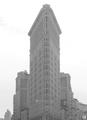
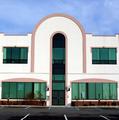
| 04/04/2003 09:30:53 AM |
The Flatiron Buildingby tomzinhoComment: Interesting design of a building. I like the old look to the photo. It looks vintage '50s all the way. Pretty good symmetry too. |
| Photographer found comment helpful. |
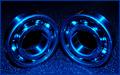
| 04/04/2003 05:44:59 AM |
bearingsby marboComment: I like the blue hues. Nice symmetry and good subject. |
| Photographer found comment helpful. |
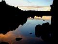
| 04/04/2003 05:42:29 AM |
Harmony & Balanceby fotoflyComment: Great shot. Like the colors and the silhouettes. I'm not seeing the symmetry though. It is however a gorgeous shot so good marks for that. |
| Photographer found comment helpful. |
| 04/04/2003 05:30:07 AM |
Architecture Symmetryby ladpupmoeComment: Not quite clear enough and looks tilted a little clockwise. The building isn't a great subject but symmetrical enough for me. |
| Photographer found comment helpful. |
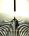
| 04/04/2003 05:26:09 AM |
Metalworks of Symmetryby GeocideComment: With this shallow DOF I'd recommend cropping the part on the bottom that is't in focus. It doesn't add much to the picture IMO |
| Photographer found comment helpful. |
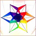
| 04/04/2003 05:13:00 AM |
AT THE KITE EXHIBIT IN THE LOCAL LIBRARYby basia03Comment: I kinda like the high key background. I think it would work better if it were just whit with no lines, but the way you've done it you've minimized the lines and it really brings out the bright colors of the kite. Good job with that |
| Photographer found comment helpful. |
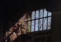
| 04/03/2003 03:05:44 PM |
Doing Timeby ladpupmoeComment: Greetings from the Critique Club
By Inspzil
Composition - Great use of some major aspects of photography. First glance shows me some nice use of negative space and leading lines. THe contrast between the blue sky and the dark room is effective. The white mortar stuff around the window is a little distracting, but its overall effects are pretty mild. The contrast is the great thing. I see you other commenters also noticed.
Technique - Excellent exposure on this one. The framing looks like it would be a little better if the window (and this is my eye seeing this, maybe not everyone's) didn't appear to be tilting toward me at the bottom. It might've been better to square up the window with the picture even if it isn't really like that. It would look better I think. DOF is good and the picture is pretty sharp.
Overall - This is a pretty good pic. It could use a little something in the composition to show either some despair on the inside or something a little happier on the outside. I keep thinking in my head of a hot air balloon out the window or something like that. I think the despair angle would be a better one to pursue. Its a nice image and definitely has its place. Nice photo and good luck in the future - Inspzil |
| Photographer found comment helpful. |
| 04/03/2003 12:33:56 PM |
Time is gone...by victor01Comment: Greetings from the Critique Club
By Inspzil
Composition - The general composition of this photo seems to be more of a political statement for this time in history than a real photographic or artistic statement. It has no real flow to it. But we all understand the significance of the statement in real world terms. In photographic terms though, these 3 things just don't really go together. The photo looks to be taken with flash which has partly washed out part of the map and cast some harsh shadows behind the hourglass. I think the full hourglass should've been shown here. The hourglass is pretty neat though and I bet you could get some cool effects shooting thru it. For this picture, it doesn't really work for me.
Technical - First off is the lighting which I already mentioned. The second is a fairly shallow DOF which makes part of the map under the plane and to the right of the hourglass pretty blurry. The photo is pretty clear, but not totally.
Overall - I can understand why this particular photo was made. In photographic terms, it doesn't do much for me though. The composition of the photo, no matter how well framed or lit, would be difficult to properly portray "on film". Whatever the case, you are correct in saying this was not well executed and even if it were, I don't think the composition lends itself to scoring well. That being said, I will tell you good luck on your future challenges and bid you good day - Inspzil |
| Photographer found comment helpful. |
Home -
Challenges -
Community -
League -
Photos -
Cameras -
Lenses -
Learn -
Help -
Terms of Use -
Privacy -
Top ^
DPChallenge, and website content and design, Copyright © 2001-2025 Challenging Technologies, LLC.
All digital photo copyrights belong to the photographers and may not be used without permission.
Current Server Time: 08/17/2025 02:51:17 AM EDT.