| Image |
Comment |
| 04/09/2003 10:25:38 PM |
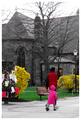
On Locust Walkby JPRComment: Nice candid shot. I like the colors, but I think a better day would've done you well. The sky is very colorless. |
 Photographer found comment helpful. Photographer found comment helpful. |
| 04/09/2003 10:23:26 PM |
The Path of Loveby fas-ligandComment: Should've did this one for candy instead of color. I'm sure you've heard that a million times. Not wild about the idea. Photo is pretty good though. |
| Photographer found comment helpful. |
| 04/09/2003 10:21:05 PM |
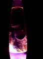
Purple Light Studyby AnnidaComment: I think the majority of this photo is underexposed to the point of being unrecognizable. The angle that this photo was taken at could've been from the bottom up and helped shed a little light on the top of this. Maybe just better timing as far as where the lava was at the time the photo was taken. |
| Photographer found comment helpful. |
| 04/09/2003 10:09:58 PM |
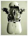
intellimouse exploded insectorby bosniakComment: Greetings from the Critique Club
By Inspzil
Composition - Interesting twist to a mouse. I never realized it could look like a robot, or a bug for that matter. The dead center framing and the color tones of the shot are a bit cold and clinical. This might have been a little better served to be turned corner to corner or something to give it a little twist, so to speak. I think it needs a little more interest factor though. Perhaps a different perspective would enhance that too.
Technical - Well taken photo. Good focus, DOF is not really an issue. The exposure is a little dark and I think it was meant to be that way. I like the way its lit. The lighting could be a little less direct to give the left side a little less to the light and promote a few more shadows there. I see the comment on top about evening out the lighting and I disagree. The symmetry is there, we need a little interest methinks. I don't know if you added a little grain or that happened in processing but I see a little on the shaded side of the mouse. ISO 50 is definitely not the cause. Perhaps its intentional too. I don't think it bothers the image but may help it a little.
Overall - I think you had a great idea disassembling this mouse. It just needs a little something . Maybe a dark background would've brought the contrast more to the forefront. I think that's a lot of the reason I think "cold and clinical" is the white background. Its a technically sound image, just needs a little something to perk the viewers interest. Good job and good luck in future challenges - Inspzil |
| Photographer found comment helpful. |
| 04/09/2003 09:57:43 PM |
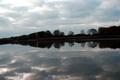
Nature's Mirrorby rogerspaulComment: Greetings from the Critique Club
By Inspzil
Composition - A lot like my image. You left a comment that led me to believe that this was yours during the voting. And I was right in assuming that this was yours. Really the composition is about as good as you could make it. A better day would've been better. The only 2 things I think that separate mine from yours is weather, and that mine was a little more 2 dimensional and straighter across the horizon. Honestly I think the shoreline going back throws things a little out of whack. There isn't much I'd change about the general composition, it looks like you just needed a little better day.
Technical - The horizon problem is a biggie and I think the underexposure is another problem that could have affected your score. The reflection honestly is at least as clear as mine. I posted mine the right way in my portfolio if you care to look. I think that was the trick that put me where I finished. Everyone looks at the reflection first, so I made that the clearest by inverting it. Yours is really the same on both sides, even more than mine. I paid very close attention to my crop, making sure that the top and bottom were exactly the same, even if the horizon was not in the middle. You might've been able to lighten the picture up some in PS, but I think overall the photo is just a little too dark.
Overall - You did pretty much the same thing as I did, just didn't get quite as lucky with the weather thing. This is a pretty good pic for me to critique as I have some experience with these shots. Go to my profile page and there's a web page there with some pics on it. I've done a few other shots that have some good reflections too. Well hopefully the weather works for you next time you get nice calm water like this. Strangely when I shot this it was clear north of this and south of this. There was just this one band of clouds directly overhead. Good luck in your future challenges. - Inspzil |
| Photographer found comment helpful. |
| 04/09/2003 09:45:38 PM |
Red Hot!by FiverComment: Greetings from the Critique Club
By Inspzil
btw thanks for the comments on my recent pictures
Composition - Very nice pattern. I'm not sure if its EXACTLY symmetrical, but its close enough for me. I like the deep red color and the contrasting silver or white or some light color. Anyway I like it. I'm not really fond of the wide aspect ratio you've chosen. I think you might have helped yourself out a little by making it narrower, even if the picture remained a little small. (something else I'm not fond of typically but in this case I think the lesser of 2 evils).
Technical - The DOF seems to be a bit narrow and the center of focus is beyond the closest circles. I personally think that looking at the picture, the first place your attention is drawn to should be in focus if for whatever reason, the whole pic is not perfectly focused. In this case the first place I noticed was the bottom of the pic which in this perspective would be closest to me. I think that is the part where the focus should be the clearest. I think you might've oversharpened this just a little. The circles are showing a little grain to them which is a good indication of that. I normally blow mine up to 70 or 80% before I sharpen them to see the effect. I'm not sure how PSP works though with the sharpen feature. For me, I sharpen everything as the very last thing I do with every picture after resizing.
Overall - A good quality first showing, better than my 4.9 at the onset of my DPC career. Is that Aluminum in those little cups? Just curious. The colors really make this picture. I think you really had a good idea, just needed to be a little clearer out of the camera. Good job on your first and good luck in future challenges. I'll keep looking for your comments. - Inspzil |
| Photographer found comment helpful. |
| 04/09/2003 08:21:12 AM |
Bona-fide Symmetryby IzadoraComment: Greetings from the Critique Club
By Inspzil
Composition - I really like this shot. It meets the challenge very well and has some great detail to it that is well captured. I don't really have a lot to say about it because I really think it was very well done. The one thing I don't like is that its a little bit brighter than "high key"
Technical - Well framed, for the most part well lit. The focus is good and DOF is great. Nice camera work. Processing is good. Black and white works well for this. The only problem with that is that the areas that are washed out are more emphasized in B&W. Otherwise, good job technically
Overall - Really like this. Not much I'd change. The perspective and angle look pretty calculated and executed very well. This is a great subject to photograph and good to see you did very well with it. Nice work and good luck to you in your future challenges - Inspzil |
| Photographer found comment helpful. |
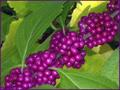
| 04/07/2003 05:41:39 AM |
Very Very Berryby BitzComment: The color is excellent. THe clarity isn't really good on the grapes. I like the contrast with the leaves. |
| Photographer found comment helpful. |
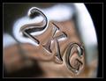
| 04/07/2003 05:36:59 AM |
Just a dumbell by kiwinessComment: Pretty good showing for the 5050 eh? One ribbon in each challenge I have to say is pretty damn good!
** I forgot to add my sincere congratulations! Nice job - Bob Message edited by author 2003-04-07 05:39:11. |
| Photographer found comment helpful. |
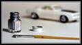
| 04/07/2003 05:07:11 AM |
1146 Silverby bamasterComment: A little more DOF would've been preferred. I really like the picture, but wish at least the brush could've been focused. |
| Photographer found comment helpful. |
Home -
Challenges -
Community -
League -
Photos -
Cameras -
Lenses -
Learn -
Help -
Terms of Use -
Privacy -
Top ^
DPChallenge, and website content and design, Copyright © 2001-2025 Challenging Technologies, LLC.
All digital photo copyrights belong to the photographers and may not be used without permission.
Current Server Time: 12/21/2025 03:52:24 PM EST.