| Image |
Comment |
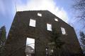
| 04/16/2005 07:31:08 AM |
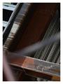
Pre-Abandonedby bil99Comment: You stepped too far out of the box on this one. I can't even tell what I'm looking at. It is technically sound though. |
 Photographer found comment helpful. Photographer found comment helpful. |
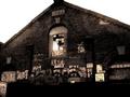
| 04/16/2005 07:29:47 AM |
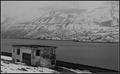
where the ghosts liveby eyjoComment: Very good composition. I think more contrast would have been better. I'm not sure the B&W works for this one. |
| Photographer found comment helpful. |
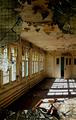
| 04/16/2005 07:28:12 AM |
Abandonedby p3wizComment: Nice color saturation, detail, and good contrast. Compositionally, I think it's lacking something. |
| Photographer found comment helpful. |
| 04/16/2005 07:26:44 AM |
JUST LISTED - Charming Fixer-Upperby 2ShayComment: Nice color saturation and pretty good composition. I don't like the way the structure on the left has been cut in half. I would try this agian but either add more of the left structure, or leave it off. |
| Photographer found comment helpful. |
| 04/16/2005 07:24:46 AM |
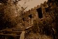
The king no longer abidesby fstopopenComment: It's a little dark. More contrast would have made this much more interesting. I would have also sharpened the focus on the building wall. |
| Photographer found comment helpful. |
| 04/16/2005 07:22:57 AM |
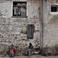
Abandoned Yes, Soulless Noby bairasComment: Very nice photo. This is one photo where the people look okay as part of the picture. You have good color saturation as well. One thing I don't like is your choice of cropping. Just because you can go 640 x 640, doesn't mean you have to. I would have made this a vertical crop; leaving out the window on the right. |
| Photographer found comment helpful. |
| 04/16/2005 07:18:07 AM |
Abandoned In The Face Of Godby space amoebaComment: Nice halo affect, but I think it's just a touch too bright right in the top center. You're getting a little washout right at the top of the building. |
| Photographer found comment helpful. |
| 04/16/2005 07:16:28 AM |
Sunkenby basia03Comment: Technically sound, but lacks in composition and interest. There isn't anything for the viewer to focus their attention on. |
| Photographer found comment helpful. |
| 04/16/2005 07:13:49 AM |
Elect Mizby charmayneComment: The B&W hurt this one. It's way too dark. Next time, if you want to go monochromatic, you don't have to use B&W. I think a different hue would have allowed you to bring out more detail. |
| Photographer found comment helpful. |
| 04/16/2005 07:12:04 AM |
|
| Photographer found comment helpful. |
Home -
Challenges -
Community -
League -
Photos -
Cameras -
Lenses -
Learn -
Help -
Terms of Use -
Privacy -
Top ^
DPChallenge, and website content and design, Copyright © 2001-2025 Challenging Technologies, LLC.
All digital photo copyrights belong to the photographers and may not be used without permission.
Current Server Time: 08/20/2025 10:55:10 AM EDT.