| Image |
Comment |
| 04/16/2005 06:33:56 AM |
|
 Photographer found comment helpful. Photographer found comment helpful. |
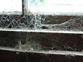
| 04/16/2005 06:32:12 AM |
Old Saw Millby drgsoellComment: Very nice monochromatic photo. I'm glad you didn't use B&W. Technically good, compositionally good as well. You should so well with this one. |
| Photographer found comment helpful. |
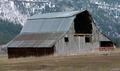
| 04/16/2005 06:30:55 AM |
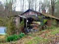
Rustic Barnby JacksonComment: Nice barn photo. It's a little too centered though. You should try to find a viewpoint that leads the viewer's eye to the barn. |
| Photographer found comment helpful. |
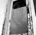
| 04/16/2005 06:29:20 AM |
Long Forgottenby DustDevilComment: Good contrast, but in the end, it's just a door (sorry). There isn't anything appealing about this particular door. |
| Photographer found comment helpful. |
| 04/16/2005 06:27:13 AM |
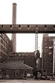
Paneless Futureby grahampComment: I've seen the "hole in the window" work before, but I think this falls a little short. There are too many broken panes. The more that are broke, the more they detract from each other. I do like the color on some of the panes though. It matches the piping on the right. |
| Photographer found comment helpful. |
| 04/16/2005 06:24:12 AM |
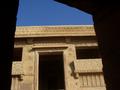
Kundhra - The Abandoned Villageby fredisdeadComment: A doorway through a doorway . . .hmmm. Good color and shape, but I"m struggling with the view. The picture makes me feel like a child on my toes trying to see through the window. It feels like I'm missing something. |
| Photographer found comment helpful. |
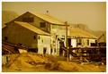
| 04/16/2005 06:21:24 AM |
For Rent?by twm122Comment: Great color. Good composition. It doesn't scream "I'm the winner" but it is a great photo. |
| Photographer found comment helpful. |
| 04/15/2005 11:19:45 PM |
No Longer Neededby jeffzoetComment: For a B&W this is pretty good. Very nice composition with a lot for the eye to look at. |
| Photographer found comment helpful. |
| 04/15/2005 11:16:53 PM |
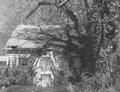
This Old (Spook) Houseby mecomarkComment: Too light. There just isn't enough contrast between light and dark. The building would have been a lot more prominent had you adjusted the black point. I think this is a good photo, but I think it could have been better. |
| Photographer found comment helpful. |
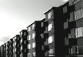
| 04/15/2005 11:14:28 PM |
Icelandic blockby leifurComment: Great pattern photo. The one thing I don't like is the way the diagonal almost cuts the photo in half. The building is also a little too B&W. If the sky wouldn't have had so many shades it might of worked. But with this sky, it makes the building look underexposed. |
| Photographer found comment helpful. |
Home -
Challenges -
Community -
League -
Photos -
Cameras -
Lenses -
Learn -
Help -
Terms of Use -
Privacy -
Top ^
DPChallenge, and website content and design, Copyright © 2001-2025 Challenging Technologies, LLC.
All digital photo copyrights belong to the photographers and may not be used without permission.
Current Server Time: 08/20/2025 04:56:12 PM EDT.