| Image |
Comment |
| 04/14/2005 07:12:33 PM |
|
 Photographer found comment helpful. Photographer found comment helpful. |
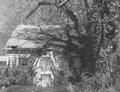
| 04/14/2005 07:11:04 PM |
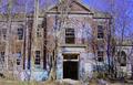
Forest Ambushby SchuffComment: Interesting try with selective colors, but I don't think it does this photo justice. It would also have been helpful to tilt the picture so that the edge of the building was parallel to the edge of the print. Exposure looks a bit soft -- probably from resizing. Might want to experiment with the USM. |
| Photographer found comment helpful. |
| 04/14/2005 07:08:32 PM |
Creepy Buildingby lovenhate54Comment: I think this would have been much better without the errant colors on the face of the building. Looks nice and sharp with good exposure. |
| Photographer found comment helpful. |
| 04/14/2005 03:08:03 PM |
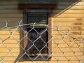
Boarded Window from Old Homeby EvaanComment: I like the texture on the black window cover and the play of the shadows on the area above. The curve in the fence adds a nice line. Nice, simple compositon with good color and excellent DOF. Meets the challenge perfectly. Bumping. |
| Photographer found comment helpful. |
| 04/14/2005 01:39:35 PM |
Brick & Treeby napsterComment: Could have been improved with a much great DOF. Picture is almost hard to look at because of the large, unfocused area. |
| Photographer found comment helpful. |
| 04/14/2005 01:36:52 PM |
|
| Photographer found comment helpful. |
| 04/14/2005 01:35:41 PM |
Mother Grim'sby tristaliskComment: Colors look over saturated and greatly detract from what could have been a good photo. Not very sharp. I think would look somewhat better if the brightness was toned down. |
| Photographer found comment helpful. |
| 04/14/2005 01:32:38 PM |
Dayton (My First Entry)by jdw_picsComment: Really nice portrait with very nice lighting. Would have been better if cropped differently so that the subject wasn't in the center. |
| Photographer found comment helpful. |
| 04/14/2005 01:29:47 PM |
|
| Photographer found comment helpful. |
| 04/14/2005 12:55:09 PM |
Abandoned Old Barnby drake217Comment: I think this could have been better with less processing. At least on my monitor the colors don't look very real. |
| Photographer found comment helpful. |
Home -
Challenges -
Community -
League -
Photos -
Cameras -
Lenses -
Learn -
Help -
Terms of Use -
Privacy -
Top ^
DPChallenge, and website content and design, Copyright © 2001-2025 Challenging Technologies, LLC.
All digital photo copyrights belong to the photographers and may not be used without permission.
Current Server Time: 08/20/2025 10:57:38 PM EDT.