| Image |
Comment |
| 09/16/2005 08:49:24 PM |
Man's Second Best Friendby alanfreedComment: hmm the guy's head isn't blurred enough, it's sort of inbetween blur and in focus. but i'm not sure what parameters you're working with. as for the squirrel, the focus is on the hair around the cheek area, the eye seems to be slightly out of the depth of field |
 Photographer found comment helpful. Photographer found comment helpful. |
| 09/16/2005 08:46:58 PM |
Mona Lisa Smileby fplouffeComment: face is exposed well. however because you chose to shoot your light from below head level there is not a lot of light to cover the hair area. and your model has a great hair style. either use a another light as a hair light or get a reflector to channel some light back down onto the hair |
| Photographer found comment helpful. |
| 09/16/2005 08:44:44 PM |
Daughterby joynimComment: you seem to have gotten flare along the top left. also the model seems to be squinting slightly. have the model close her eyes before the shutter |
| Photographer found comment helpful. |
| 09/16/2005 08:42:11 PM |
RYANby mandyturnerComment: the right side of the background seems a bit over complicated and it detracts the viewers eye from the subject |
| Photographer found comment helpful. |
| 09/16/2005 08:38:18 PM |
Growing Upby AranchaComment: good even lighting, however, i dont think the horizontal format works for this shot. i think vertical would hav ebeen better. |
| Photographer found comment helpful. |
| 09/16/2005 08:37:18 PM |
Commesso di Limoncelloby tateComment: hmm the model seems to have squinted at the shutter. one way to avoid this is to have the model blink several times or close his/her eyes before the shot. and then open them right before you take the picture. |
| Photographer found comment helpful. |
| 09/16/2005 08:35:29 PM |
Selfby LadeeMComment: blue channels seem to be oversaturated. background seem to have an off-white or beige ton to it which somewhat matches the contrast levels of the skin. this tends to mesh the background and the model to the same tone, instead of separating the subject from its background |
| Photographer found comment helpful. |
| 09/16/2005 08:29:07 PM |
Joshuaby peeceeComment: it looks like you used the camera flash, which is good as a fill. but when the sun doesn't do much to contribute to the lighting, the lighting and thus the picture always seems to look a bit flat. with stright on lighting, the picture loses a lot of it's 3d feel. also the picture looks a bit cool. im not sure if this was a white balance issue |
| Photographer found comment helpful. |
| 09/16/2005 08:25:03 PM |
Oliviaby CoolsComment: seems a tad underexposed. also try to achieve the most distance between the background on the model as possible to get a better background blur. the background leaves still seem to be a bit too defined. |
| Photographer found comment helpful. |
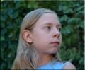
| 09/16/2005 08:23:55 PM |
Girl in loveby birgirComment: although the light source is coming off from the right and slightly above the model's head, it still appears a bit flat. also a tighter cropped might have been better |
| Photographer found comment helpful. |
Home -
Challenges -
Community -
League -
Photos -
Cameras -
Lenses -
Learn -
Help -
Terms of Use -
Privacy -
Top ^
DPChallenge, and website content and design, Copyright © 2001-2025 Challenging Technologies, LLC.
All digital photo copyrights belong to the photographers and may not be used without permission.
Current Server Time: 07/31/2025 07:51:45 AM EDT.