| Image |
Comment |
| 03/17/2005 12:36:57 AM |
Sharing secrets, sharing the cake...by AlbireoComment: this photo is just too unnatural for me. The theme it's trying to convey, and the way the shot was taken seem opposed - the photo does not convey the intimacy and casualness of the scene. This sort of interaction between friends should be natural and spontaneous, yet this picture is clearly contrived and posed. Also, the picture seems too dark, with the black background. |
 Photographer found comment helpful. Photographer found comment helpful. |
| 03/17/2005 12:34:26 AM |
Best Friends Foreverby eostylesComment: To me, this is almost touch and go on a DQ. I won't bother recommending it though, as it is a bit of a stretch; if someone else does, they can.
I've seen many of these pieces before, very cute little sculptures. What pushes your entry away from a DQ is that it is so beautifully composed, it feels lifelike. excellent shot, i'm really impressed with it (and feel that the quality of the composition makes the photo about more than just the sculpture, hence not recommending for DQ).
Wow. longest comment ever. =D |
| Photographer found comment helpful. |
| 03/08/2005 06:19:03 PM |
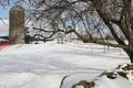
pale fenceby holdingtimeComment: i think this is a perfect example of there being too many distracting elements. the tree is ok, the rocks are cool too, the tree's shadow is beatiful (especially contrasting the precision of the fence and it's shadow), but the construction on the left, the orange fencing - totally unneccessary.
even just croppping this shot to 514 px wide (cut off left) is a good start - although you do lose some of the tree's shadow. |
| Photographer found comment helpful. |
| 03/08/2005 06:15:10 PM |
~by nfesselComment: definitely the funkiest shot i've seen, very nice work. |
| Photographer found comment helpful. |
| 03/08/2005 06:14:28 PM |
|
| Photographer found comment helpful. |
| 03/08/2005 06:12:43 PM |
the white houseby messerschmittComment: i think this would have been a great shot if it wasn't soo... white! the foreground has lost all definition, , and looks a little too stark for my liking.
Message edited by author 2005-03-09 22:53:30. |
| Photographer found comment helpful. |
| 03/08/2005 06:10:24 PM |
Emmaby MelethiaComment: seems a little snapshottish... really could have used a white dropsheet behind. |
| Photographer found comment helpful. |
| 03/08/2005 06:09:50 PM |
Where's the Green?by glad2badadComment: one of the best things about a golf ball is the texture - and we've lost nearly all the ball's dimples! |
| Photographer found comment helpful. |
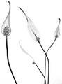
| 03/08/2005 06:08:14 PM |
Calla Lillyby ZippyComment: much better! saw one called 'virginal blossom' or similar - yours has much better definition, nicer texture of the petal. |
| Photographer found comment helpful. |
| 03/08/2005 06:07:11 PM |
Craneby MarkComment: could have been a nice shot, but it's too fuzzy, lacking clarity, with too much contrast with that brighter top left patch, looks like another case of too much post-photo editing (trying to make it REALLY white) |
| Photographer found comment helpful. |
Home -
Challenges -
Community -
League -
Photos -
Cameras -
Lenses -
Learn -
Help -
Terms of Use -
Privacy -
Top ^
DPChallenge, and website content and design, Copyright © 2001-2025 Challenging Technologies, LLC.
All digital photo copyrights belong to the photographers and may not be used without permission.
Current Server Time: 08/04/2025 06:06:09 PM EDT.