| Image |
Comment |
| 10/04/2006 10:54:11 AM |
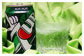
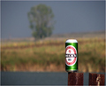
7 Up!by CheerzComment: I like the green background and the negative space would work well for text placement. acouple of blown highlighs detracts a bit from excellent product presentation. |
 Photographer found comment helpful. Photographer found comment helpful. |
| 10/04/2006 10:34:25 AM |
2-4-10by nerdynotdirtyComment: Nice comp and idea. needs a sharper focal point to be really effective. In advertising, the product name/logo or a readily idenifiable characteristic of the product would be an idea focal point. |
| Photographer found comment helpful. |
| 10/04/2006 10:31:51 AM |
real man's choice.by kundimansabuwanComment: Do real men wear bracelets like that? ;) Very nice comp and dof that lends itself well to text placement. I could use this and produce a very nice and effective ad.(minus the jewelry) Nice job |
| Photographer found comment helpful. |
| 10/04/2006 10:22:02 AM |
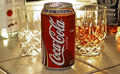
Dr. Coolby guitars54Comment: Nice comp and dof. Lighting is a bit harsh on top of the can. Nice use of negative space and DOF leaves room for text. overall very nice. |
| Photographer found comment helpful. |
| 10/04/2006 10:20:50 AM |
Coca-Cola : A Fine Complimentby dallasduxComment: I really like this idea. The rum and whiskey a bit out of focus in the background is genious. Lighting needs to be rethought and the focus needs to be way sharper. (I like this enough to ask for a reshoot rather than just discard it!) |
| Photographer found comment helpful. |
| 10/04/2006 09:59:43 AM |
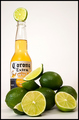
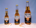
Where Good Limes Go When They Dieby scarbrdComment: Nice tag line and lighting. Comp works well to allow room for text. Nice presentation of product. I'd have used a different color background but thats just my opinion. |
| Photographer found comment helpful. |
| 10/04/2006 09:55:17 AM |
|
| Photographer found comment helpful. |
| 10/04/2006 09:53:09 AM |
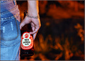
Guinness, The Timeless Classicby cutlassdude70Comment: Great lighting and attention to presentation of product. Logo on glass is in a difficult place to be 100% effective but the negative space provide an area for text. Very nice job. |
| Photographer found comment helpful. |
| 10/04/2006 09:30:34 AM |
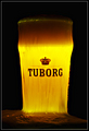
TUBORGby GautiComment: Great back lighting and presentation of product. I like the longer exposure and the effect it gives. An off centered comp would add interest (IMO) and give room for text. |
| Photographer found comment helpful. |
| 10/04/2006 09:28:27 AM |
Breakfast, Lunch, and Dinnerby JackRyanComment: An added lime would've given this ad so much more. nice lighting and presentation of product. Sands a nice touch but I would've gone with a different color background. |
| Photographer found comment helpful. |
Home -
Challenges -
Community -
League -
Photos -
Cameras -
Lenses -
Learn -
Help -
Terms of Use -
Privacy -
Top ^
DPChallenge, and website content and design, Copyright © 2001-2025 Challenging Technologies, LLC.
All digital photo copyrights belong to the photographers and may not be used without permission.
Current Server Time: 08/24/2025 02:19:43 PM EDT.