| Image |
Comment |
| 02/10/2008 04:44:48 PM |
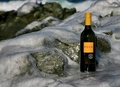
Rock Winesby KarenNfldComment: Nice product display. comp would work for text and the ice gives it a "cold" feel.I would've brought the bottle closer to hightlight it more. |
 Photographer found comment helpful. Photographer found comment helpful. |
| 02/10/2008 04:42:51 PM |
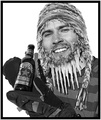
Best Friendsby EssAreDubyaComment: Not bad. Comp is workable and product is clearly displayed. A little more light on the camera would help make more of an impact. |
| Photographer found comment helpful. |
| 02/10/2008 01:27:53 PM |
|
| Photographer found comment helpful. |
| 02/10/2008 01:19:20 PM |
Eye Candy for Photographersby cislanderComment: I can picture this in a Ritz Camera shop poster for a Valentine's day sale. A bit more space on top would let the creative team place text easier. A bit more contrast and selective color saturation boost would give a bit richer color to the candy. One of the better ads in the theme for its potential. |
| Photographer found comment helpful. |
| 02/10/2008 01:15:29 PM |
Sapphire Dreamsby Dr.ConfuserComment: Nice work here. I like the tilt and that the product is prominant.A little more negative space on the left or right would help place text. |
| Photographer found comment helpful. |
| 02/09/2008 09:17:04 PM |
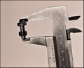
Acme Precision High Quality Fasteners Since 1928by GreetmirComment: I like this and not too many have tried this association type of add. By putting the Micrometer you give the feeling of "Precise". Very nice. Product is well displayed and tones add to the feel of thead. Negative space makes text placement easy. I mat of gone wuth a tighter crop and less tilt but yours is very, very nice. |
| Photographer found comment helpful. |
| 02/09/2008 09:07:36 PM |
|
| Photographer found comment helpful. |
| 02/09/2008 09:04:13 PM |
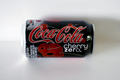
Cherry Zeroby losemeComment: Clean and crisp. I'm sure what the product is and colors are vivid. A less centered comp would make text placement much more smooth. Shadows might be less with fill flash or a light tent. |
| Photographer found comment helpful. |
| 02/09/2008 09:01:42 PM |
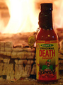
Blazing Heat! Burning Desire! Just Right!by clagallaComment: Nice product placement and display as far as comp goes. Text would fit in well and I like how the DOF helps define the comp. My only pick would be that the light on the product needs to be brighter. Hot sauce should visually slap you in the face. |
| Photographer found comment helpful. |
| 02/09/2008 08:59:25 PM |
|
| Photographer found comment helpful. |
Home -
Challenges -
Community -
League -
Photos -
Cameras -
Lenses -
Learn -
Help -
Terms of Use -
Privacy -
Top ^
DPChallenge, and website content and design, Copyright © 2001-2025 Challenging Technologies, LLC.
All digital photo copyrights belong to the photographers and may not be used without permission.
Current Server Time: 08/24/2025 02:19:21 PM EDT.