| Image |
Comment |
| 02/11/2008 10:22:54 PM |
Home Brewby SyberguyComment: Many would say that it too bitter;) Nice ad. Product placement and presentation are great. Overall look and tones are very appealing. |
 Photographer found comment helpful. Photographer found comment helpful. |
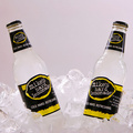
| 02/11/2008 10:21:36 PM |
COLD, HARD, REFRESHINGby ace flymanComment: Great work. Ice gives the ad a "cold" feel to it. Product is well presented and the photo is perfectly sharp. Tones add to the visual fell and the comp is excellent for text placement in the future. I really like the symmetrical aspect of this too. 10 |
| Photographer found comment helpful. |
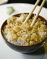
| 02/11/2008 10:19:15 PM |
O'Hana Riceby korileyComment: Nice work. Food is well displayed and presented in an appetizing manner. DOF really controls the viewers attention.Off centered comp makes text placement easy. Very effective ad photo. |
| Photographer found comment helpful. |
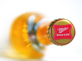
| 02/11/2008 10:16:22 PM |
It's Miller Timeby lear202btComment: Beautiful job. A really nice ad. I'm sure of the product and the its prominantly and interestingly displayed. Comp and DOF allows for easy text placement. Colors are bright and details are sharp. 10 |
| Photographer found comment helpful. |
| 02/11/2008 10:13:52 PM |
Saucy Italian "Preggo"by LeeDComment: Nice ecolor scheme and product is prominantly displayed. Comp would allow for text placement and technicals a right on. I think you could of used a shallower DOF to isolate the product better. Also the title (perhaps it was intentional) to me infers "pregnant". I don't know if this would sell more sauce.. |
| Photographer found comment helpful. |
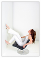
| 02/11/2008 10:06:37 PM |
F978 Chair by Geoffrey Harcourt exclusively for Artifort.by PuckzzzComment: I like the comp and the negative space on this ad. The technicals are perfect. My only issue is that I'm not really sure what the product is. Perhaps a different POV with the chair more prominant could achieve that effect. A really great photo though. |
| Photographer found comment helpful. |
| 02/11/2008 10:05:12 PM |
Yankee Candles.....They'll take you there!by susanhComment: Kudos all around. Product is well presented and the background adds to the effect. Blue skies make me think "fresh". wow! nice work! My only pick would be to ask for a less centered comp to be able to add text without losing the balance. 10 |
| Photographer found comment helpful. |
| 02/11/2008 10:02:53 PM |
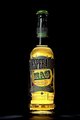
Intense beverageby thierr26Comment: The product translated is "the more desperates". ha ha. Product is well displayed and clear and sharp. Technicals are perfect. A little less centered comp would make text placement easier without killing the balance. |
| Photographer found comment helpful. |
| 02/11/2008 09:58:09 PM |
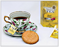
Get Ur Steep Onby HipychikComment: Beatiful work here. A near perfect ad. The cup of tea with the box makes me sure of what the product is and everything is perfectly displayed. A little more space on top for possible text a cleaning up the small crumbs under the cookie are my only small picks. I'm still giving it a 10. Good luck! |
| Photographer found comment helpful. |
| 02/11/2008 09:45:11 PM |
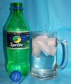
Sprite!by jere2201Comment: Nice product presentation and the comp works for text placement. If you move the product further away from the backdrop, you'll see less of the distracting texture of it. Also shake the soda up a bit or dip a straw in it to ge the bubble effect. I'll make the ad more appealing. |
| Photographer found comment helpful. |
Home -
Challenges -
Community -
League -
Photos -
Cameras -
Lenses -
Learn -
Help -
Terms of Use -
Privacy -
Top ^
DPChallenge, and website content and design, Copyright © 2001-2025 Challenging Technologies, LLC.
All digital photo copyrights belong to the photographers and may not be used without permission.
Current Server Time: 08/24/2025 03:25:43 AM EDT.