| Image |
Comment |
| 03/28/2005 09:54:02 AM |
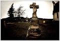
Celtic Crossby SteveJComment: I like the choice of subject. and I like the three crosses in a row. My reaction is that the background makes it more difficult to focus on the subject. Had it been a dull day, the highlights of the foliage would be less distracting. Or, if one used a longer lens, the background would be more out of focus - though the rhythm of the crosses would not work quite so well. I'm not convinced that the green adds much to the photo; typically the eye focuses on interesting texture and line more cooperatively when things are black and white. Just some ideas... |
 Photographer found comment helpful. Photographer found comment helpful. |
| 03/28/2005 09:44:29 AM |
|
| Photographer found comment helpful. |
| 03/28/2005 09:43:43 AM |
|
| Photographer found comment helpful. |
| 03/28/2005 09:43:09 AM |
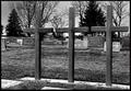
Trinityby pumaComment: The three sturdy metallic crosses work like an iron fence, keeping us out of the cemetary. It's a powerful image. |
| Photographer found comment helpful. |
| 03/28/2005 09:35:40 AM |
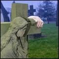
Help is at Handby RosskoComment: I love the idea of the photo, but the pallor of the skin makes the live subject seem more dead than the stone one. The harsh fill light from the flash, IMO, ruins what's left of the subject. |
| Photographer found comment helpful. |
| 03/28/2005 09:31:05 AM |
Deliver Us From Evilby PedroComment: Fisheye view seems wasted here, perhaps because the subject is too near the center of the photo. |
| Photographer found comment helpful. |
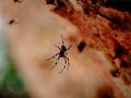
| 03/28/2005 09:24:45 AM |
Charlotte in her web...by ergoComment: Understanding that it is an insect 'cemetary' somehow does not redeem the photo. It would have been better if a few more strands of the web were in crisp focus and if the subject were not so close to the center of the frame. One well photographed spider is infinitely better than two and a half less well photographed ones. The colors seem a little wierd, it might have looked better in B&W. The contrast seems a little low; it looks like there may not be any fully white pixels. |
| Photographer found comment helpful. |
| 03/28/2005 09:13:12 AM |
|
| Photographer found comment helpful. |
| 03/28/2005 09:12:58 AM |
Robert Smithby giegaComment: Sometimes cranking up the saturation works. I love the textures and colors. Nice, simple, strong composition. |
| Photographer found comment helpful. |
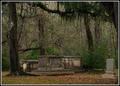
| 03/28/2005 09:11:46 AM |
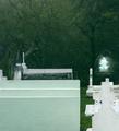
At Old Sheldon Churchby davidbedardComment: As the picture formed on my screen I held my breath, for I love Spanish moss. I'm afraid I was disappointed with what lay below. The monuments seem a little jumbled and indistinct. It looks like they might look good taken individually with their own backgrounds, but it strikes me as a bit of a jumbled composition. |
| Photographer found comment helpful. |
Home -
Challenges -
Community -
League -
Photos -
Cameras -
Lenses -
Learn -
Help -
Terms of Use -
Privacy -
Top ^
DPChallenge, and website content and design, Copyright © 2001-2025 Challenging Technologies, LLC.
All digital photo copyrights belong to the photographers and may not be used without permission.
Current Server Time: 06/08/2025 05:41:54 AM EDT.