| Image |
Comment |
| 03/23/2003 05:57:17 PM |
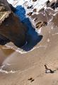
Miles of Momentsby GotchaComment: I like the shot a lot, the perspective, the person and the dog , the movment with them. I am very distracted by the heavy blue cast of the shadow and I think you should reduce it. Very nice picture anyway. 8. Lionel |
 Photographer found comment helpful. Photographer found comment helpful. |
| 03/23/2003 05:55:46 PM |
Pondlifeby e301Comment: Grezat shot and colors. I like a lot the reflections and the fishes over the building. One of my prefered shot this week. I like the symmetry in the 'chaos' ( diagonal line). |
| Photographer found comment helpful. |
| 03/23/2003 05:53:47 PM |
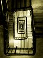
The Corridor by p_johnsComment: Great shot ! I understand the 'corridor' thing but I would have personnaly prefer 'just the stairs'. One of my prefered this week. 8. Lionel |
| Photographer found comment helpful. |
| 03/22/2003 09:32:59 PM |
|
| Photographer found comment helpful. |
| 03/22/2003 09:24:03 PM |
Simpler Timesby crabappl3Comment: I do on tknow why but I like the simplicity of this shot. Simple and qiuet. I like it The only thing I do not like but I guess you could not do different is the green vertical sign cut. Usually if there is a word somewhere it's better to have it fully in the picture. Less important in that case as the sign is vertical. Nice photo. 7. Lionel |
| Photographer found comment helpful. |
| 03/22/2003 09:22:11 PM |
daydreamerby magnetic9999Comment: Classic and very nicely done. I think I would have picked an other color for the bra as it's the only pink in the shot and more a 'side effect'. Good shot otherwise. I like the face expression. Maybe the contrast is too strong (shadow too strong botteom left corner). 7 . Lionel |
| Photographer found comment helpful. |
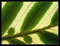
| 03/18/2003 07:27:13 AM |
Greenish leafby kiwinessComment: Vey nice .. I love the contrasts, the light behind, the pattern the shapes. |
| Photographer found comment helpful. |
| 03/18/2003 07:26:27 AM |
Leaf Architectureby jjbeguinComment: Nice shot. I would although have avoided the white area in the upper right corner. It distract a lot from the patter/texture and ver nice contrast between the greens.6. Lionel |
| Photographer found comment helpful. |
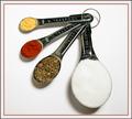
| 03/17/2003 06:39:56 PM |
tbsp. and tsp.'s by shutterflyComment: Very nice ... not that much to say ... just to be picky .. maybe the shadow is a little too close to the border at the bottom ... it touch it.But very nice. 8. Lionel |
| Photographer found comment helpful. |
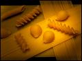
| 03/17/2003 06:38:20 PM |
Pasta Timeby alanfreedComment: I think brighter light and more uniform would have serve better. I like the opposition beetween the lines and the other shapes of pasta. 6. Lionel |
| Photographer found comment helpful. |
Home -
Challenges -
Community -
League -
Photos -
Cameras -
Lenses -
Learn -
Help -
Terms of Use -
Privacy -
Top ^
DPChallenge, and website content and design, Copyright © 2001-2025 Challenging Technologies, LLC.
All digital photo copyrights belong to the photographers and may not be used without permission.
Current Server Time: 08/25/2025 10:58:31 PM EDT.