| Image |
Comment |
| 04/07/2003 11:33:50 PM |
Colorful Pairby kevinswopeComment: Nice concept but .. colors are way too saturated .. whites are blown out and the res are totally saturated .. too much for me. |
 Photographer found comment helpful. Photographer found comment helpful. |
| 03/31/2003 12:18:30 AM |
|
| Photographer found comment helpful. |
| 03/31/2003 12:17:12 AM |
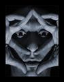
The Maskby marcoComment: Reconnu Jacques ! Très sympa .. bonne utilisation des ombres et des nuances de gris. Bon courage ! 7 |
| Photographer found comment helpful. |
| 03/30/2003 10:01:40 PM |
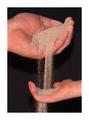
Sands of Timeby one66stangComment: I like the Idea but you should have tried black and white. Coloratios in the skins shows too much. |
| Photographer found comment helpful. |
| 03/30/2003 10:01:02 PM |
|
| Photographer found comment helpful. |
| 03/27/2003 08:02:43 AM |
Parting momentsby p_johnsComment: I like this photo . It looks to me lie some photo that could hav been taken 40 or 50 years ago. For some reason it looks 'french' or 'italian' to me. I think however the 'presence' of the couple has to 'fight' too much with the vertical pole with the sign, with the vercical tree, with the vertical trash. Maybe a little too much there or you would have need a shallower depth of field. And the bright white sign draw the attention. Good luck. 7 . Lionel |
| Photographer found comment helpful. |
| 03/25/2003 12:17:28 PM |
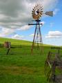
Winds of Timeby bobgaitherComment: Very nice shot. I likea lot the shots when there is a symetry (the horizon line) like this that is not related on a centered horizontal line. VEry nice composition .. it's like we are there. Symbol of another time , an other technology. Great picture. 8. Lionel |
| Photographer found comment helpful. |
| 03/24/2003 07:41:06 AM |
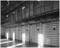
Doin' Timeby falveyComment: Very good idea and nice realization. The grain is appropriate and the light projections give the shot nice contrasts and other ways for the eye to go throught the picture. 7. Lionel |
| Photographer found comment helpful. |
| 03/24/2003 07:33:26 AM |
It's Lateby r_sandlerComment: Very nice concept and realization. I like the silhouette approach. It bothers me a little (but not much) that theback of the neck touch the verticals lines on a tower. But very nice ....8. Lionel |
| Photographer found comment helpful. |
| 03/24/2003 07:29:48 AM |
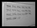
Doin' Timeby lbWhaplesComment: I like the idea but I do not like the realization. I think that for that you should have try a dramatic picture , some high contrast, Black and white maybe but not just numbers on a clean wall. It does not , in my oppinion, give the sense of a jail wall. |
| Photographer found comment helpful. |
Home -
Challenges -
Community -
League -
Photos -
Cameras -
Lenses -
Learn -
Help -
Terms of Use -
Privacy -
Top ^
DPChallenge, and website content and design, Copyright © 2001-2025 Challenging Technologies, LLC.
All digital photo copyrights belong to the photographers and may not be used without permission.
Current Server Time: 08/25/2025 10:51:11 PM EDT.