| Image |
Comment |
| 02/03/2003 02:22:42 AM |
|
 Photographer found comment helpful. Photographer found comment helpful. |
| 01/30/2003 02:11:59 AM |
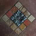
14 Squaresby DennisFComment: Technically, more than 14 squares but I get your point! Nice crisp definition and warm colours. Lovely shot. |
| Photographer found comment helpful. |
| 01/29/2003 11:42:13 AM |
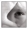
Eyes Sq Onby redfigComment: Nice idea but I would have liked to have seen more of the hand on the right of frame. |
| Photographer found comment helpful. |
| 01/28/2003 01:42:41 AM |
Tag! You're it.by DezComment: I'm really surprised that this one didn't do better. Ironic really that the grafitti that so many people didn't like was the whole point of the photo!! It was a shame that the reflection of the light was there though. |
| Photographer found comment helpful. |
| 01/27/2003 01:52:00 AM |
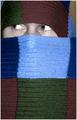
Pikaboo!by ParentxComment: Nice photo. The scarf seems to have a little spot towards the top of the light blue square which is slightly distracting. I like the fact that the persons eyes are not looking at the camera. |
| Photographer found comment helpful. |
| 01/27/2003 01:42:53 AM |
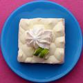
Shapes, Color, and ... Pie?!by indigo997Comment: Composition is excellent but there's something which doesn't seem quite right and I'm not sure what it is! Perhaps it's the shine from glaze of the bowl, perhaps it's the stitching of the pink background fabric. |
| Photographer found comment helpful. |
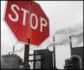
| 01/26/2003 04:42:02 AM |
the Madnessby moondoggieComment: Nice photo. I think it would have been better to include the top of the sign rather than cropping it off but it's still a good shot. I like the lack of colour in the background buildings but I keep being drawn towards the little red light on the building on the left. |
| Photographer found comment helpful. |
| 01/26/2003 04:33:22 AM |
Artificial Heartby ndsComment: I like this one. I'm not sure whether to laugh at it or cry though! The sky seems a little harsh and I'm not sure about the contrast on some of the branches. Excellent shot though and a really good composition. |
| Photographer found comment helpful. |
| 01/26/2003 04:31:53 AM |
Start Spreadin' the News by magnetic9999Comment: There's a nice tone to this shot and I like the viewpoint you chose, looking upward. The composition is excellent and you've made good use of the space available in the frame. |
| Photographer found comment helpful. |
| 01/26/2003 04:25:17 AM |
Tag! You're it.by DezComment: Nice viewpoint. The only thing I don't like about this photo is the reflection of the light on the Give Way sign, it's a shame that the light was on. |
| Photographer found comment helpful. |
Home -
Challenges -
Community -
League -
Photos -
Cameras -
Lenses -
Learn -
Help -
Terms of Use -
Privacy -
Top ^
DPChallenge, and website content and design, Copyright © 2001-2025 Challenging Technologies, LLC.
All digital photo copyrights belong to the photographers and may not be used without permission.
Current Server Time: 08/20/2025 08:44:59 AM EDT.