| Image |
Comment |
| 09/19/2008 09:01:44 AM |
Not Taking Any Chancesby AngadeonComment: While amusing as a concept, this photo doesn't work for me. It's too dark, there is glare on the glad wrap box (and on the glad wrap itself), and the candle doesn't add anything to the image, other than another distraction. |
 Photographer found comment helpful. Photographer found comment helpful. |
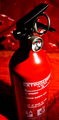
| 09/19/2008 08:57:26 AM |
Fire Safety.by GenrOneComment: Very red. I like the composition of this image... the dominance, the therefore, importance it converys/imbues on the extinguisher is impressive. The image suffers because of the shallow DOF, and perhaps for being a little too red (IMO)... but generally, I quite like this image. Well done. |
| Photographer found comment helpful. |
| 09/19/2008 08:53:19 AM |
Safe Duckingby QuackersComment: Very ducking funny. :)
This is the top scoring condom photo in this challenge, for me anyway. The humour element (use of ducks and clever title) did it for me.
In terms of the photo... it suffers because of the multiple shadows from the multiple light sources, the open wrapper is too dominant/distracting, despite you doing well to place it outside of the DOF... perhaps arranged differenly, it might have worked better (for me... perhaps?). |
| Photographer found comment helpful. |
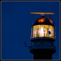
| 09/19/2008 08:47:14 AM |
Bringing Safety to Seaby nessnajComment: Nice shot. I've got this in my top 10 for this challenge. I like the minimalism of it. I like an image that I'd seriously consider using as a desktop, and this falls into that category. I would have like to have seen more detail in the area below the light, though, given the basic rules for this challenge, this would not have been possible without overexposing the light. The border doesn't work for me... think it would have been stronger without it... but that's only my opinion. Well done... I hope this does well. |
| Photographer found comment helpful. |
| 09/19/2008 08:38:00 AM |
Eye Protectionby choltmeierComment: Nice image. It's nice and sharp... I like the angle too. The gloves and the green background don't work for me... I find them both very distracting. The crop might be a little too tight too, though, I'd have to see the original to be sure. Well done. |
| Photographer found comment helpful. |
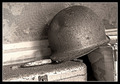
| 09/19/2008 08:34:17 AM |
Investment Insuranceby mcieslakComment: Nice image, though I think many voters might struggle to recognise what it is (many people don't ride bicycles). I like the lighting, and the arrangement of the helmet. The space above it is too large for my liking, and the border doesn't really add to the image significantly enough to risk using it in a DPC challenge (many voters dislike it - though I don't think it warrants any deductions in this instance). |
| Photographer found comment helpful. |
| 09/19/2008 08:28:59 AM |
Pinby glad2badadComment: Pin is nice and sharp. The detail in the purple is a bit distracting. I like the unbalanced nature of the pins position, which is a nice juxtaposition (I've been wanting to use that in a comment for ages) between the theme of "safety" and the risk of an unbalanced, open "safety pin".
From my experience, these minimalist type photos often don't fare will in voting, but I hope this one does well. I like it. Well done. |
| Photographer found comment helpful. |
| 09/19/2008 08:25:04 AM |
In His Armsby JessicaVComment: Beautiful image. Best of the "in arms" entries IMO. Clean and sharp. Perhaps might have been better with more detail in her hair and if more of her face was visable... also the clasped hands look a little odd for some reason. I think this should be a top 10 finisher. |
| Photographer found comment helpful. |
| 09/19/2008 01:06:31 AM |
Life Saverby CuttoothComment: Nice work... and this is my favourite helmet shot in this challenge, though it's a bit cluttered for my liking, in that the detail in background and the boxes takes the interest away from the main subject. |
| Photographer found comment helpful. |
| 09/19/2008 01:03:47 AM |
Safe from Harm by mchalmersComment: Absolutely wonderful photo. Sharp and clean. I love the minimalism of this image... the border is okay. The DOF is a bit too shallow for my liking. Well done... one of my favourites from this challenge. |
| Photographer found comment helpful. |
Home -
Challenges -
Community -
League -
Photos -
Cameras -
Lenses -
Learn -
Help -
Terms of Use -
Privacy -
Top ^
DPChallenge, and website content and design, Copyright © 2001-2025 Challenging Technologies, LLC.
All digital photo copyrights belong to the photographers and may not be used without permission.
Current Server Time: 08/04/2025 09:25:52 PM EDT.