| Image |
Comment |
| 06/01/2006 07:39:53 PM |
In the Showerby postoakinversionComment:
Critique Club
My first impression is that this is very dangerous because what happens if the camera gets wet. Nice image. Color seems a little off because normally we tend to think that shower walls are white. But the case could be different for you. I like the focus and composition. My attention immediately goes to your eyes and that is where you want someone to start IMO. The water also has a nice motion blur to it although a little lost in the shower wall at first. The DOF I think is a little off and your elbow takes away from the photo. I would say either make the DOF so that the elbow was in focus or crop it out. I think cropping it would hurt it more so my opinion is to try again and put everthing in focus. |
 Photographer found comment helpful. Photographer found comment helpful. |
| 06/01/2006 07:25:43 PM |
Balancing Actby ClubJuggleComment: Critique Club
Looks like you predicted a little low. I like the lighting also. I think you done a fabulous job with it. Nice focus on yourself. I can really see all the detail in your hair and that is always a plus. Also the eyes are really nice and crisp. I like the fact that you have a little motion blur on the ball and your hand to show movement. The background was a good choice also. Also the colros are right where they need to be. And by that I mean there aren't any harsh red hues in your skin and the color is right on. |
| Photographer found comment helpful. |
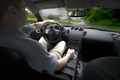
| 06/01/2006 07:19:20 PM |
Zby jwillertonComment: Critique Club
Man I remember viewing this one while the voting phase was still in. I really like it. I think the composition is ok but I think it would improve it a little if you were to crop a little more off of the left of the photo maybe just before you get to your ear. I really like the motion blur and the greenery. The one thing that bothers me toward the windshield is I think a nice clean windshield would be tons better. see that line that is caused by the wipers? I think that hurts the image. Also seems like the focus is more on the headrest of the seat right in front of the camera and I think maybe put the focus on you whihc is hard to do. I am not sure if you looking at the camera in the mirror really helps or hurts the image. I keep flipping back and forth on that part. In some instances it is nice to have a connection with thew viewer and in some not so. At first I was thinking it wasn't a good thing now I am leaning the other way. Either way it is a nice shot that is very hard to take and you did a great job. |
| Photographer found comment helpful. |
| 06/01/2006 07:11:59 PM |
Just Me.by wavelengthComment: Critique Club
Very nice simple photo. The crop/composition is fine although a little tight next to your hand. I think all that is ok. Where you can improve I think is the glasses should never cross the eyes. Maybe get a little lower with the camera. The focus is great and right on. The image does seem a little red maybe taking that down a little would help. The lighting seems good although a little harsh on your forehead. Either way it gives nice depth to the photo. |
| Photographer found comment helpful. |
| 06/01/2006 06:52:28 PM |
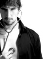
Listenning to myselfby TOYComment: Critique Club
I cheked out your profile and it seems to me I should be learning from you rather than me critiquing you. Either way here is my honest critique.
My first impression is I really like this image. The black and white was a great choice also. The crop selection is great and the focus is spot on. I wonder how it would look without the stethoscope. The only thing that seems to bother me is your necklace. But it is very hard to see. Either way I think you should have cloned it out. The shadows on this are showing great depth and therefore I feel your lighting is perfect. Great job. |
| Photographer found comment helpful. |
| 06/01/2006 06:44:59 PM |
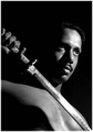
The drawby sangeethComment: *Critique Club*
First impressions, compositions is great. I like the tight crop. Focus is spot on where I think it needs to be. My attention immediately goes to your eyes. Which has a look of determination. I like the DOF which is making your chest blurry. I really like the fade to all black behind you. Job well done. The two things that I say would improve your photo is to try and avoid the hot spots on the sword and on your forehead. Really nice photo though. |
| Photographer found comment helpful. |
| 06/01/2006 06:36:17 PM |
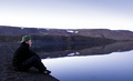
Silence viewby ivargComment: * Critique Club *
Nice clean image. Composition wise it is perfect. The one thing that bothers me is it seems that the focus is directed more toward the landscape rather than the person. The blues are real nice but I think the sky would look better with maybe clouds or a tad more blue to it. But that is something you can't control. I really like the calmness of the water. It really adds to the photo. Message edited by author 2006-06-01 21:02:03. |
| Photographer found comment helpful. |
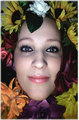
| 05/29/2006 08:49:47 PM |
Floral Hair (Originally by Billy Pegram)by KrisbyComment: This image is great. I reallty love the colorful flowers and the eyes are great. Great shot IMO that could be improved if you just bump the saturation of the colors up a little to make them pop. |
| Photographer found comment helpful. |
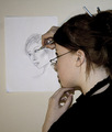
| 05/29/2006 08:48:10 PM |
A Portrait Of A Portraitistby KrisbyComment: I think the big thing that hurt you is there are too many distractions in this image for me. The hair pins for one. The shadow also. It is an ok image with great potential. You have a really creative idea whihc can be greatly improved. My advice to you is to reshoot this with better lighting. |
| Photographer found comment helpful. |
| 05/29/2006 02:24:13 PM |
C for Canonby marvinComment: Greetings from the Critique Club!!!!
Technical The DOF is almost perfect and the focus is spot on. I can really see all the small detail in the lenscap.
Lighting The lighting is great. I can see the word Canon real good. I just wish the whole word was in focus.
Composition Compositon is good. You have compoased it to make it an interesting shot. Very nicely done.
MY opinion is that you have a very good image of a lens cap. I like the detail and the lighting and the nice colors the sorta blueish color is a very nice color to look at. You havbe executed well in my opinion. |
| Photographer found comment helpful. |
Home -
Challenges -
Community -
League -
Photos -
Cameras -
Lenses -
Learn -
Help -
Terms of Use -
Privacy -
Top ^
DPChallenge, and website content and design, Copyright © 2001-2025 Challenging Technologies, LLC.
All digital photo copyrights belong to the photographers and may not be used without permission.
Current Server Time: 08/14/2025 05:51:26 PM EDT.