| Image |
Comment |
| 04/17/2006 03:57:55 PM |
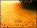
NeoCon Water Quality Initiativeby srbrubakerComment: Wow. This is sad. I had no idea that we still had rivers that look like this in the US. This series is important and persuasive. Good journalistic photography. I hope pictures like this cease to be available to any photographer, but thank you for capturing it to let others know how things are. |
 Photographer found comment helpful. Photographer found comment helpful. |
| 04/17/2006 03:40:17 PM |
Bo Bondby messerschmittComment: What a look! She's got the most beautiful hair and dangerous look... you've made a nice picture here and she gave you a great pose. The processing with the very dark background works well. |
| Photographer found comment helpful. |
| 04/17/2006 03:18:29 PM |
Stoicby CalliopeKelComment: Ah, you are so so so so so very good! Your daughter is beautiful, too. The thing that I like the very most about this (besides those eyes!) is the framing of your composition. It's so cool with the triangular shape of the swimming pool corner, underscored by your daughter's arms and hands. I see that it's time to make you a favorite photographer - can't believe you're not in there yet! LONG past due. |
| Photographer found comment helpful. |
| 04/17/2006 10:03:05 AM |
|
| Photographer found comment helpful. |
| 04/17/2006 10:00:33 AM |
Not the jumping type...by GuGiComment: Nice patterns and as someone commented below, this is a poignant take on the challenge. The red shirt really draws the eye nicely to the woman. |
| Photographer found comment helpful. |
| 04/17/2006 09:43:30 AM |
|
| Photographer found comment helpful. |
| 04/17/2006 09:40:28 AM |
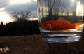
Sunset With Goldfishby posthumousComment: Wow, only three comments on this?! I'll leave you one, then :-)
I'm surprised this scored so low because it's very creative and the technicals, although they could be improved, are not that bad (in my opinion).
What I like: The bright color of the fish contrasts nicely with the dull colors of the landscape. I love how the landscape horizon is kind of skewed, while the fish is perfectly aligned with the horizontal. I like the strong variation in light, and especially the way the light is shining through the fish's tailfin.
What could possibly be improved: As noted below, the focus could be better and the dark area in the background could stand to either be blurred more or lightened up a bit. I'd love to see this with a shallower DOF. I think if the fish's body were dodged a bit, it might be just enough to make the dark background not matter.
Mostly, I think this is a really good shot that got a low score. I didn't vote, but probably would've given you a 6. Message edited by author 2006-04-17 09:41:25. |
| Photographer found comment helpful. |
| 04/17/2006 02:34:47 AM |
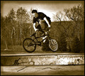
Focusedby NeuferlandComment: Fantastic entry, Deannda! I love the processing here; the subject is ready to jump out of the screen. The background is so interesting with this processing ... looks so old-timey. The graffiti also adds interest. But the best part is the gradient or whatever it is you put around the edges, especially in the sky area. I think that's what makes the biker stand out so well. |
| Photographer found comment helpful. |
| 04/17/2006 02:06:50 AM |
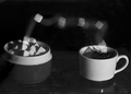
One sugar, pleaseby graphicfunkComment: Ah, you are such an inspiration, Daniel! Tack sharp b&w and clever, clever, clever. Message edited by author 2006-04-17 02:08:42. |
| Photographer found comment helpful. |
| 04/14/2006 04:36:59 AM |
|
| Photographer found comment helpful. |
Home -
Challenges -
Community -
League -
Photos -
Cameras -
Lenses -
Learn -
Help -
Terms of Use -
Privacy -
Top ^
DPChallenge, and website content and design, Copyright © 2001-2025 Challenging Technologies, LLC.
All digital photo copyrights belong to the photographers and may not be used without permission.
Current Server Time: 08/12/2025 07:48:26 AM EDT.