| Image |
Comment |
| 07/02/2005 07:57:54 AM |
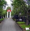
Belltowerby marvinComment: While this meets the leading lines challenge topic, I'd love to see it rotated a little to the left and try to remove some of the purple fringe around the trees. This happens when you have a really grey or white sky... not to easy to fix, unfortunately. I like the red and white colors contrasted with the greens and greys. |
 Photographer found comment helpful. Photographer found comment helpful. |
| 07/02/2005 06:17:48 AM |
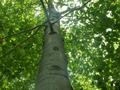
To The Skyby HighwayFlowerComment: This shot fits the challenge well, as my eye is led straight up and into the distance. However, there are some problems for me with it: The light flare on the right near the base of the tree and some more flare up near the tip distract somewhat. I wonder how it would be if you had the same shot but moved out to the left where all the leaves are? What I mean is that the tree would be located towards the right third of the frame and the other 2/3 would be all those nice green leaves. Maybe that would've cut back on some of the flaring. |
| Photographer found comment helpful. |
| 07/02/2005 06:14:08 AM |
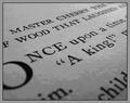
"Once upon a time...."by sfarrell23Comment: Clever composition. The frame suits the image nicely. The only distraction for me is that it looks like the sharpening damaged some of the pixels in the lower third... the transition from light to dark grey looks a tad blotchy. You've done a nice job of fitting the challenge. |
| Photographer found comment helpful. |
| 07/02/2005 06:11:39 AM |
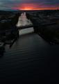
Directionby cabaComment: I love the color here, from stark and desolate greys, with the river leading up to the beautiful orange sunset. The photo might benefit from being cropped just below the bridge, and maybe some levels work to bring out a little more definition around the bridge. I thnk that bridge would make a good bottom frame for this shot. |
| Photographer found comment helpful. |
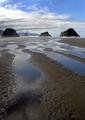
| 07/02/2005 06:07:08 AM |
Crescent Beachby ZoomdakComment: Makes me so homesick. The rocks really stand out nicely, especially the one on the right, and the lines lead my eye right back there. For me, it feels like the image could be a little less bright. |
| Photographer found comment helpful. |
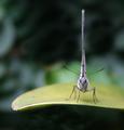
| 07/02/2005 06:03:46 AM |
Straight upby joaquinComment: Sooo cute. Your image really shows me the reason why the "rule of thirds" is there. Thanks for a good lesson and a great shot. |
| Photographer found comment helpful. |
| 07/02/2005 06:02:07 AM |
Mayday ! Mayday !by taterbugComment: Fits the challenge perfectly. Not only that, this is a really cool photo. Nice colors and DOF. I like the frame, too. |
| Photographer found comment helpful. |
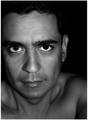
| 07/01/2005 06:17:15 PM |
Self portrait # 050629by rameviComment: I agree with kevrobertson about the tonal range, but there's something about your eyes that seem too white. I'd like to see a shot with you looking down a little, so there isn't so much white underneath. I really like the skin tones and curves under your face (ooh, I think this is starting to sound a little weird...). Also, I have no idea if this would be an improvement or a mistake, but I can't help but wonder if it might be better with your right ear in the frame. The lighting seems very good, and I'm impressed. Good job. |
| Photographer found comment helpful. |
| 07/01/2005 05:02:56 PM |
Survivalby AranchaComment: Fantastic! Color, contrast, clean-ness, ... everything. |
| Photographer found comment helpful. |
| 07/01/2005 04:59:04 PM |
Serenityby sheapodComment: Ooh, I like this! This effect is great here. The reflections are beautiful and I like how clean everything (including the sky) is. |
| Photographer found comment helpful. |
Home -
Challenges -
Community -
League -
Photos -
Cameras -
Lenses -
Learn -
Help -
Terms of Use -
Privacy -
Top ^
DPChallenge, and website content and design, Copyright © 2001-2025 Challenging Technologies, LLC.
All digital photo copyrights belong to the photographers and may not be used without permission.
Current Server Time: 08/10/2025 12:01:08 AM EDT.