|
|
|
Showing 561 - 570 of ~4095 |
| Image |
Comment |
| 01/08/2008 09:59:08 AM | Arpeggioby rinacComment: I really like the way you have created an impression of the scene without resorting to post-processing filters. It's clear what the scene is - an individual under a beautiful umbrella walking through a park/ trees. But there are no details to get in the way of interpreting the image however the viewer wants to. The essence of impressionism!
I do find the white outfit quite bright, but I like that. It, and the lovely block of purple, really draw my eye to the main subject. The semi-circular curves of the motion blur on the tree leaves is very cool. |  Photographer found comment helpful. Photographer found comment helpful. |
| 01/06/2008 10:27:58 AM | by Joey LawrenceComment: Wow! This image just pulls me in. A person could drown in those eyes.
This portrait really has a luminescent quality that I think is centred most strongly in the boy’s eyes and then in his beautiful full lips and two front teeth.
There are so many details to enjoy - his face (on which we can see the remnants of his last meal or drink), his tousled hair, the patterns of his shirt and bangles, his tiny child’s hands, the tiny newborn puppy on his lap...
His expression, aware of the photographer but not reacting massively to you, is so appealing.
The backdrop contributes well to the image; enough detail to provide a context (and some colour), but beautifully blurred by the shallow DOF to create a plainer backdrop behind his upper body and face.
And that DOF really is spot on– the face, hand, puppy (and one fold of the shirt) are beautifully sharp. The rest beautifully soft.
Even the colour palette is perfect here. I love the way that the browns and pinky-white of the puppy are reflected in the boy’s brown skin and his pale shirt. The yellow and orange of his bangles and shorts are supported by the oranges on the floor behind him.
But, in the end, it’s his eyes I’m drawn back to. Such huge eyes, brought alive by that catchlight.
Edit: This is my 5000th comment on DPC (though this edit may re-order it to show as 5001st)! Message edited by author 2008-01-08 10:01:45. | | Photographer found comment helpful. |
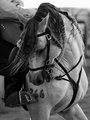
| 01/06/2008 10:18:30 AM | Intensityby lynnesiteComment: Initial thoughts
A nice portrait of a working animal – one that shows some of the animal’s personality.
Composition/ Content
The strongest aspect of this image to me is that the turned head, with hair sweeping out across it, conveys a certain liveliness in the animal that a more standard equine portrait would not. Anthropomorphic though it is to see it that way, the “smile” also contributes to that perception.
As well as that liveliness there is also much detail to look at such as the various bits and pieces of the bridle, the crimped hair, the tatooed number and the patterns on the skin/hide.
Initially I didn’t like the inclusion of the rider but, as I look at the image more, I find that the anonymity of seeing only his leg (with that lovely button detail) actually serve to emphasise the fact that this portrait is all about the animal.
Technical
I like the high contrast black and white. The image feels just a touch dark to me overall but I can see that the tones do range from white through to black. I wonder if a slight curves adjustment might help?
My Opinion On The Photo
Not an image that draws me in to look again and again but a pleasant animal portrait that successfully conveys some personality or liveliness in the animal.
| | Photographer found comment helpful. |
| 01/06/2008 10:08:59 AM | Polar Bearby TlemetryComment: Initial thoughts
Lovely pose, creating a strong composition.
Composition/ Content
As you correctly surmised, I love wildlife and strong images of wildlife are always a pleasure to view. This portrait of a polar bear really shows off the bulk of the bear as well as his beautiful pale fur and his lovely feet. I like the pose you’ve captured here, relaxed, content, at ease.
The background is simple and uncluttered. I think you made the right decision to clone out fencing/ man-made objects that fell within the frame.
As well as the triangle of the bear I find myself drawn to verticals (in his two forelegs) and horizontals (backlegs, water, snow and rock lines).
Technical
You mentioned yourself that the position of the sun meant a blown out area on his side. I think you’ve done a great processing job to minimise that and the light and shadows do not seem too harsh.
The blue toning works well, though I’d be interested in seeing a straight black and white as well as a sepia toned version.
My Opinion On The Photo
Charming portrait of a polar bear.
| | Photographer found comment helpful. |
| 01/06/2008 10:03:00 AM | 7.jpgby chesireComment: Initial thoughts
A sombre portrait, hence a little different to the norm.
Composition/ Content
I like much about the composition – the framing provided by the hat/ background, the tilted angle, the lack of distracting background. The chin feels a little hemmed in by the lower edge of the image though.
Contents-wise, seems like a straightforward portrait though the down-cast eyes mean that I don’t feel any sense of connection with the model. Perhaps that was intentional to convey a certain mood but, from a viewer’s perspective (or at least, a viewer who doesn’t personally know the model) it serves to distance us. There’s no sense of life in the image or any feeling of intimacy.
Technical
Even lighting and good contrast in the black and white conversion.
But feels very soft. This may be intentional but happens not to be a style I’m fond of personally.
My Opinion On The Photo
This is a competent portrait but not ones that shines out for me, partly because it’s not as sharp as I’d like, but mainly because I don’t feel any connection with the model. Message edited by author 2008-01-06 10:36:30. | | Photographer found comment helpful. |
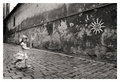
| 01/06/2008 09:11:45 AM | Princess Sunby pawdrixComment: Initial thoughts
I have already viewed this image when browsing your portfolio a few months ago. Now, as then, I’m drawn strongly to the image.
Composition/ Content
As you know, I have a passion for travelling and, as a result, view a lot of travel photography. Although this could equally be considered a standard environmental portrait, I think it fits well into the travel photography genre.
The two main focal points are the pretty girl (that dress is just made to be photographed) and the sun graffiti on the wall. But as well as that I’m drawn to the cobbled lane, the wonderfully weathered texture of the wall, the parallel lines of the lane, wall and roof leading us between the girl and the sun and back again.
This image is a great capture of the kind of split second moment that makes journeys come alive.
And the black and white treatment is a winner – I think colour would intrude here.
Camera Work - Technical
My take on the motion blur in the girl? I wish the girl was in focus. I understand that it may well have been a deliberate decision. And I can totally see how some viewers feel that the motion blur is essential to give life to her running steps butâ€Â¦ personally I think her pose would convey that perfectly well. Were her pose to be just as it is in this image but with a sharper focus I think it would be even stronger. (And this is from someone who does often really like images with lots of blur in the main subject).
| | Photographer found comment helpful. |
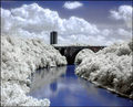
| 01/06/2008 08:51:16 AM | Cool Riverby timfythetooComment: Initial thoughts
Honestly? Not to keen on the strange effects of the processing.
Composition/ Content
Content is interesting – a simple combination of natural landscape scene and two man-made structures.
Compositionally, I like how the river sweeps around to the bridge and is echoed by the curve of the bridge arch itself. There is also a strong diagonal formed by the main line of clouds and then down into trees of the right bank of the river.
Digital Processing - Technical
It’s totally down to personal taste, I know. For me, the processing ruins the image. I don’t like the effect of desaturation on the foliage nor the artificial look of the water surface. The clouds and sky seem to suffer the most from the processing and no longer look natural.
Any negatives?
The processing is the main one for me. Additionally, I’m not sure the content of the image is strong enough to make the image stand out.
Fits The Challenge
The last thing I feel when I look at this is the peace and harmony of zen. Instead I feel discordant and out of sorts, like the natural order of things has been thrown away.
Hope this isn’t too disheartening a comment? I figured an honest reaction was more valuable than a vanity comment!
| | Photographer found comment helpful. |
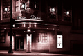
| 01/06/2008 08:41:28 AM | Yesterday's Jazz Todayby CharleneComment: Initial thoughts
An intriguing location that no doubt has an interesting history.
Composition/ Content
This image is reminiscent of the glamour days of Hollywood movies when sensational men and women lived life to the full! Wouldn’t it be interesting to spend an evening here?
Compositionally, I like the corner viewpoint placing the neon sign and the strong vertical pillar on a third. But the horizontal line of that sign/ frontage seems to split the image in half rather strangely.
I find myself drawn more to the details above the sign than below but they are too shrouded in darkness to make out well.
Any negatives?
I usually quite like high contrast images but I the shadows in this image are slightly too extensive and hide much detail that might be of interest.
My Opinion On The Photo
An interesting subject matter and reasonably strong composition and good choice of duotone colour too. Overall though, it’s not one of those images I feel I want to return to again and again as the subject matter is just not interesting enough.
| | Photographer found comment helpful. |
| 01/06/2008 08:32:11 AM | dollby briantammyComment: Initial thoughts
Intimate and relaxed portrait.
Composition/ Content
I find the composition of this portrait especially pleasing. I really like the way you’ve got up close and personal – that tight crop really contributes to the intimacy of the image. I also like the framing provided by the hat and the way the pale background behind continues that. The curve of hair on her face also works well. Additionally, the simple colour palette of pink skin, red lips and top, white hat and background and brown hair, with just a touch of blue creates a certain simplicity that helps bring the focus to her expression. I am definitely drawn to her eyes and smile.
Camera Work - Technical
The image doesn’t feel as sharp is it could, though perhaps that’s a deliberate choice. Personally, I’d prefer a little more sharpness in eyes, nose and mouth areas.
Any negatives?
Other than additional sharpness I’d prefer if the hat didn’t slightly obscure one of her eyes as it means I’m drawn more to the other eye rather than looking at her face evenly. Being fussy, I’d say that the tangle of hair in the lower right area could do with being tidied/ excluded. But I imagine that this was a candid in which case those elements were probably not as easy to control.
My Opinion On The Photo
A charming portrait of a beautiful girl.
| | Photographer found comment helpful. |
| 01/06/2008 08:25:16 AM | Another Rainy Dayby figaroComment: Initial thoughts
An emotional hitter of a situational portrait that kicks off a lot of thoughts.
Composition/ Content
Content-wise, the image isn’t about aesthetics so much as a comment on life. For that reason, the contents of the bedroom, that one might normally want to exclude from a portrait, are essential to the image itself.
The image feels balanced in terms of layout with the man positioned on/close to a vertical third. I like the way that the light from the window falls on the man and therefore focuses attention on him and his expression.
The muted colours of the bedding, walls and furniture contribute to the feeling of boredom/ loneliness that eminate from the man.
Any negatives?
Whilst I appreciate the reason for the vignette-style edges I find them a little too strongly applied for my tastes. That said, I do like the way the floor and further reaches of the room are in shadow.
My Opinion On The Photo
This image makes me feel sad for the man; this is, I’m sure, the intention. It also makes me wonder where he is and whether he is ill, lonely, bored or all three. On a wider level it makes me think about what I want and don’t want for my own life (and the lives of my loved ones). As such, I find the image emotionally striking and thought-provoking.
| | Photographer found comment helpful. |
|
Showing 561 - 570 of ~4095 |
Home -
Challenges -
Community -
League -
Photos -
Cameras -
Lenses -
Learn -
Help -
Terms of Use -
Privacy -
Top ^
DPChallenge, and website content and design, Copyright © 2001-2025 Challenging Technologies, LLC.
All digital photo copyrights belong to the photographers and may not be used without permission.
Current Server Time: 08/15/2025 10:01:55 AM EDT.
|