| Image |
Comment |
| 04/23/2003 01:18:39 PM |
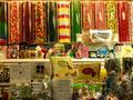
Neighborhood Candy Storeby BAMartinComment: Critique Club
Initial thoughts
Colourful, cluttered, strange lighting
Composition/ Content
I find the vertical sweet barrels at the top of the frame visually appealing – I’m interested in whether a shot comprising only these containers would be cleaner and appeal on a broader, abstract level.
The lower part of the image is very cluttered. I don’t know where to look – there doesn’t seem to be a point of focus. This also makes overall composition quite weak for me. Lighting is also poorer in the lower area where much of the produce seems to be in shadow.
The horizontal line between top and bottom parts of the image is a little too central for my tastes.
Camera Work - Technical
Lighting seems very yellow – I don’t know whether this could have been resolved by playing with white balance settings or by applying post processing to the image.
Digital Processing - Technical
Post processing might reduce the yellow tone of the lighting.
Fits The Challenge
Yep!
My Opinion On The Photo
Too cluttered. I think trying to include too much has weakened the composition and impact of this image. I’d love to see a similar shot focusing on just the vertical containers or featuring a smaller and more artfully arranged selection of items from below.
|
 Photographer found comment helpful. Photographer found comment helpful. |
| 04/23/2003 01:11:41 PM |
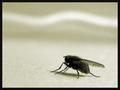
The fly which couldn't fly...by auiComment: I really like this image - very simple, and very minimalist. What makes it for me is the wavy white line across the top and the graininess is also attractive.
When you say that it couldn't fly is that because you put glue down or just because it's resting? |
| Photographer found comment helpful. |
| 04/23/2003 01:07:05 PM |
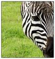
Natures Refereeby TarbiniComment: What a lovely shot! This is a really impressive example of getting a strong shot of a striking animal in what I assume is a zoo environment.
The cropping/ composition together with the contrast between the black and white of the zebra and the green grass are what make this for me.
Border is also well chosen to complement the image. |
| Photographer found comment helpful. |
| 04/23/2003 01:04:06 PM |
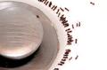
Sink Life at Happy Hourby MalokataComment: Wow!
Is there a ring of glue or sugar or is it just some weird natural boundary that most ants won't cross? It's like they've screeched to a halt and the scout ant is shouting back to them - don't come any further - this place is HOT!
Or mayb'e I've just had too much caffeine today?!
I like the simplicity in both colour and composition. |
| Photographer found comment helpful. |
| 04/21/2003 06:05:17 AM |
|
| Photographer found comment helpful. |
| 04/21/2003 06:04:05 AM |
|
| Photographer found comment helpful. |
| 04/07/2003 05:32:35 PM |
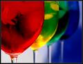
Chromaticityby AleciaComment: Kavey Critique
Initial thoughts
I really like this – I find it very intrigueing.
Composition/ Content
I think the composition here is superb – a very strong abstract – the curves of the glasses, the stems and that triangular area of blue below. They’ve been positioned very accurately in that sense.
I also like the use of DPF to ensure that the nearest glass is most sharply focused.
I love the way that the furthest glass is the same colour as the background – that adds very cleverly to the feeling of depth.
Background
I like that it isn’t all one colour in this image – the variation in tones of white and blue are very appealing.
Camera Work - Technical
Looks great to me.
Fits The Challenge
Very well.
My Opinion On The Photo
I like this image very much and would certainly buy it on a postcard or greetings card.
|
| Photographer found comment helpful. |
| 04/07/2003 05:24:16 PM |
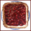
Pie Are Squared (πr²)by ClubJuggleComment: Kavey Critique
Initial thoughts
Cute idea – nice red berries.
Composition/ Content
I really like the square crop and the inclusion of the circular plate behind. It’s a nice abstract shape to have a square and circle intersecting within the larger square of the image.
The light is just a tad harsh – it’s blowing out the edges of the tinfoil and some of the lighter areas of crust.
Also – did you use any kind of polarizing filter? I am wondering whether that would cut down on glare from the pie gelatin surface.
Background
Nice clean white.
Fits The Challenge
I think so – it’s a humourous take but one that does also include that circle.
My Opinion On The Photo
Fun and nicely composed though not an image I’d necessarily look twice at outside of this challenge.
|
| Photographer found comment helpful. |
| 04/07/2003 05:19:25 PM |
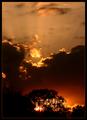
Amber Lightby crabappl3Comment: Kavey Critique
Initial thoughts
A beautiful quality of light. Very serene.
Composition/ Content
I really like the composition – I wondered for a moment whether the clouds should take up two thirds or one third but I decided very quickly that the decision you’ve made on how much clouds/ sky to include is just right.
The shapes of the clouds are very interesting.
I am slightly drawn to the darker grey clouds at the lower edge and wonder if it would have been possible to avoid including these?
They seem to me to detract from the rather heavenly feel of this image.
Background
A nice rich blue.
Border
I like the fine yellow line within a darker border – though the back of the border makes the blue of the sky look less rich. Then again, that’s not necessarily a bad thing.
Fits The Challenge
Yes!
My Opinion On The Photo
I like this image very much.
|
| Photographer found comment helpful. |
| 04/07/2003 05:02:50 PM |
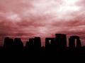
Stonehengeby KonadorComment: Critique from Kavey
Initial thoughts
Very atmospheric. Slightly too pink.
Composition/ Content
I like the inclusion of a lot of sky – and that the actual subject is situated only in the lower third. Although I know how large the stones are, this reminds me of how small they are too when viewed on a different scale. It feels like they are shrinking away from the weather.
I would prefer to have a view that showed me more arches and less blocks – that would make the composition more interesting as well as reflect the challenge more strongly.
One idea would be to take a similar picture of just one arch – with same background and same positioning in lower third, but portrait.
Background
Great feeling of oppression in the clouds. Too pink for me.
Camera Work - Technical
Seems fine. Hard to tell.
Digital Processing - Technical
Seems fine, too pink.
Fits The Challenge
Yes, though not as obviously as it could.
My Opinion On The Photo
I like it but it’s not a favourite.
|
| Photographer found comment helpful. |
Home -
Challenges -
Community -
League -
Photos -
Cameras -
Lenses -
Learn -
Help -
Terms of Use -
Privacy -
Top ^
DPChallenge, and website content and design, Copyright © 2001-2025 Challenging Technologies, LLC.
All digital photo copyrights belong to the photographers and may not be used without permission.
Current Server Time: 08/18/2025 03:56:57 PM EDT.