| Image |
Comment |
| 05/15/2003 12:44:32 PM |
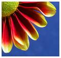
Petals by agwrightComment: This is very striking and I like the composition. The border isn't right for the image in my opinion. I like the slightly mottled appearance of the background blue. |
 Photographer found comment helpful. Photographer found comment helpful. |
| 05/15/2003 12:40:58 PM |
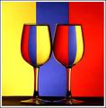
Primary Glass by JackoComment: This is great - a clever and very striking variation on a theme that had started to become a little tired recently... Really beautiful. |
| Photographer found comment helpful. |
| 05/15/2003 12:39:38 PM |
|
| Photographer found comment helpful. |
| 05/15/2003 12:38:46 PM |
primary loomby deceptiveComment: I really like this - simple composition and strong colour. The background has some gradiation of colour but otherwise it's great. This reminds me of one of the artworks based on the London Underground (Tube) - I can't recall the name but I will see if I can find it on the internet.
edit: Tate Gallery - 1986 - David Booth |
| Photographer found comment helpful. |
| 05/15/2003 12:33:29 PM |
|
| Photographer found comment helpful. |
| 05/15/2003 12:30:40 PM |
Unwrappedby friscaComment: Nice simple shot - great saturation in the reds and blues. Lighting doesn't feel quite right - the yellow is bouncing quite a lot of it off which means the yellow seems paler whereas the red ribbon is in the shadow in some areas.
Great composition. |
| Photographer found comment helpful. |
| 05/15/2003 12:27:43 PM |
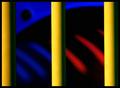
The Zooby FrooberComment: What a wonderful abstract - strong lines in the foreground which really strengthen the composition and wonderful soft curves behind - i like the sweeping black curve and the smaller brighe ones. That black circle is also just right.
Good luck! |
| Photographer found comment helpful. |
| 05/13/2003 06:25:39 AM |
Distortedby MaYzComment: This is a fascinating image and were it sharper would be a 7 or 8 for me. In this case I think the central composition works well - the colours are great and the border is well chosen. |
| Photographer found comment helpful. |
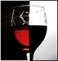
| 05/13/2003 06:22:29 AM |
Curves in Glassby ploogieaComment: I really like the composition in this image. It's incredibly simple yet very elegant. For me the weakness is that the object that I'm assuming is made of glass doesn't really say glass to me - the qualities of the glass itself aren't really explored or evident.
Lighting is a little low for my tastes but I appreciate that's perhaps a deliberate decision to strike a certain mood. |
| Photographer found comment helpful. |
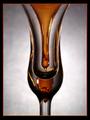
| 05/13/2003 06:20:28 AM |
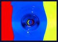
Campariby ThomasComment: I'm in two minds about this - on one hand there is the fact that it's such a close copy of a recent entry in a recent challenge - which means the creativity isn't your own - on the other hand I do appreciate that one great way to learn more to to try and emulate the work that one admires. The jury is still somewhat out for me - on balance I think it's great to imitate in order to learn but not so great to then enter the imitation into a challenge as one's own work.
About the image: I like the colour of the red liquid - it has a nice tone to it. My biggest criticism is the choice of glass - I think this kind of shot works best with a plain glass which really plays on the abstract geometric nature of the shapes created - in this case, the dimples and patterns in the cut glass detract from that geometry. |
| Photographer found comment helpful. |
Home -
Challenges -
Community -
League -
Photos -
Cameras -
Lenses -
Learn -
Help -
Terms of Use -
Privacy -
Top ^
DPChallenge, and website content and design, Copyright © 2001-2025 Challenging Technologies, LLC.
All digital photo copyrights belong to the photographers and may not be used without permission.
Current Server Time: 08/20/2025 12:38:32 PM EDT.