| Image |
Comment |
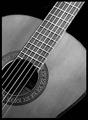
| 03/17/2004 05:19:10 PM |
My Garciaby jpochardComment: Nice study of a simple and beautiful object. I like your choice of what to include in the frame and what not to - creates a really pleasing composition with the circle just touching the egde of the frame, the long sticky bit (I know I know there are established names for these bits) reaching for the top corner and the three edge areas providing less symmetrical curves. Great choice to go black and white too - really allows me to focus on the forms. |
 Photographer found comment helpful. Photographer found comment helpful. |
| 03/17/2004 05:16:49 PM |
Pierby ScottKComment: I like the two sets of parallel line and I really like the way the top one sits against the top of the frame and the other ones lead me to that view. |
| Photographer found comment helpful. |
| 03/17/2004 05:15:33 PM |
Sunset Silhouettesby JC_HomolaComment: A pretty sunset with lots to look at which I prefer to some sunsets which have nothing at all to focus on. But I'd almost say it's a touch too busy, especially at the left, and wonder whether a closer zoom might have removed that area to leave you with just the line of poles right across the foreground. |
| Photographer found comment helpful. |
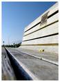
| 03/17/2004 05:14:07 PM |
Benchby faidoiComment: Oooh what a GREAT viewpoint - REALLY unusual and makes a completely unexpected shape from an everyday object. Nice use of shallow DOF too. |
| Photographer found comment helpful. |
| 03/17/2004 05:13:10 PM |
doorwayby jailbirdComment: Nice study! Love those shadows. Could do with some reflected light to reduce the shadow towards the top. |
| Photographer found comment helpful. |
| 03/17/2004 05:12:16 PM |
Curvesby MarieWComment: Those are some interesting lines - I like that the two lines you're presenting us with are parallel but not straight. Also like the inclusion of the door handle to add an extra point of interest though it's a particularly ugly plasticy handle. I nice modern chrome one would have looked great against the skin and wood. Quality of image isn't too good and colour seems overly orange. But I do like the image content and idea. |
| Photographer found comment helpful. |
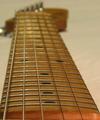
| 03/17/2004 05:10:12 PM |
squier's neckby scalesComment: Nice use of shallow DOF. I find the colour of the background a little disappointing - I think it just doesn't really contrast well with the rich warm wood of the instrument. |
| Photographer found comment helpful. |
| 03/17/2004 05:06:56 PM |
Once in a blueby ivashComment: Nice touch to move everything to a diagonal within the frame and I like the repetition of the open vent flaps. |
| Photographer found comment helpful. |
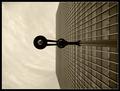
| 03/17/2004 05:05:52 PM |
Vertical Viewby ManicComment: Hello!!!
You might remember me screaming about the birds but I remember you peering up at the lamp posts!
I dolike this, I like that you've turned it on it's side and I like the composition. Black and white works well to emphasise the geometric shapes.
I like the round reflections or lights or whatever they are we can see in the windows - I never noticed those on the day.
And I do like the fact that the sky has that cloud texture in it. Adds interest.
Makes me feel cold just looking at it but only because I remember how bleeding windy it was!
Good luck!
Now give me a comment please! |
| Photographer found comment helpful. |
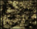
| 03/17/2004 05:02:51 PM |
Japanese Silk Screenby HayaneComment: I like the texture this provides but need some kind of focal point or more of a composition. I also wonder if it would be better taken face on so that the lines remained vertical and horizontal throughout the frame. Nice light and shadow patterns though... |
| Photographer found comment helpful. |
Home -
Challenges -
Community -
League -
Photos -
Cameras -
Lenses -
Learn -
Help -
Terms of Use -
Privacy -
Top ^
DPChallenge, and website content and design, Copyright © 2001-2025 Challenging Technologies, LLC.
All digital photo copyrights belong to the photographers and may not be used without permission.
Current Server Time: 08/28/2025 12:25:06 PM EDT.