|
|
|
Showing 10611 - 10620 of ~11240 |
| Image |
Comment |
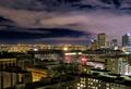
| 01/17/2005 05:25:01 AM | MediaLiMburgby messerschmittComment: In many ways this is the best "pure" architectural photograph in the challenge. That is to say, it looks like it was shot by/for an architect. The light and values are striking, if udnerstaed. Unfortunately, it's far from sharp. Hell of a building, though. |  Photographer found comment helpful. Photographer found comment helpful. |
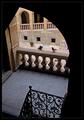
| 01/17/2005 05:23:11 AM | White Palaceby photomayhemComment: Is this you, BradP? I'd know that Mormon temple anywhere, I shot it for the architetcs when i was a San Diegan... I suppose there may be other San Diegans in DPC of course...
This is shot with what we call "raking light", where one facet is fully lit and the light parallels the other facet. It typically works better closer-in, then we want to show details of surface texture. The overall effect ona white building at this distance of remove is a little flat; the picture would be stronger if there were somewhat less light on the semi-shadowed facade. Often the make-it-or-break-it point is only a matter of a couple minutes of shooting time.
The image suffers also from blocking up in the dark areas; a little work with curves or levels could make this much more luminous. I like the pure symmetry of the image. | | Photographer found comment helpful. |
| 01/16/2005 12:57:11 PM | So much love and joy in a family!by tolovemoonComment: *** CRITIQUE CLUB COMMENT ***
There's a lot of love & joy in this image, and as a family keepsake it is priceless. I like the sense of 3 generations at play, and I'm fascinated by how the baby's attention is focused across his grandfather (?) at his mother (?), despite that the grandfather is the one actually doing the interacting. (I suppsoe it's possible that the older folks are the parents, and the woman in green is a neice or somesuch...)
As a challenge photo, however, it has problems.
The lighting is harsh and flat, a characteristic of built-in flashes, which I presume was how you shot it. Notice how the foreground hand is brighter than it should be, and the background has fallen way off in value. It'svery rare for a picture with this sort of lighting to do well in a challenge, although it works very well for family snapshot-type photos.
Even more importantly, the background itself is extremely busy and totally against the intimate mood of the subjects themselves. It's actually a good thing that the light falloff is so extreme, I suppose, because if the backgroudn were actually lit it would be even more distracting.
So, basically, this image has been judged low, I think, on lack of "technical merit", not for weakness of content, and I tend to go along with that. It's a nice shot for the family, way better than most such snapshots, but not really challenge material.
Robt.
| | Photographer found comment helpful. |
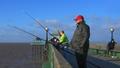
| 01/16/2005 12:46:45 PM | Waitingby ArtanComment: *** CRITIQUE CLUB COMMENT ***
This is a generally appealing image that does not really have any areas I can dive into for constructive criticism except 2 things that occur to me:
1. It seems a little oversaturated to me. The sky's so blue, the hat's so red, the dayglo jacket's so dayglo. The overall effect is so cartoonish that it's hard to take an emotional sense from this. In your comments you mention it was "bloomning cols with a bracing wind." I get no sense of either from the photo.
2. On the nit level, it's unfortunate that the seated figure on the right is sprouting the lamppost from his head. That figure is a key element in the composition; without him it's much more static. I find it intriguing that one of your ammenters says that figure is a liability; IMO, the complete opposite is true.
Speaking of the image specifically from the POV of the challenge it was entered in, I think it may have suffered from not having what I would consider a "true" candid feel. For me, a "true" candid carries some sort of an emotional overtone, and this is lacking in that aspect. There's no tension, no faces to speak of, no emotion at all.
In a more general sense, the composition, while pleasant enough, is entirely static. It's not "bad" composition (It has good diagonals, good intersections, a prominent foreground object, etc) but it's not really "going" anywhere exciting.
Altogether, a competent but unremarkable image, nothing to get excited about but nothing to discard in despair either.
Keep on shooting!
Robt. | | Photographer found comment helpful. |
| 01/16/2005 05:36:22 AM | Susquehanna Fallby spydrComment: Lacks the WOW factor, but the pure symetricality of it and the level of detail please me greatly. | | Photographer found comment helpful. |
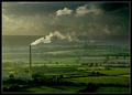
| 01/16/2005 05:35:11 AM | The Cloud Factoryby e301Comment: This is quite breathtaking. I'm a little discomfitted by the greenish cast of the sky, though. | | Photographer found comment helpful. |
| 01/16/2005 05:33:29 AM | | | Photographer found comment helpful. |
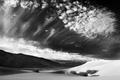
| 01/16/2005 05:32:47 AM | Clearing stormby GordonComment: Terrific figure/ground ambiguity gives an air of mystery to this fine B/W image. | | Photographer found comment helpful. |
| 01/16/2005 05:32:00 AM | | | Photographer found comment helpful. |
| 01/16/2005 05:31:22 AM | Bird Houseby jjbeguinComment: This quiet, serene compostion grows on me. And grows on me... no nits, high score. | | Photographer found comment helpful. |
|
Showing 10611 - 10620 of ~11240 |
Home -
Challenges -
Community -
League -
Photos -
Cameras -
Lenses -
Learn -
Help -
Terms of Use -
Privacy -
Top ^
DPChallenge, and website content and design, Copyright © 2001-2025 Challenging Technologies, LLC.
All digital photo copyrights belong to the photographers and may not be used without permission.
Current Server Time: 09/02/2025 02:23:03 PM EDT.
|