| Image |
Comment |
| 04/28/2005 11:41:03 AM |
|
 Photographer found comment helpful. Photographer found comment helpful. |
| 04/28/2005 11:36:31 AM |
Catch of your lifeby lissylouComment: Nice concept, but closer to the ring would have shown more detail of it. The composition you choose looks like you wanted to take a picture of a baseball glove. Light a bit too strong on top of the glove. |
| Photographer found comment helpful. |
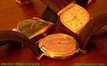
| 04/28/2005 11:34:23 AM |
Hamilton Watch Company circa 1958by bcobleComment: White balance seems off, unless that's what you were after. The watch in the foreground looks very interesting and should have been the main subject. Also, the low angle you choose show little of the closest watch; and there's quite a bit of glare in the glasses. Text in not intrusive, good, but color is distracting. |
| Photographer found comment helpful. |
| 04/28/2005 11:30:32 AM |
Beauty Jewel...by sfarrell23Comment: Text is very intrusive; a bit too big. Diamond should have receive more light to have some sparkle. They look dull. |
| Photographer found comment helpful. |
| 04/28/2005 11:28:58 AM |
The natural stoneby lastefComment: There has to to be a better way of showing a nice stone that on a flat black background. |
| Photographer found comment helpful. |
| 04/28/2005 11:24:44 AM |
|
| Photographer found comment helpful. |
| 04/28/2005 11:04:18 AM |
Because You LOVE herby RayEthierComment: I think the use of shallow DOF (which I really like) is generaly not a good idea for especially jewelry advertisement theme. I think the more detail of the jewelry, the better. It would have been better if the area just behind the ring was in focus. The choice of text font and color is debatable. |
| Photographer found comment helpful. |
| 04/28/2005 10:59:34 AM |
The Gameby mpembertonComment: Jewelry seems like an afterthougth in tis picture. Lighting is uneven from front to back. Rings are very static in the composition. |
| Photographer found comment helpful. |
| 04/28/2005 10:57:36 AM |
|
| Photographer found comment helpful. |
| 04/28/2005 10:56:19 AM |
|
| Photographer found comment helpful. |
Home -
Challenges -
Community -
League -
Photos -
Cameras -
Lenses -
Learn -
Help -
Terms of Use -
Privacy -
Top ^
DPChallenge, and website content and design, Copyright © 2001-2025 Challenging Technologies, LLC.
All digital photo copyrights belong to the photographers and may not be used without permission.
Current Server Time: 08/23/2025 10:40:15 AM EDT.