| Image |
Comment |
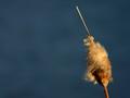
| 04/27/2005 01:33:43 PM |
Just Oneby SammieComment: This has a wonderful feel to it. For this challenge, I'd like to see a little more negative space, perhaps with the top of the cattail just barely reaching beyond the halfway point of the frame. Minimalism aside, though, this would otherwise be a very strong composition. |
 Photographer found comment helpful. Photographer found comment helpful. |
| 04/13/2005 01:03:47 PM |
|
| Photographer found comment helpful. |
| 04/13/2005 12:59:52 PM |
Forest Ambushby SchuffComment: I like the concept, but I think the hue shift was a bit too extreme. It distracts from the overall feel of the image. |
| Photographer found comment helpful. |
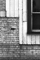
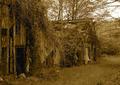
| 04/13/2005 12:58:42 PM |
Timber & Bricksby robsmithComment: You did a great job of capturing the textures, but with such a tight crop you lose the context of those textures. |
| Photographer found comment helpful. |
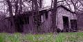
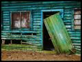
| 04/13/2005 12:56:51 PM |
Greenhousesby joebokComment: I like the subject and composition, but the flat contrast hides the textures instead of accentuating them. |
| Photographer found comment helpful. |
| 04/13/2005 12:53:42 PM |
|
| Photographer found comment helpful. |
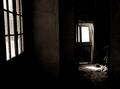
| 04/13/2005 12:52:15 PM |
|
| Photographer found comment helpful. |
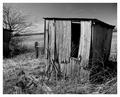
| 04/13/2005 12:51:04 PM |
Leave Me Aloneby glodaComment: I like the mood that you've captured here, but the foreground is a bit too distracting, and the halo effect around the roof looks over-processed. Was that a result of the natural lighting or post-processing? |
| Photographer found comment helpful. |
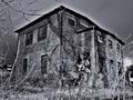
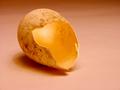
| 04/13/2005 12:49:05 PM |
Birth Homeby charliebakerComment: You're taking the concept of "building" a bit far, but this is beautifully shot and I like the conceptual link to the challenge. I suspect you'll get dinged a lot for "not meeting the challenge" but I applaud your approach. A few nits: a wee bit more depth of field to bring the outside back of the shell in focus (although I like the inside of the shell being out of focus, so this might not be possible), and get rid of the spot in the shadow to the bottom left of the shell. |
| Photographer found comment helpful. |
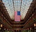
| 02/04/2005 05:00:10 PM |
The Flag in the 'Old Arcade'by bobdaveantComment: Thanks for including the link to this in your comment of my photo. This is beautiful and certainly deserved a much better score. The symmetry is great and I love the pattern of lanterns along the side. The flag is crisp and beautiful. Thanks for sharing it. |
| Photographer found comment helpful. |
Home -
Challenges -
Community -
League -
Photos -
Cameras -
Lenses -
Learn -
Help -
Terms of Use -
Privacy -
Top ^
DPChallenge, and website content and design, Copyright © 2001-2025 Challenging Technologies, LLC.
All digital photo copyrights belong to the photographers and may not be used without permission.
Current Server Time: 08/20/2025 12:36:11 PM EDT.