| Image |
Comment |
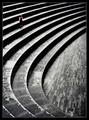
| 04/27/2005 01:58:03 PM |
Repetition with variations for small childby e301Comment: This is wonderful. I wish the girl stood out just a wee bit more, but not sure how you would've accomplished that. I'll be disappointed if this doesn't place in the top ten! |
 Photographer found comment helpful. Photographer found comment helpful. |
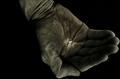
| 04/27/2005 01:56:48 PM |
The Grain Of Riceby SondaComment: This is a great shot for this challenge. The way you've highlighted the rice really helps it stand out, although it does look just a little forced. Perhaps a softer border between the light and dark would have helped with that. Also, the excess dark background on the left side of the hand is a little distracting. A square crop with a centered composition might have improved this a little. Still a fantastic shot, thouth. |
| Photographer found comment helpful. |
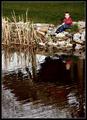
| 04/27/2005 01:52:35 PM |
At the Pondby dwterryComment: Nicely composed. The reeds make it just a little too busy and distract from the boy, but still a wonderful shot. |
| Photographer found comment helpful. |
| 04/27/2005 01:51:36 PM |
|
| Photographer found comment helpful. |
| 04/27/2005 01:50:42 PM |
One Ringby sprite777Comment: Nice, very sharp. There seem to be some jpeg artifacts though in the center top of the image. Also, I'd like it more for this challenge if the ring didn't take up quite as much of the frame. |
| Photographer found comment helpful. |
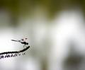
| 04/27/2005 01:49:37 PM |
Out on a Limbby Zap228Comment: Great shot! Perfect for this challenge. Only nit is that the background is a bit too bright (especially on the right hand side) and that distracts from the subject a little too much. |
| Photographer found comment helpful. |
| 04/27/2005 01:48:30 PM |
Miss Noseyby roadrunnerComment: This is a great concept. Fits the challenge perfectly imho. I'd like it a little better if her face weren't quite so much in shadow. |
| Photographer found comment helpful. |
| 04/27/2005 01:46:13 PM |
Countdownby SycoPhantComment: This is probably more of a macro shot than a minimalist shot. That said, I think the shot could be improved with a greater depth of field to ensure that all of the remote is in focus. The lighting is also a bit harsh - I'd like to tell you how to improve that but I honestly don't know much about it. Also, it would be better if the remote was free of dust. I hope this doesn't come across as harsh -- just trying to help :) |
| Photographer found comment helpful. |
| 04/27/2005 01:38:13 PM |
Black Tulipby peeceeComment: Beautiful and sharp. From a minimalist perspective, I think this would have been stronger without the other flowers in the background. Perhaps changing the angle of your shot to isolate the tulip agains the green grass alone might have been a little stronger. Additionally, I wouldn't have put the flower itself so high in the frame since it is the focal point of the image. |
| Photographer found comment helpful. |
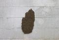
| 04/27/2005 01:36:05 PM |
bee hiveby aplomb76Comment: This could be a very interesting subject. I don't think the centered composition was necessary the best bet for this shot, though. Perhaps getting quite a bit closer so we can see some of the details of the bees, and placing them in say the lower left corner with the majority of the frame being filled with the cinder block wall might have worked better. Of course, then you'd have had to risk getting stung! |
| Photographer found comment helpful. |
Home -
Challenges -
Community -
League -
Photos -
Cameras -
Lenses -
Learn -
Help -
Terms of Use -
Privacy -
Top ^
DPChallenge, and website content and design, Copyright © 2001-2025 Challenging Technologies, LLC.
All digital photo copyrights belong to the photographers and may not be used without permission.
Current Server Time: 08/20/2025 12:35:21 PM EDT.