|
|
|
Showing 3121 - 3130 of ~3801 |
| Image |
Comment |
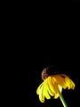
| 09/17/2005 03:24:26 AM | Susanby esdarbyComment: Greetings from the Critique Club.
It's such a stark, mimimalistic image that there's not much material for a critique! Especially as the commentators during voting seem to have covered everything anyway. The composition is interesting and seems to me particularly appropriate for the wilted-looking flower (it's a Black Eyed Susan, I suppose). It may not have been your intention, but the effect created is of a battered but determined flower struggling to fight its way into the frame! I normally have a (perhaps irrational) dislike of flower photographs; they offer the intellectual and emotional challenge of a TV test pattern, as far as I'm concerned. But you have found a way to inject your flower image with personality and pathos, and I applaud you for that. I've seen your portfolio, and I know that you are a masterful flower photographer. But I've also seen your non-flower images, many of which are intensely emotional and artistically adventurous, so I'm not surprised that you've found a way to make a flower appealing even to a philistine like me.
Cheers,
Paul Martin |  Photographer found comment helpful. Photographer found comment helpful. |
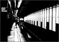
| 09/16/2005 09:27:53 PM | Uptown on the E Trainby HRoxasComment: Bonjour Henry ... and greetings from the Critique Club!
I'm especially pleased to have drawn this image for review, for several reasons.
First because I voted it 10 (see below), so I can now explain my enthusiasm in more detail.
Second because it attracted the attention of several commentators whose work and judgement I particularly admire.
Third because it's such a superb example of street photography that I had expected the photographer would be revealed as one of DPC's particular masters of that genre (e.g. JPR, who felt you "should have placed much higher") ... but your portfolio demonstrates a similar level of skill across just about every type of photography. So I hope readers of this will be encouraged to take a look at all your work and learn.
Now, the image itself:
The composition is effective, if nearly inevitable for the location & subject. Leading lines and the rule of thirds are elegantly acknowledged, but not to the point of cliche ... you have properly relegated them to the rhythm section, while your soloists take the spotlight. And I use the musical metaphor advisedly, because I feel this image and good jazz are bedfellows. Take the wonderful recurring dark/light pattern on the wall ... it's strongly suggestive of a piano keyboard of course, and given that your title recalls Ella Fitzgerald & Duke Ellington's "Take the A Train" (and various other A Train, E Train and J Train titles, as well as Billy Joel's "Uptown Girl"), there's a clever musical allusion that I think provides the dominant figurative theme of this work.
The inclusion of the 50th Street location sign on its vertical band of black is also clever; "50 Street" makes a good subtitle for the photograph, and the black band provides a visual buffer on the quiet side of the image, thus making the opposite, open side of the scene all the more dynamic.
The inclusion of the human figure is an interesting question ... one commentator felt it may be a mistake. I can't agree. This oddly-dressed man, positioned far enough away to not dominate to image, but just close enough to retain some personality, adds to the evocative, uneasy spirit of the scene applauded by another commentator.
And there's a marvellous "image within an image" to enjoy as well ... the tracks, the puddles and train headlights form in themselves a fascinating little cameo.
As for the challenge ... of course your photograph is powerfully High Contrast, and not just because that was the challenge theme, but because it really had to be.
Cheers,
Paul Martin
(edit for typo) Message edited by author 2005-09-16 23:10:26. | | Photographer found comment helpful. |
| 09/15/2005 08:27:55 AM | Lavatara in Darknessby jbsmithanaComment: Hi JB ... and greetings from the Critique Club.
Well, you've already acted on the selection artifact issue, so let's forget that. Except don't be too hard on yourself about it; this is an awfully difficult subject to select cleanly, especially when you're going for a clean black background! Now, the rest. The composition is terrific ... not just the thirds thing, but the careful inclusion of the edge-on bloom at lower left and the two buds above the main bloom. Not only artistically satisfying, but botanically meticulous as well! The actual image of the primary bloom is also very good; immaculately exposed and crisply focused in all the right places. The evening light was well chosen to accentuate the soft, flourescent glow of the petals. And of course from a challenge theme point of view, it could hardly be any more impressive; the colour contrast and the tonal contrast are spectacular.
I can offer no other constructive criticism; the selection stuff aside, it's simply a very fine image.
Cheers,
Paul | | Photographer found comment helpful. |
| 09/15/2005 07:31:25 AM | Vantageby aznymComment: G'day X,
I usually score your stuff very high, but I must admit I gave this a lousy six. More fool me! It's as rivetting as all your work; I just blundered ... must have had a couple of extra whiskies that night and just stumbled by with my senses dulled. So, apologies for an unworthy score and thanks for another of your demanding but rewarding masterpieces! P. | | Photographer found comment helpful. |
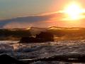
| 09/15/2005 06:27:39 AM | Lightwaveby owenComment: G'day Owen. Greetings from the Critique Club!
Odd co-incidence; my first CC critique and the shot was taken quite close to where I live.
The image is undeniably High Contrast, and yet it's not really that particular quality that first engages the viewer ... it's more the deft composition and the beautiful transluscent nature of the breaking wave top that establishes the initial impression. That slight subordination of the challenge theme is no bad thing, in my view. You have instead used High Contrast with more subtlety than most, as a natural extension of your vision for the subject. In other words you've avoided using High Contrast as a drunk uses a lamp post - for support rather than illumination.
Your composition is ultimately the most impressive and instructive aspect of the image. I applaud the fact that you have resisted placing either the rock or the sun at one of the classic 'thirds' intersections. Your photograph is all the more harmonious for that decision, because your slightly 'weaker' placement of those two elements means that attention is not unduly deflected away from the wave top. For the same reason, the placement of that wave top at the vertical half-way point is apposite - we therefore don't see the usual stretch of wet sand at the bottom or big sky with seagull at the top ... you knew exactly what your subject was, and you confidently eliminated everything that wasn't it! This is a fine image; beautiful and, if the viewer will take a few moments, also highly instructive. Among other things, it is a very powerful example of when it can be appropriate to bend the conventional compositional rules.
Cheers,
Paul Martin | | Photographer found comment helpful. |
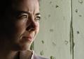
| 09/15/2005 01:06:35 AM | Perplexedby wsteynComment: Nicely captured expression. She looks concerned and uncertain about something. You've established an emotional connection between the viewer and your subject ... essence of a good portrait, in my view. 7. | | Photographer found comment helpful. |
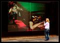
| 09/15/2005 01:02:27 AM | Comparisonby e301Comment: Probably no strictly a portrait, but who cares about strict? It's interesting & provokes thought rather than barfing. 7 | | Photographer found comment helpful. |
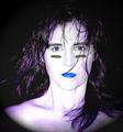
| 09/15/2005 01:00:04 AM | Anarchyby Sherri1209Comment: So much more interesting than the Barbie & Ken portraits. 7 | | Photographer found comment helpful. |
| 09/14/2005 11:42:18 PM | | | Photographer found comment helpful. |
| 09/14/2005 11:39:28 PM | | | Photographer found comment helpful. |
|
Showing 3121 - 3130 of ~3801 |
Home -
Challenges -
Community -
League -
Photos -
Cameras -
Lenses -
Learn -
Help -
Terms of Use -
Privacy -
Top ^
DPChallenge, and website content and design, Copyright © 2001-2025 Challenging Technologies, LLC.
All digital photo copyrights belong to the photographers and may not be used without permission.
Current Server Time: 08/15/2025 02:44:00 AM EDT.
|