| Image |
Comment |
| 06/23/2005 10:00:46 PM |
|
 Photographer found comment helpful. Photographer found comment helpful. |
| 06/22/2005 11:08:55 PM |
Captured In Timeby popdeepopComment: Good try at this location. I have tried several times and been frustrated by the back drops.
I like the way you picked out this one horse and rider. Maybe a more narrow depth of field would help the statue stand out. Just narrow enough to slightly blur the wall and the trees. |
| Photographer found comment helpful. |
| 04/27/2005 07:35:30 AM |
House of the Rising Sunby sherComment: I really like your eye. I like this whole package. By that I mean the title fits the image, the image fits the challenge without feeling contrived and I don't see anything I would change. Well, maybe the last course of bricks at the bottom seems to be in shadow, but then that just adds interest. I don't rate many 10's when I first see a photo but this is a 10. |
| Photographer found comment helpful. |
| 04/23/2005 08:54:17 AM |
hands onby dj2118283288Comment: I really like the warm tones. I think the next thing I might do is to try to get the lighting to be more even. Paper is maybe just a bit over exposed and the others are edging into under exposure near the edges. A second or third light source might help that. The yellowish reflection just over the rock is distracting. I gave it a 6. |
| Photographer found comment helpful. |
| 04/23/2005 08:37:56 AM |
The Beauty of Handmade Paperby docpjvComment: I like the colors and the detail in the edges of the paper. I might have tried croping so that the edges and top of the stack are not visible so that the frame is filled with the "stripes". |
| Photographer found comment helpful. |
| 04/15/2005 05:34:15 PM |
Lost Within Withoutby ericsuthComment: What a picture. I am trying to think of constructive criticisms and all that comes i s praise.
Are you familliar with the poem "A Warning To The Reader" by Robery Bly? Appropo just doesn't begin to cover it. |
| Photographer found comment helpful. |
| 04/15/2005 05:28:46 PM |
The Lost Grandeurby kghoshalComment: I know it is just a matter of taste, but I just don't much like the processing here.
Good choice of subject and I like how you have framed it. |
| Photographer found comment helpful. |
| 04/15/2005 05:26:26 PM |
The Apple Tree House circa mid 1700by graphicfunkComment: Aren't the power lines annoying? Of course, without them I couldn't be sitting here using my electriclly powered computer.
And in this case they seem to add to the feeling of this beauty being passed by. If you could have backed off just enough to get more of the front grounds without loosing the chimney might havel helped but I like it a lot just like it is. |
| Photographer found comment helpful. |
| 04/15/2005 05:12:01 PM |
Abandoned Yes, Soulless Noby bairasComment: I love the texture of the wall. Some of the entries in this challenge have left me sad in a way but, like the title says, still has life even if the building has fallen into disuse.
Best I've seen so far, including mine. :)
|
| Photographer found comment helpful. |
| 04/07/2005 11:08:02 PM |
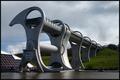
FalkirkWheel1_small.jpgby TallblokeComment: Wow! What a neat shot of a neat machine. I have never seen anything like this. Thanks for putting up the series or I would never have been able to sort of guess what is going on. So this is kind of like a lock, right? I find it hard to do things of this scale. Nice job. Now I have to go see what I can find out about this Falkirk Wheel. I'll probably be up all night now. ;) |
| Photographer found comment helpful. |
Home -
Challenges -
Community -
League -
Photos -
Cameras -
Lenses -
Learn -
Help -
Terms of Use -
Privacy -
Top ^
DPChallenge, and website content and design, Copyright © 2001-2025 Challenging Technologies, LLC.
All digital photo copyrights belong to the photographers and may not be used without permission.
Current Server Time: 08/18/2025 06:18:34 AM EDT.