| Image |
Comment |
| 11/17/2004 05:18:15 PM |
Black and Whiteby stragsComment: This is cool. Black and White taken literally and with good composition, lighting and balance. I feel the spoon is a distraction however. 9. Good luck! |
 Photographer found comment helpful. Photographer found comment helpful. |
| 11/17/2004 05:16:12 PM |
|
| Photographer found comment helpful. |
| 11/17/2004 05:09:20 PM |
calmness and curlsby claudia26Comment: A little too much brightness/contrast? Skin tones seem just a little lost on this monitor. nice composition and pose though. 6. |
| Photographer found comment helpful. |
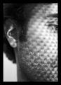
| 11/17/2004 05:04:07 PM |
Dark Portraitby ColeyComment: Hmmm. Dark or not, I really think focus on the eyes rather than chin would have made this better, especially if it slightly softened the chin detail. Cropping is good. 6. |
| Photographer found comment helpful. |
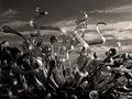
| 11/17/2004 05:01:47 PM |
Glass Fountainby theflyComment: Didn't know tickets to Venus were available already! Where do I get one? :P I love this. First 10 so far this challenge. :) Good luck! |
| Photographer found comment helpful. |
| 11/17/2004 04:59:37 PM |
|
| Photographer found comment helpful. |
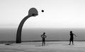
| 11/17/2004 04:21:26 PM |
the danceby mrsamsaComment: Had the focus been on the foreground most bird, this woul dhave been excellent. Luck was not on your side this day. |
| Photographer found comment helpful. |
| 11/17/2004 04:06:04 PM |
Rasterized sideby aleksiComment: Love the composition and textured. It's a shame basic editing did not permit cloning out those distracting speckles. Contrast perhaps just a tiny bit high. (My LCD monitor, though well calibrated, is unforgiving of such things.) All that said, I like it a lot. 8. |
| Photographer found comment helpful. |
| 11/17/2004 03:57:58 PM |
Dangerous curve aheadby lucascarrComment: This image fascinates me. A first sight I'd say "too much contrast or insufficient light balance." But the softness of the shadow lines and the way it accentuates the back curvature is jsut awesome use of lighting and/or post editing.
That conflict and feelings of needing to look further than first glance make this a delighfully interactive work for me. 8. |
| Photographer found comment helpful. |
| 11/17/2004 03:54:33 PM |
Oldie Goldies - Got any of these?by dmlemanComment: There's a clutter here to me, it's crying out for some negative space or something. Nice display of shades, but shadows showing perpective seem awkwardly missing. I'm not sure how you would tend to those issues while maintaining readibilty on the titles.
Lighting and contrast pretty good. A little bright to the left perhaps. 6. |
| Photographer found comment helpful. |
Home -
Challenges -
Community -
League -
Photos -
Cameras -
Lenses -
Learn -
Help -
Terms of Use -
Privacy -
Top ^
DPChallenge, and website content and design, Copyright © 2001-2025 Challenging Technologies, LLC.
All digital photo copyrights belong to the photographers and may not be used without permission.
Current Server Time: 08/22/2025 04:13:55 AM EDT.