| Image |
Comment |
| 11/13/2007 12:43:01 AM |
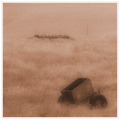
Remembering the fallen - duotone in red and blueby SoulMan1978Comment: i am not sure of the definition of duotone to be judging that aspect of the image. My understanding is one color with black or white. here i see the red and the pail violet. so i don't know. besides that the image seems to lack contrast/detail. |
 Photographer found comment helpful. Photographer found comment helpful. |
| 11/13/2007 12:37:31 AM |
Cliff Dwellingby Les_FeckComment: on the positive side, i like the shapes and crop, the lighting (shadowing) is good too. The color is also fine. On the other side, i think the pattern has no focal point. also seems slightly overexposed or lightened, the whites seem strong and lack detail. 5 |
| Photographer found comment helpful. |
| 11/13/2007 12:31:44 AM |
Left Behindby EstimatedEyesComment: I think you have some nice subjects here but I think it needs more detail. I think the graininess takes away here. 5 |
| Photographer found comment helpful. |
| 11/13/2007 12:28:38 AM |
Satin Beautyby RosacalacaComment: the image is crisp but the light is so flat it's hard to see. also is cropped to evenly or centeredly(?) 5 |
| Photographer found comment helpful. |
| 11/13/2007 12:26:07 AM |
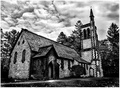
Before the Stormby brimacComment: i like the effect of the wide angle lens on buildings. I think if you were back a little more and showed more sky it would look really cool. the sky is very dramatic it would be nice to see more. 5 |
| Photographer found comment helpful. |
| 11/12/2007 09:03:36 PM |
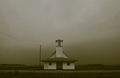
Wherever two or more of you are gathered...by bmartuchComment: I like this image and the unusual composition, I love the structure too, only thing i don't like is the color. I was going to say that the powerline is distracting, but that is just a kneejerk reaction to powerlines in general. Actually I think they're a common part of scenery and it works well here. nice job. 8
bump 9 |
| Photographer found comment helpful. |
| 11/12/2007 08:03:48 PM |
|
| Photographer found comment helpful. |
| 11/12/2007 07:47:29 PM |
|
| Photographer found comment helpful. |
| 11/12/2007 07:01:57 PM |
|
| Photographer found comment helpful. |
| 11/04/2007 02:43:04 AM |
Day 4by ordinaryangelComment: this is very nice. could you explain to me how you did this? |
| Photographer found comment helpful. |
Home -
Challenges -
Community -
League -
Photos -
Cameras -
Lenses -
Learn -
Help -
Terms of Use -
Privacy -
Top ^
DPChallenge, and website content and design, Copyright © 2001-2025 Challenging Technologies, LLC.
All digital photo copyrights belong to the photographers and may not be used without permission.
Current Server Time: 08/22/2025 05:37:39 AM EDT.