| Image |
Comment |
| 10/07/2007 03:06:09 PM |
Paperby Dirt_DiverComment: Interesting color. Interesting design. Not much else though. |
 Photographer found comment helpful. Photographer found comment helpful. |
| 10/07/2007 03:05:11 PM |
Sweet Septemberby BradComment: Pretty girl. Good focus. Horizontal crop works OK. Balance of lights and darks good. Color good. Great skin. I don't know but the bright background spot behind her head is somewhat distracting. It's a little bit too intense. I think if it could be brought down by about half that the focus would stay longer on the girl's face. Yes, I think that this picture could be inproved considerably if that bright spot were darkened. |
| Photographer found comment helpful. |
| 10/07/2007 03:00:34 PM |
Green Lynx on the Prowlby sparrowsdeathComment: Great closeup! Wonderful detail. Nice background blur. Maybe a little dodging of the spider legs would help, maybe not. Nice Crop. Good composition. |
| Photographer found comment helpful. |
| 10/07/2007 02:58:12 PM |
Danceby joynimComment: Sweet. Doesn't show a lot of "dance" though Maybe a closer crop getting rid of the armpits would help. Maybe framing it as a head shot would be better. |
| Photographer found comment helpful. |
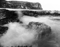
| 10/07/2007 02:54:54 PM |
|
| Photographer found comment helpful. |
| 10/07/2007 02:53:34 PM |
Abandonedby zifengwComment: Not enough detail in the darks. I might tweak the contrast a little. Good composition. |
| Photographer found comment helpful. |
| 10/07/2007 02:52:14 PM |
Waiting...by zaflaboutComment: Nice soft look. I like the white drape. The exposure was just right for the white drape. I don't know, maybe the face could come up just a little bit. I think that I would try to retouch some of the blemishes on the face and arms. I like the composition and balance. It keeps me within the frame of the picture. Title good! The more I look at this the more I like it. If this was sharpened, it was just right. |
| Photographer found comment helpful. |
| 10/07/2007 02:46:19 PM |
Autumn sneaking upby jodis_evaComment: OK. I like these even though they are a bit over saturated and oversharpened. Maybe not! Maybe it would have been better with the green leaves cropped off of the right side. The black hole on the right side is begging to be filled with something. Yes, I think that it could be helped by cropping right about at the middle of the black hole on the right--- maybe even a little bit more, perhaps up to the red leaves |
| Photographer found comment helpful. |
| 10/07/2007 02:41:22 PM |
Icon x2by wingyisleedsComment: Interesting. I don't know but the darks seem a little too dark. Not enough detail in the darks. Perhaps it is cropped to close. Overall the photograph doesn't work for me. It depends on the use for this photo. In an ad for (something) I guess it might work. I can see it with copy text on the upper right and middle right side. |
| Photographer found comment helpful. |
| 10/07/2007 02:36:39 PM |
Dudleysby TimComment: Well, I don't know. Not much here. |
| Photographer found comment helpful. |
Home -
Challenges -
Community -
League -
Photos -
Cameras -
Lenses -
Learn -
Help -
Terms of Use -
Privacy -
Top ^
DPChallenge, and website content and design, Copyright © 2001-2025 Challenging Technologies, LLC.
All digital photo copyrights belong to the photographers and may not be used without permission.
Current Server Time: 08/04/2025 04:32:31 PM EDT.