| Image |
Comment |
| 09/28/2005 11:52:42 AM |
100_2169 copy geno.jpgby taterbugComment: What beautiful lighting. I'm not sure if this is taken with a diffraction filter, soft focus or just a little motion blur. The effect is largely the same. You have evoked a feeling of a minstrel strumming a gentle lullaby in a dark bedroom, perhaps that of a young child, lit by a night light or something.
I wonder if this effect might even be heightened by a slight drop in brightness to really give it a gentle feel. The light on the hand is just a bit strong.
Thanks for posting this pic. It's a great style that I hope one day I might find a situation to imitate. |
 Photographer found comment helpful. Photographer found comment helpful. |
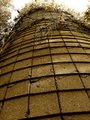
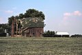
| 09/28/2005 11:46:29 AM |
Siloby taterbugComment: Hey, Neat capture! What an interesting subject. I like your treatment of the tones. I wonder if you could get in there with a burning tool to try to take care of some of the overexposed areas near the top and on the branches.
Maybe a little bit of a grunge treatment could bring out a feeling of disuse and lack of maintenance and TLC.
It's pretty neat as is, just trying to give some ideas. |
| Photographer found comment helpful. |
| 09/27/2005 11:59:02 PM |
Euphoriaby taterbugComment: Powerful counterstatement. Looks like a junkie tripping on a staircase. This is of course the end result. I have seen it very close to me. The illusion of happiness that is clung to until death.
I like the washed out feeling and the leaves in the corners of the stairs. Very thematic. Very powerful to the right audience. |
| Photographer found comment helpful. |
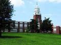
| 09/27/2005 11:24:12 PM |
pulliam-hallby tsheetsComment: Nice picture. Beautiful colours and a statuesque building. The sky seems a bit washed out in comparison with the rest of the picture?
I really like the shadows from the trees.
The little extra bit on the building on the right seems a little strange. Could the pic be cropped in a few mm and slice to the edge of the larger building right at the end?
Really well done on the A80, one of my favorite P&S cams. |
| Photographer found comment helpful. |
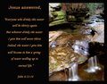
| 09/27/2005 11:00:48 PM |
John 4: 13-14by jpochardComment: Hey, this is a really great card/inspirational postcard/poster. The picture on the right is gorgeous with excellent colours and well, excellent everything really.
The only suggestion I might have is that there is a bit of a hot spot in the top left hand corner on the rock that is a bit distracting from the water. Even some of the other rocks on the edges are a tad bright. You have done such a great job highlighting those water fall spots, it is a shame to have the distractions to the rocks. Burn? Message edited by author 2005-09-27 23:37:01. |
| Photographer found comment helpful. |
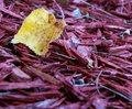
| 09/27/2005 10:54:48 PM |
leafby taterbugComment: What an interesting picture. I don't know if these are true colours or not. Regardless, I love the mixture of yellows, purples and blues in the berries.
Compositionally it is very nice. I am a little disappointed with the brown speckles, but it's not that bad.
Thank you for posting this pic. Message edited by author 2005-09-27 22:55:37. |
| Photographer found comment helpful. |
| 09/27/2005 10:43:01 PM |
Decrepit Barnby tsheetsComment: Nice barn. You've got a great subject, and have provided a really nice view and treatment of it. I think your post processing choices are excellent. The barn has a great feel.
I find the white building on the right a bit distracting however.
Looking at the barn itself, the left side being dark and the right side being light, I wonder if it might have been possible to crop in a lot closer, leaving the dark part on the left side of the picture and ending up with the right side on the right side of the picture.
I know that the distance is an important element of this shot, so I wonder if you artificially made the change to a portrait layout with the crop tool you could make this change and preserve the original flavour and intent.
Great pic, congrats on moving to the 350xt. |
| Photographer found comment helpful. |
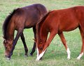
| 09/27/2005 10:33:48 PM |
Synchronized Grazingby taterbugComment: This is a really great picture. I love the focus on the faces and the detail brought out there.
The crop here is superb in the left and right, matching exactly the hind legs of the two horses.
Great theme, well executed.
My only complaints would be in the grass colour and DOF. Did you try this picture with high and low sat in the greens?
I'm sure you know that though. |
| Photographer found comment helpful. |
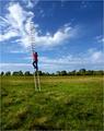
| 09/26/2005 01:27:22 PM |
Up by Joey LawrenceComment: Hey, just think. I was going to post on your MIB shot that I was really missing seeing ribbons with your name on them lately. Now I just feel dumb. :)
And look dumb. And sound dumb, but that's another issue altogether. ;)
Keep it up guy!
PS. I actually did this before. I was a window washer in Canada and sometimes there are places and things you just can't get at due to landscaping and houses on weird terrain. I was lighter than my buddy, so I climbed up the ladder and he held it steady a few inches from a window. It was only really scary going up and down. I went right to the top, about twenty five feet up, about the same height as your ladder.
Us crazy Canucks eh? Message edited by author 2005-09-26 13:32:28. |
| Photographer found comment helpful. |
| 09/25/2005 08:37:39 AM |
|
| Photographer found comment helpful. |
Home -
Challenges -
Community -
League -
Photos -
Cameras -
Lenses -
Learn -
Help -
Terms of Use -
Privacy -
Top ^
DPChallenge, and website content and design, Copyright © 2001-2025 Challenging Technologies, LLC.
All digital photo copyrights belong to the photographers and may not be used without permission.
Current Server Time: 08/28/2025 01:05:26 AM EDT.