| Image |
Comment |
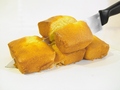
| 12/26/2005 08:33:49 AM |
For Baking Luck -- A Four Loaf Cleaverby karmatComment: I laughed. Loudly. You probably didn't hear it though.
Too bad you didn't have a cleaver. I immediately stopped laughing as soon as I saw that. Actually, that's a lie. I didn't really care, given the context ;)
This definitely works better than the Lying Snitch and the Poor Strobe or whatever other variant. |
 Photographer found comment helpful. Photographer found comment helpful. |
| 12/26/2005 08:27:47 AM |
Cereal Killer (aka Cheerio Woody!)by frogletComment: Good pic. If you want to get rid of those shadows in the back, you might consider picking up a length of non-crushed velvet.
Otherwise, I actually like the lighting, you're right, it did make it more dramatic. |
| Photographer found comment helpful. |
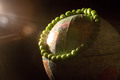
| 12/26/2005 08:21:02 AM |
Peas on Earthby tcmartinComment: Very nice pic. I LOVE the way you used lens flare (I have recently learned the proper term is "aperture ghosting").
It really gave it a PJ from space look.
Great execution. |
| Photographer found comment helpful. |
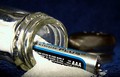
| 12/26/2005 08:17:29 AM |
A Salt & Batteryby mandyturnerComment: Interesting choice of background. The blues really complement each other well.
I wonder if it's just me being weird, but I noticed that there were 3 A's in your title (having used An AmpersAnd instead of an 'and') and 3 A's in your battery.
I wonder if these things were intentional.
Regardless, very nicely done. The only thing I really didn't care for was that the lid has been very obviously removed and placed in such a way to indicate that this is a totally manufactured pic. Doesn't take anything away from the pic though. |
| Photographer found comment helpful. |
| 12/26/2005 08:09:12 AM |
Deferredby rayz1Comment: Sidesplitting. Good one. I love how cat's just seem to know that we are taking pictures of them. It's the only time they don't like being the center of attention.
The stray tufts add to the picture. |
| Photographer found comment helpful. |
| 12/26/2005 08:04:11 AM |
iPhotoby stare_at_the_sunComment: This is incredible. Looks like a really high end Poser model or something. Wow.
I'ld love a how-to on getting pictures to look this smooth. It's not appropriate for every shot, but this is really eye-catching. |
| Photographer found comment helpful. |
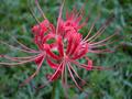
| 12/25/2005 01:35:57 PM |
Naked Ladyby NitenComment: Great looking pic, but I can't seem to find any birds or bees in the pic? ;)
I personally don't hate the center-weighted composition, but I feel that it is actualy a bit off-center. Also, it may have benefited from moving more above to pull a bit more of a circular feel from it. That might work to complement the centering better. |
| Photographer found comment helpful. |
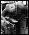
| 12/25/2005 12:07:47 PM |
Hard Metal.....Soft Heartby hdogg4uComment: Beautiful pic and beautiful story behind it.
Re the Chit below, being mocked by a moron is like a badge of honor. Wear it with pride.
I wish he had badmouthed some of my pics. |
| Photographer found comment helpful. |
| 12/22/2005 09:35:16 AM |
You Are What You Eat! by manic35Comment: Fantastic picture. It is so well laid out that I doubt anyone even really noticed the wrinkles in the backdrop sheet in the top right corner. If you are anything like me, you probably worried heaps about that, but FWIW, I didn't really mind them because of the way they lined up and the hue that the shadows took.
Really well done. You are lucky that his hair is the colour of cheese.
Great way to remove the bulkiness of those diapers too. |
| Photographer found comment helpful. |
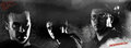
| 12/20/2005 09:05:25 AM |
sin city DPC.jpgby TallblokeComment: Sweet stuff. I found the movie to be a bit silly, but simply wicked style. The guy (a la Tim Allen) in me enjoyed that movie thoroughly.
This pic seems like it needs a bit of a kick in the contrast department though. The blacks in Sin City are really black. This one seems a bit soft.
This is most noticeable as a problem on the guy on the right. He also seems to be placed a little oddly, maybe a bit too high and far in from the edge.
The two other faces are pretty well balanced, but might stand a bit more contrast before totally losing all the detail in the face. |
| Photographer found comment helpful. |
Home -
Challenges -
Community -
League -
Photos -
Cameras -
Lenses -
Learn -
Help -
Terms of Use -
Privacy -
Top ^
DPChallenge, and website content and design, Copyright © 2001-2025 Challenging Technologies, LLC.
All digital photo copyrights belong to the photographers and may not be used without permission.
Current Server Time: 08/28/2025 09:06:41 AM EDT.