| Image |
Comment |
| 11/13/2004 06:35:11 PM |
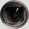
Selfby GabrielComment: Well, now, this really looks like a circular selection around the lens. Especially as the colour matches the DPC background. I guess you used the DPC grey as photoshop target for the color correction? Anyway, it doesn't provide a refreshing view of a camera lens. There's nothing too special about it. |
 Photographer found comment helpful. Photographer found comment helpful. |
| 11/13/2004 06:29:06 PM |
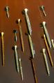
Screws attackby xoaoComment: I bet you're crazy that you can't do any cloning, eh? What a great idea. I feel attacked. |
| Photographer found comment helpful. |
| 11/13/2004 06:25:16 PM |
5 to 12by t_onlineComment: Looks like we we both had the same idea. However, yours looks good. |
| Photographer found comment helpful. |
| 11/13/2004 04:25:12 PM |
|
| Photographer found comment helpful. |
| 11/13/2004 04:24:16 PM |
Intensityby GatorguyComment: This truly is intense. If looks could kill...Or if sharpness could ;) |
| Photographer found comment helpful. |
| 11/13/2004 04:22:21 PM |
Too litttle timeby tristaliskComment: It's not your fault, but I'm getting tired of inside views of clocks. Don't worry, I took a shot of a wristwatch. Just like ten other people.
You shouldn't have cropped the pointers, and the upper right corner is motion blurred. |
| Photographer found comment helpful. |
| 11/13/2004 04:12:37 PM |
Smile... before you drop!by photoleonComment: Those lens effects amaze me mo every time. Where was that smiley? Did you shoot through it? I can't figure it out. I'll just pretend the smiley was inside the drop. And that makes it great. Only the yellow should be more biting, brighter. |
| Photographer found comment helpful. |
| 11/13/2004 04:07:03 PM |
Fractured Acrylicby jemisonComment: I don't know what this is, I don't know where's the top, I can' even find out what'S in the front and what's in the back. This completely confuses me. And that's exactly what makes this shot so great. |
| Photographer found comment helpful. |
| 11/13/2004 04:04:53 PM |
Virgin Islandsby GPComment: This shot lacks colour. You should have used either a coloured surface, a coloured ceiling (yeah, I know) or coloured lights. But I really like how the drops deform the neon lights. |
| Photographer found comment helpful. |
| 11/13/2004 03:59:12 PM |
Possibilitiesby KaDiComment: The idea is excellent. But the brush is not different enough from the background. I don't know whether you used one of your own paintings for the background, but I think it would have been better to use a painting with bright colors or white areas (Miró). |
| Photographer found comment helpful. |
Home -
Challenges -
Community -
League -
Photos -
Cameras -
Lenses -
Learn -
Help -
Terms of Use -
Privacy -
Top ^
DPChallenge, and website content and design, Copyright © 2001-2025 Challenging Technologies, LLC.
All digital photo copyrights belong to the photographers and may not be used without permission.
Current Server Time: 09/04/2025 06:34:41 PM EDT.