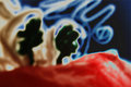
two treesby
posthumousComment: Dear Don,
This is a big 'Hi' from the Critique Club.
Before we get to this specific image, I must say that looking at your previous challenge high scorers and your portfolio, you have a very specific style and preference for the more abstract. Please never change a wonderful style for the sake of popularity.
I have had a long look at your entry and read every one of your feedbacks. As you will gather from that, and in my opinion, one will either love this creation, or hate it. There is no middle ground when it comes to abstracts.
You have displayed a very good sense of composition and playing with colors. The fact that the eye must search, and keep on searching for some point to focus on, might have been the main shortcoming of the picture. The burned out area of the red, right, keeps taking the eye in, involuntary making it the point of focus.
The background would have benefited if it was a solid black. It could have at least set the image free by creating another visual dimension.
A daring image presented to a fussy membership was indeed brave. You succeeded with "Ophelia's Net Weight" (3rd highest challenge entry) in what I would call an abstract, but you must admit that that photograph is in another class in every respect. Remember abstracts and impressionisms are either love or hate pictures, this one did not appeal. By creating a more specific point of focus for the eye, and keeping the eye in photograph will surely go a long way in improving a photograph.
Kind regards,
docpjv