| Image |
Comment |
| 06/28/2006 06:29:44 PM |
brie edit.jpgby margiemuComment: Margie, I have no real training or qualifications, so this is just an opinion. As for bokeh, I think this is a very good example. As for the portrait itself there's a lot I like about it: excellent lighting, nice expression, well cropped. However it does seem a bit soft to me both from too-shallow depth of field and maybe some camera shake. Also I would prefer a little photoshop improvement of her face: the speck on the right side of her chin removed, for example, as well as the dark spot at her left nostril and below her left eye.
All in all, she's a cutie and this is a sweet photo! |
 Photographer found comment helpful. Photographer found comment helpful. |
| 06/28/2006 04:56:43 PM |
|
| Photographer found comment helpful. |
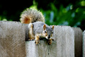
| 06/28/2006 04:53:59 PM |
Taste Like Chicken.by BullieComment: Title gave me a good chuckle :o) I think the squirrel's a wee bit too centered. Beautiful bokeh in the b/g, by the way! {8} |
| Photographer found comment helpful. |
| 06/28/2006 12:25:56 AM |
Virgin Lightby sherpetComment: V-E-R-Y nice Sherryl!! Sweet sentiment, too. My warmest wishes to your friend Brenda. |
| Photographer found comment helpful. |
| 06/23/2006 02:13:43 PM |
|
| Photographer found comment helpful. |
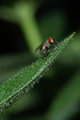
| 06/23/2006 10:33:20 AM |
DSC_1307.jpgby kenskidComment: Holy moly that's a sharp lens! (Isn't that the leaf of a Venus Flytrap that he's sitting on?!) |
| Photographer found comment helpful. |
| 06/22/2006 09:38:55 PM |
|
| Photographer found comment helpful. |
| 06/22/2006 10:08:35 AM |
Destination Sandboxby glad2badadComment: Man you just never know, do you? Ouch/lol!! Sorry for the disappointment but it's a cool photo anyway :o) |
| Photographer found comment helpful. |
| 06/22/2006 09:49:31 AM |
Canonous Tulipaby BenComment: Sorry Ben but I'm not a fan of this one :o) Too centered, the flower petals lack detail, very shallow dof (f2??)! It looks just as you described it, a last minute idea you snapped off just to enter the challenge. Most of us have done that, and then swear we'll never repeat that mistake! But hey, two folks gave it a ten! |
| Photographer found comment helpful. |
| 06/22/2006 09:45:21 AM |
18, 19, 20...by BenComment: Overall I like this shot but there are a few things I note that detract from it for me. The vertical bar on the left of the photo really draws my eye away from the subject, especially considering how bright it is. The crop, too, so tall and narrow. I think I understand that you were emphasizing the lankiness of the fellow by doing so, but it makes me hesitate... not sure about it.
I do like the composition, however. Others commented that he is just hanging there but to me it communicates exhaustion and fatigue. The exposure is good but the b/w conversion is a bit bland in my opinion. Overall a nice first entry... it scored much better than my first! :o) |
| Photographer found comment helpful. |
Home -
Challenges -
Community -
League -
Photos -
Cameras -
Lenses -
Learn -
Help -
Terms of Use -
Privacy -
Top ^
DPChallenge, and website content and design, Copyright © 2001-2025 Challenging Technologies, LLC.
All digital photo copyrights belong to the photographers and may not be used without permission.
Current Server Time: 08/17/2025 03:48:09 PM EDT.