|
|
|
Showing 701 - 710 of ~3731 |
| Image |
Comment |
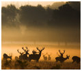
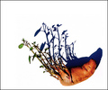
| 08/22/2007 06:21:18 AM | Wildernessby AlexSaberiComment: I actually prefer this one over your entry but that´s just me, great shot´s both of them though! |  Photographer found comment helpful. Photographer found comment helpful. |
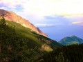
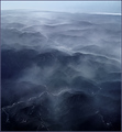
| 08/17/2007 11:12:13 AM | Shadow Valley.by slytennisComment: Greetings from the critique club :)
Hi there again :) Well first off, congrats on your new personal best score so far.
I have some major issues with this image though, mainly the image quality. I am sorry if I am too frank about this but whatever caused it, especially the sky in my opinion and also the mountain that is in the right side of the picture just looks awful, if this is how this image came out of your camera at iso 50 I would seriously check into if it´s defect cause there is simply way way too much color noise in those areas of the picture.
I have some suspicions that maybe your monitor is not calibrated, do you see all of the grayscale underneath pictures when you vote?
I think the color noise rather comes from something you did when you post processed this image. I don´t know what software you use but I think most of them allow you to see the histogram, it´s a good tool for knowing when you are blowing out either the shadows or highlights, you are totally blowing out the higlights in the sky. I suspect you increased the saturation somewhat to get more vivid colors? Well I personally if anything decrease saturation and instead use levels/curves and other contrast related stuff like tweaking contrast in the raw converter since I only shoot raw images, that way I don´t get the color noise that is in this image and still get pretty vivid colors. I urge you to try it out anyway if you haven´t used curves or levels so far.
Other than that, the image quality, I think this is a pretty good image. It´s well composed, MUCH better than the other one I commented on the other day and you seem to have been there at the right time of day cause the lighting looks pretty good so I think you could have scored even better with this image if you had taken care not to blow the highlights like that and used some other method than you did to get the vivid colors. Again, I urge you to check out if your screen is off, that could also explain a lot cause if your screen has some bad settings on it, images can look great at your screen but much worse for other people.
Kind regards from Iceland, Lárus. | | Photographer found comment helpful. |
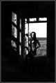
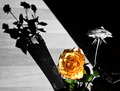
| 08/16/2007 12:57:48 PM | The shadows of my soul by DogAngelComment: Greetings from the critique club :)
Well hi there Guðbjörg, always fun to critique a fellow Icelander.
Well I kindof like it too but I don´t love it, if I had voted I probably would have given it a 6. It´s a pretty cool shot, I like the wind in the hair and the shadow in the window falling on her. The black areas are too much for my taste though, I would have either wanted to see a little bit brighter shadows or simply a photo that cropped a lot off the top and bottom of this photograph.
I don´t fully understand the camera settings, why iso 800? If it´s grain you are looking for, sure but that won´t be visible in web resolution anyway, why not may be 1/125 shutter, iso 100 and 5.6? Eh, that is just what I would do so don´t listen too much to me, I just think that would have lead to better image quality.
Nice choice to make it b/w, I think this photograph would do well in a series with several others like it so just keep at it and work on your own style.
Kind regards from your own Iceland, Lárus. | | Photographer found comment helpful. |
| 08/15/2007 09:17:38 PM | Allureby TOYComment: ignite, you wierdo, all I notice in this picture is the hot naked lady :P
Ah who cares about cigarettes and how bad they are for you, I don´t smoke and absolutely detest the act of smoking but I love quite a few people who do smoke and I don´t judge them, who cares who is smoking in a photograph or not, can you smell it off the screen?
Nice shot Laurent, love the lighting :) | | Photographer found comment helpful. |
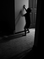
| 08/15/2007 12:33:47 PM | Walking Through Wallsby posthumousComment: Greetings from the critique club :)
Well this is just freaky, third time I get assigned to one of your images... :P
First off, I have told you like your b/w processing style and this is no exception, great tones and all that stuff so got nothing more to say on that subject.
Secondly, I think you nailed the neccesary shutterspeed, the movement of the arm is dead on while the other one i still so I would not have wanted to see it any other way regarding the camera settings. Composition and framing by the black areas around the child are pretty good, I might think they are just a tad too much on either side but still, nothing that is bothering me, if you cropped off maybe 3-5% off both left and right side I think this image would appeal more to me personally, but that´s just me.
I kindof get the low score though, even though I don´t agree with it, would have wanted to see this score about a full point higher or just shy of 6. I mean it meets the challenge but maybe people who voted didn´t think the image was about the shadow and wanted images more in the style of the blue and red ribbon winners and thought you just selected any photo wich had a shadow in it and posted in the challenge, you know how anal some DPC voters can be about such things.
I would have given this a 6, I kindof like it but still, you know me, I want something more to pop off the screen when I look at a photo and while this is good, it doesn´t really interest me fully, I would have wanted to see a scalvert version of this idea, I hope you get what I mean.
Anyway, keep up your style, I know you don´t care about scores and frankly, I have stopped caring much either... :)
Kind regards from Iceland, Lárus. | | Photographer found comment helpful. |
| 08/15/2007 12:17:45 PM | Just One More Puff Before We Goby JohnLampkinComment: Greetings from the critique club :)
First of all, congrats on your new personal best score, that can only improve though as I see great potential in this image.
I kindof like it and would have given you a 6 if I had voted, wich means to me means better than average but still not really a great shot, could have been great had a couple of things been done diffrently/better (for my taste anyway).
First of all, I kindof like it but it´s still wierd that the cigarette is so huge compared to the skeleton, I assume the skeleton is some kind of miniature but it´s kindof confusing so I think that might have thrown some people off. I actually like it that way as it really emphasizes the smoking and draws attention there but maybe you would have been better off using some smaller cigarette brand, if that exists, I don´t smoke so maybe all filters are the same size, I dunno.
I do like the setup, the shadow that is cast but personally I would have wanted to see it more concentrated, it´s too light for my taste, try using a smaller lightsource than the one you used and the shadow should be much darker and concentrated. Also, I think using a darker backround would have helped just as the shadow should be darker cause then the smoke in the picture would have been much more prominent. I like the slight vignetting and think you should have added much more in post processing, that would definately have improved the shot alot. Also the image is a bit too "gray", or doesn´t have as much contrast as I would have liked to have. Try this if you have photoshop, copy the layer, go to filter-other-high pass and use that with a very high setting on the new layer, then change the blending mode to soft light, works well on b/w-ish images and should boost it to a more three dimensionality, would work wonders on this shot.
Anyway, that is it, can´t find any more to say about the image, think it was underrated and should have placed higher in the challenge so keep at it.
Kind regards from Iceland, Lárus. | | Photographer found comment helpful. |
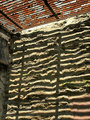
| 08/15/2007 09:06:15 AM | Rogue Potatoby ScapeshotsComment: Greetings from the critique club :)
Well I get assigned to one of your photos again, this is the fourth critique I give today and the first one was also someone I critiqued not too long ago, wierd huh :)
Anyway, like this shot heaps better than the one with the keyboard, it´s not even in the same league so you are definately improving, keep it up.
I don´t have much to say about the shot though so I´ll keep this short. There are a couple of things though, especially regarding the post processing.
First off, I would have liked the shadow better had it been black and not so blue toned somewhere. This would be easy to clean out in post processing by using the sponge tool set on desaturate or a channel mixer layer set to monochrome and then masked in the shadow only, something like that.
Something about the contrast/sharpening seems off to my taste, while the potato looks good, the leaves and the white that intersects with them seem sort of oversharpened, or there is too much contrast between them for my taste, like you selected everything but the potato and leaves and blasted it to white. I find it much more pleasant when you let the white area around leaves such as this peacefully bleed over to the leaves and potato, not be so sharp. Also when you whiten a backround like this, the subject always seems more contrasty than it did before whitening the backround so when I do this, totally blow out the whites, I usually set the contrast afterwards as I don´t want to over do it.
These are all just nitpickings and I think you did a pretty good job, again just keep it up.
Kind regards from Iceland, Lárus. | | Photographer found comment helpful. |
| 08/15/2007 08:54:17 AM | ¿ 'Eve of Destruction' or 'Dawn of Correction' ?by Dr.ConfuserComment: Greetings from the critique club :)
First off, wow! I really like this shot and I think it´s WAY underrated in the challenge. I still have seen better but this definately would have gotten a very good score from me, I probably would have given out an 8 and I don´t give out many of those per challenge. I would have wanted to see this in the top 10. I really like the processing, the look of the image is great, great tones hues.
That you got it from a cell phone is impressive, although that doesn´t matter much when you resize photos down to web size afterwards, you´d be hard pressed to tell the difference from a phone camera or a DSLR with quality lenses. Still impressive though, so don´t get me wrong, wonder how it looks in full rez.
Anyway, got no real constructive critizism on this photo as I like it pretty much as it is and I don´t really understand the relatively low score, think this should have scored at least a full point higher or a 6.8+.
Possible explanation for the score is that people didn´t think it fit the challenge, or could see no clear cut shadows in the photo or wanted the photo to contain specific shadows like the blue and red ribbon winners, who knows...
Kind regards from Iceland, Lárus. | | Photographer found comment helpful. |
| 08/15/2007 08:00:48 AM | Parallel Linesby juliejoldComment: Greetings from the critique club :)
Well I don´t have much to say about this image so I´ll keep this short.
First, it definately meets the challenge in my books. However, this is pretty much in essence what I would call an average photo, it´s not bad but not something I would call interesting either. Sure, you got some leading lines in there but all in all, there is simply nothing I find interesting in the shot, no spot that stops my eye and asks it to take a second look. My eye just wanders over the frame for a couple of seconds and had I been voting I simply would have clicked the 5 button and moved on to the next photo without commenting.
Again, like I said, not bad but not good either, if you want to do well in challenges here you have to have a more interesting subject, something extraordinary, so the voters will stop longer, you have to force them to think about your image.
Kind regards from Iceland, Lárus. | | Photographer found comment helpful. |
| 08/15/2007 07:51:48 AM | Drawing the shadesby marvinComment: Greetings from the critique club :)
Well well, I get assigned to your image again. To tell you the truth, I am not as fond of this one as the one of the woman. It´s not bad, but truthfully I would have voted a 5 and moved on to the next shot without commenting, I don´t find it bad but not good either.
First of all, this is just me and my problem but I really detest selective desaturation and that for starters is hurting the image in my opinion.
It does meet the challenge, no doubt. I do really like that vertical shadow of the wall, without it this shot would have been very boring so excellent work on that part. However, the flowers+vase and shadow are well something I have seen before and while you did it correctly, it´s not really all that interesting to me anymore and would have needed to have some twist too it to make it extraordinary, like some trick that the shadow showing someone reaching into the flower bouquet and picking one of the flowers away but no hand visible near the actual flowers. Sort of like the blue ribbon shot of the cat with the lion shadow, a trick like that would have been needed for this to really pop off the screen.
All in all a decent shot and who knows, had it been in color or just b/w I would probably have given it a 6 wich in my book means above average but still not really making my jaw drop to the floor.
Greetings from your very own Iceland, Lárus. | | Photographer found comment helpful. |
|
Showing 701 - 710 of ~3731 |
Home -
Challenges -
Community -
League -
Photos -
Cameras -
Lenses -
Learn -
Help -
Terms of Use -
Privacy -
Top ^
DPChallenge, and website content and design, Copyright © 2001-2025 Challenging Technologies, LLC.
All digital photo copyrights belong to the photographers and may not be used without permission.
Current Server Time: 08/17/2025 07:10:12 AM EDT.
|