|
|
|
Showing 691 - 700 of ~3731 |
| Image |
Comment |
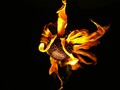
| 08/23/2007 05:03:32 PM | Fireflowerby KrisCarpenterComment: Greetings from the critique club :)
Well this shot is kindof cool but still, I have seen enough flower shots to last me a lifetime and I really need something different for me to stay interested. You kindof achieve that thanx to the lighting so definately keep experimenting with that flashlight.
I do like the colors and yes, it kindof does look like it´s on fire so nicely done, this is something I would have voted a 6 I believe, wich to me means above average but still not dropping my jaw to the floor. Think that has mostly to do with the black backround, not sure what I would have wanted instead of black but all I can tell you I think that is what is keeping this shot from dropping my jaw. Perhaps having it in an ashtray on a wooden table? Dunno...
Anyway, focus and lighting are good and that´s pretty much all I can say about the image, keep on experimenting :)
Kind regards from Iceland, Lárus. |  Photographer found comment helpful. Photographer found comment helpful. |
| 08/23/2007 04:58:16 PM | Come on baby, light my fireby TimComment: Greetings from the critique club :)
Well sorry but I don´t have a whole lot to say about this image, it´s kind of neither good nor bad and had I voted in this challenge I would probably have given this a 4-6 rating and left no comment like the vast majority of the voters did.
There is pretty much nothing wrong with the image, it´s in focus and the framing/composition is not bad but on the other hand there is really nothing I find interesting about it either. There is no interesting colors in it (obviously, duh, but I mean I usually find concert photos more interesting in color), there is nothing really interesting going on and I can´t tell if this is just a friend of yours singing karaoke or if it´s a concert in a blues joint or whatever...
I think you know all this, judging by your portfolio so I´ll just leave it at that :)
Kind regards from Iceland, Lárus. | | Photographer found comment helpful. |
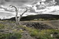
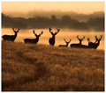
| 08/23/2007 10:12:25 AM | Nature Reclaiming Silver Minesby pmichaudComment: Greetings from the critique club :)
Well first of all, I want to say this shot is pretty good and I had probably given it a 6 if I had voted. That´s a huge compliment cause I really really really detest selective desaturation when it´s done without any apparent reason. It´s almost not noticeable so it´s pretty well done, I didn´t quite get that you selectively desated it at first, just thought the sky looked very odd. I can say for sure I still would have preferred the sky to remain as it should be, blue but that´s maybe just me, have a feeling it cost you somewhat with the voters though, possibly a 6+ score.
Anyway, the shot is nicely composed and got good tones everywhere so it´s well lit and processed too. I personally think the foreground could stand to be a bit darker though and would have darkened it in post processing had I taken this photo but it´s not something that is bothering me, just thought I´d mention it.
The scene is interesting, mostly for that dead tree wich was a good find. All in all I think this shot is above average in the challenge and I see most voters agree with me.
I am sort of surprised you had to reduce noise in this image, I also have a 30D and at iso 100 it´s crispy clean unless you underexpose and then bring up shadows, the shadow areas then have noise in them but that would never be apparent in web resolution.
Kind regards from Iceland, Lárus. | | Photographer found comment helpful. |
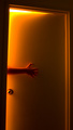
| 08/23/2007 10:03:35 AM | At Hell's Entranceby SomeamateurComment: Greetings from the critique club :)
Well I actually think this shot is kindof cool! I completely disagree with the vote and placement it got in the challenge. I still don´t think it´s bloody brilliant but I would have wanted to see this score about a full point higher or so. These free studies are always tough...
There are several things that could have been done better though. The door for starters... It just looks so ordinary wich I do like, kind of like it´s usually a normal door and then transforms into the door to hell but still, maybe if there was something that was a bit meancing about it that could give it away to the observant. Like a cooler doorknob, that round doorknob looks so dull, if you had a black one with a crooked handle or something that would just have looked more fitting somehow.
I do like the lighting and the placement/feel of the hand. Maybe if you had drawn on the door to make it seem like the hand was being dragged in, drawn like marks so as if the fingernails had carved a path in the door, like the hand was hanging on for dear life?
This shot is promising and I like the idea, hope you don´t let the score get you down, just pay more attention to the details in a photo like this and you should be set :) For what it´s worth, I would probably have given this a 7 if I had voted and I don´t give out many of those in free studies.
Kind regards from Iceland, Lárus. | | Photographer found comment helpful. |
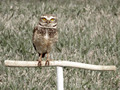
| 08/23/2007 09:53:00 AM | I am watching you.by adrianodjComment: Greetings from the critique club :)
Well first off, congrats on your new personal best score, for now at least! I am kindof impressed you got a pretty respectable "wildlife" shot with a p&s camera. However, these photos always come out better if they are taken with a camera with a bigger sensor, like DSLR and a pretty long lens. Why? I feel the biggest fault with this image is the fact that the Owl pretty much totally blends in with the backround and a DSLR and long lens with a big aperture would have solved that problem by just taking the backround totally out of focus.
I basically 100% agree with stevenov and digifotojo´s comments. I do like the desaturated look and use it often and the eyes look pretty cool so I would just say that you need a better camera/lens if you are going to focus on this type of photography in the future :)
I also feel that the even lighting of the shot kindof makes my eyes wander towards the edges of the shot, I think this photo would have benefited with either some slightly increased vignetting or a frame or possibly both.
Other than that, a pretty decent shot but there are just too many bird photos already here at DPC that if you want to do them and score well, you both need perfect technically photos (bird in focus, backround out of focus) and preferrably something extraordinary going on in the shot, don´t know what that could be but preferrably the Owl doing something interesting, not just sitting there.
Kind regards from Iceland, Lárus. | | Photographer found comment helpful. |
| 08/23/2007 09:42:18 AM | Youthby permapierComment: Greetings from the critique club :)
First off, to be honest, I would have voted this shot a 4 and just moved on to the next shot without commenting like the vast majority of the voters seemed to do, vote a 4-6 and not comment. I am sorry but I kindof feel this is below average comapred to the vast majority of the photos in this challenge but it´s not really a bad photo either, I probably would have given it a 5 in another challenge (I put higher expectations on photos in free studies) and I thought this shot met the challenge.
The shot is simply what I percieve to be a snapshot of a family member wich has absolutely no meaning to people outside your family but is great to put in the family album. It´s not a bad shot, just not something that I find terribly interesting, this photo doesn´t say anything about the individual other than he appears to have just come out of the pool.
I am somewhat perplexed about the camera settings, especially since you used an lens that allowed you to use up to a full 2.8 aperture. The f11 and shutter of 400 kindof ruin any kind of mood the ambient lighting could have brought to this shot and also leads to the biggest problem I have with the shot, the lighting just coming from the flash.
Had you only used the flash for fill in and used more of the ambient lighting I would have found this shot much more appealing. That could just have been me but I have a feeling most people would agree. There is also those white areas at the bottom of the photo, I assume that´s part of his swimsuit but they just look like blown out/out of focus white areas that don´t really make any sense to me, almost like you had waterdroplets on the lens, I can´t really tell what that is. It´s really pulling my eye towards that area of the photo, I find myself looking towards the bottom and then to his face wich is very distracting.
On the plus side I like the attitude the model is projecting, although that doesn´say much about him like I told you earlier.
Try fixing the lighting, mainly not rely solely on direct flash lighting and use more of the ambient light you have available and maybe have something in the backround that ties in with what the individual is wearing/doing and I bet you would score heaps better.
Kind regards from Iceland, Lárus. Message edited by author 2007-08-23 09:43:46. | | Photographer found comment helpful. |
| 08/23/2007 08:03:17 AM | | | Photographer found comment helpful. |
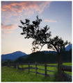
| 08/22/2007 08:44:14 AM | Drawn to the lightby KHoltComment: Greetings from the critique club :)
Well this is a pretty nice shot, if I had voted I probably would have given it a 6. Not really much constructive stuff I can say about it, the shot is nicely composed and exposed, got tones all over. Maybe the darkest parts could be a bit brighter, for my taste but that´s not something that is bothering me at all. All in all this is a pretty pleasant shot to look at but there is also nothing that is extremely interesting about it, something that would warrant it a higher vote from me and apparently most other users.
I at least completely disagree with apple77berry, I think the composition is nice but I think wickee_one raises a good point about noise, the shot would be better without it but it´s also nothing that is bothering me.
What I like best about the composition is that the tree seems to be stretching up to the clouds in the upper left corner.
Sorry but don´t really have anything more to say so I´ll just say kind regards from Iceland, Lárus. Message edited by author 2007-08-22 10:41:48. | | Photographer found comment helpful. |
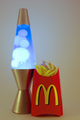
| 08/22/2007 06:42:35 AM | McMunchiesby photodudeComment: Greetings from the critique club :)
Well to start off I would probably have given this image a 4, sorry but I don´t think this image is really bad but I would classify it as being a little bit below average and kindof agree with the score and place it got.
The biggest reason is the lighting on this shot. You say you built a lightbox for this photograph? I can´t really see that in this photo, you sure you used it correctly? The standard fool proof way of using a lightbox is to fire at least two lights into it, one from each side and pretty much the same power on both lights. Sure, there are a ton of other ways to do it but that´s the easiest way to do it and get acceptable results.
The image is also in my opinion underexposed, if I had taken this shot I would have wanted a much more high key look to it since you placed it in a lightbox, if you have not familiarized yourself with the camera histogram I encourage you to do that, it´s an invaluable tool.
There is also what appears to me to be some strange artefacting in the mcdonalds box in the red areas, just above the "M" on the right side, did you use some tool to clip the red highlights (like levels?). Looks a bit wierd, whatever caused it.
The colors seem a bit off to me too, looks like the WB was a bit off, did you light this with tungsten bulbs? If you are not shooting in raw and can correct WB afterwards, I encourage you to familiarize yourself with the WB settings and use the correct ones when shooting with artificial lighting, tungsten lighting can cause non flattering color cast´s on subjects.
All in all this definately met the challenge and I did get the humor in the shot, think you should have gone all the way though and just filled the shot with french fries and not just one box cause that´s what I think of when I think of Munchies, A LOT of food and just not one box of fries :)
Kind regards from Iceland, Lárus. | | Photographer found comment helpful. |
| 08/22/2007 06:26:03 AM | Burst of colorsby sekarmalathyComment: Greetings from the critique club :)
Well don´t really know what to say as constructive critizism, I like the shot pretty much as it is. Only thing that I would change was I would have had just a little bit more space at the bottom but only like 2-3% just so that the glasses don´t seem to cramped in there.
That´s it, I like everything else about the shot, the colors and lighting in particular. I still am not really in awe about photos like this so I would "only" have voted this a 7 but I know how hard they are to do so I respect that. In short, I think the only reason this didn´t do better is that a lot of people who participate on DPC are like me, we want awe inspiring photos every time of something extraordinary like a killer sunset, some exotic location or portraits of very interesting people and that is usually what does well in free studies.
Anyway, nice job :) Kind regards from Iceland, Lárus. | | Photographer found comment helpful. |
|
Showing 691 - 700 of ~3731 |
Home -
Challenges -
Community -
League -
Photos -
Cameras -
Lenses -
Learn -
Help -
Terms of Use -
Privacy -
Top ^
DPChallenge, and website content and design, Copyright © 2001-2025 Challenging Technologies, LLC.
All digital photo copyrights belong to the photographers and may not be used without permission.
Current Server Time: 08/17/2025 06:45:33 AM EDT.
|